21 Yogurt Cup Packaging Design Ideas to Inspire You
Yogurt cup packaging design ideas open the door to endless creative possibilities for brands wanting to stand out. A cup is more than a container; it’s often the first thing a customer notices before they even read the label. With so many dairy products competing for attention, creative packaging can turn a routine purchase into a memorable brand moment. Even small design choices, like color or texture, can shape how a product is perceived on the shelf.
This post walks through a wide range of inspiring directions for yogurt packaging, focused purely on creativity and imagination. Instead of diving into production techniques, the goal here is to spark ideas that brands can adapt to their own personality and audience. Whether you’re launching a new product or refreshing an old one, there’s likely an idea here worth exploring.
Best Yogurt Cup Packaging Design Ideas to Try
There’s no single right way to approach yogurt cup packaging design, which is exactly what makes this space so exciting. Some brands lean into bold, playful visuals, while others prefer quiet, understated elegance that lets the product speak for itself. The right direction often depends on the brand’s personality, target audience, and the story it wants to tell.
Below are twenty-one creative directions worth exploring, ranging from color and pattern choices to storytelling and cultural inspiration. Each idea offers a different way to make yogurt packaging feel intentional, fresh, and worth a second glance on a crowded shelf.
Minimalist Yogurt Packaging Ideas
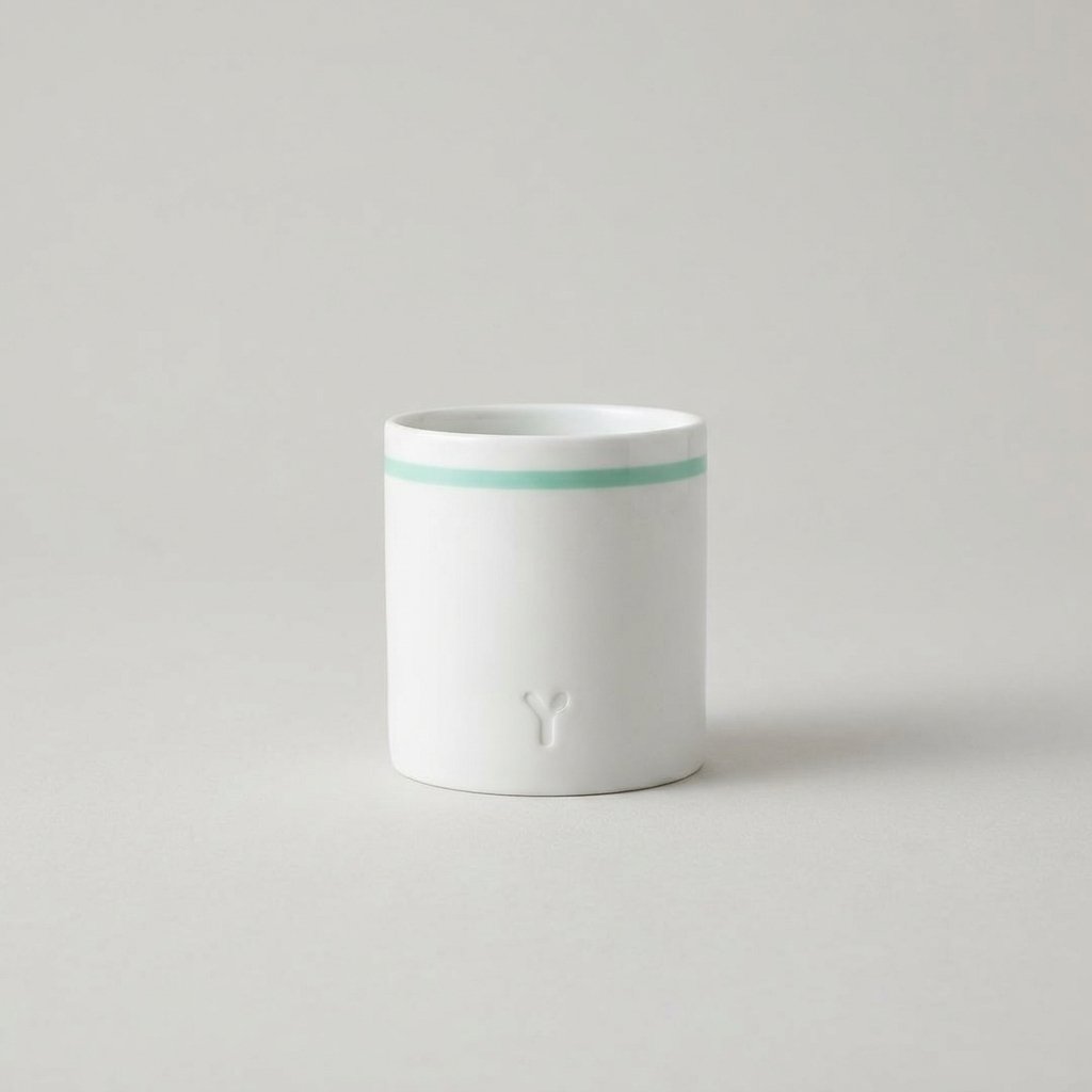
Minimalist design strips away unnecessary clutter, letting a single color or clean typeface carry the entire look. This approach often feels premium and modern, appealing to customers who associate simplicity with quality. A minimalist yogurt cup might use just one accent color against a white or neutral background.
Brands choosing this direction often rely on subtle details, like a small embossed logo or delicate line work, to add personality. The result feels calm and confident, standing out precisely because it refuses to compete for attention with loud graphics.
Vintage-Inspired Yogurt Cup Packaging Design Ideas
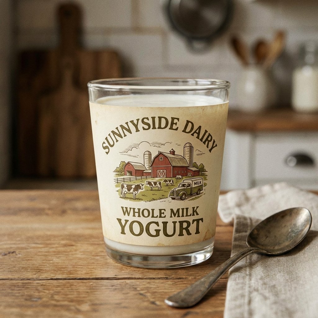
Vintage-inspired packaging borrows visual cues from past decades, using retro fonts, faded color palettes, and classic illustrations. This style taps into nostalgia, making customers feel a sense of warmth and familiarity even with a brand-new product. It works especially well for brands emphasizing traditional or homemade qualities.
A vintage yogurt cup might feature hand-drawn farm imagery or old-fashioned lettering reminiscent of early twentieth-century dairy labels. This creates an emotional connection that feels timeless rather than trend-driven, giving the packaging lasting appeal.
Colorful Fruit-Themed Packaging Ideas
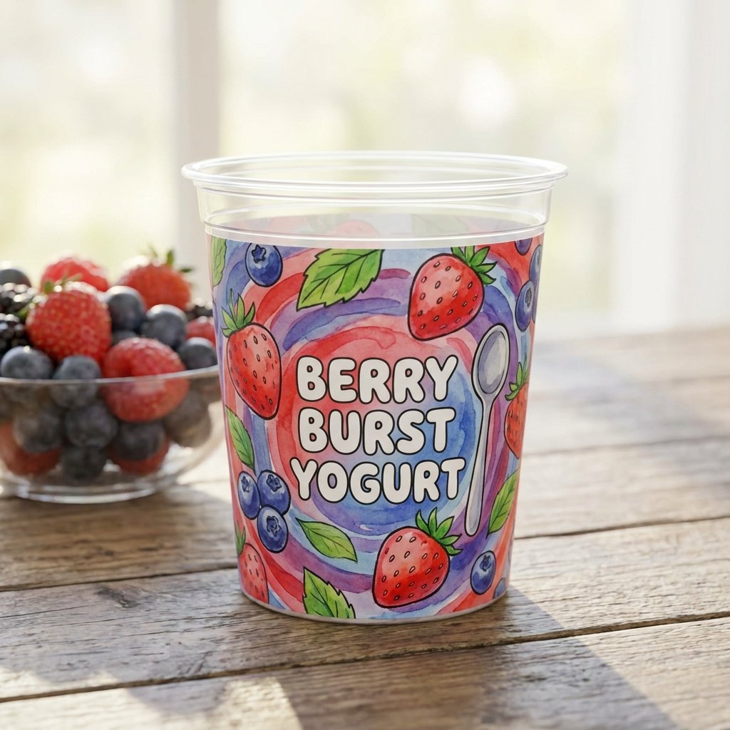
Fruit-themed designs use vibrant illustrations or photography to instantly communicate flavor before a customer reads a single word. Bright strawberries, mangoes, or blueberries printed directly on the cup create an immediate sensory connection to taste. This idea works particularly well for flavored yogurt lines with multiple varieties.
Color-coded fruit themes also help customers quickly distinguish between flavors while browsing a shelf full of similar products. The visual energy of fruit-based packaging often feels playful, fresh, and inviting, especially for family-oriented brands.
Read More: 20 Adorable Cup Design for Kids Ideas Parents Are Loving
Nature-Inspired Yogurt Cup Packaging Design Ideas
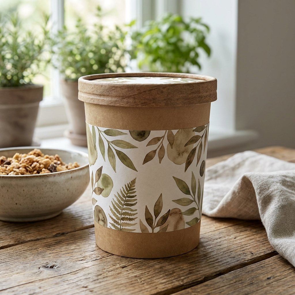
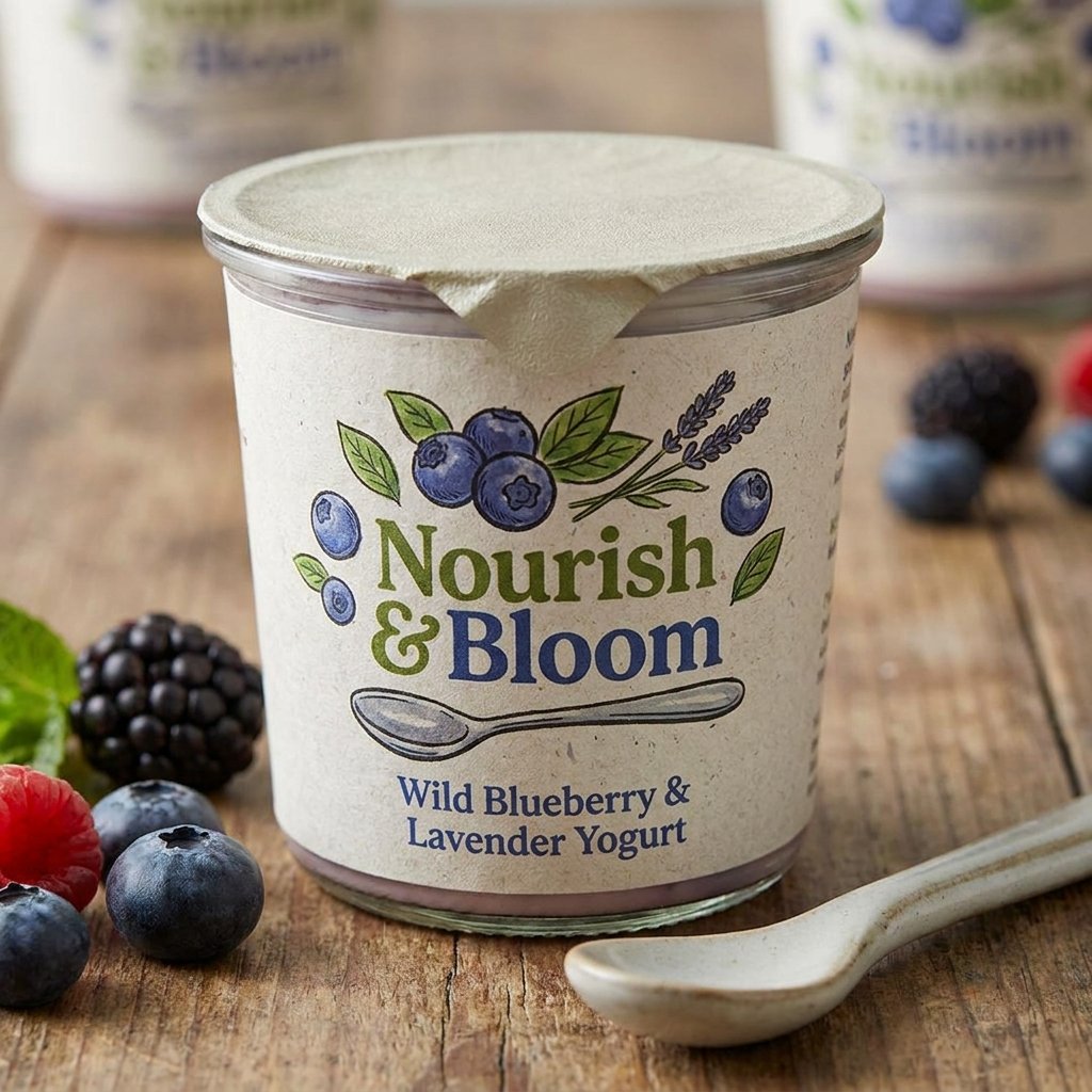
Nature-inspired packaging draws on organic textures, earthy tones, and imagery like leaves, wood grain, or soft watercolor landscapes. This direction suits brands emphasizing natural ingredients, farm sourcing, or environmentally conscious values. The overall feel tends to be calming and grounded.
Subtle textures mimicking paper or linen can enhance this effect, making the packaging feel tactile even before it’s touched. Nature-inspired designs often resonate with health-conscious customers who associate organic visuals with cleaner, simpler products.
Playful Character Packaging Ideas
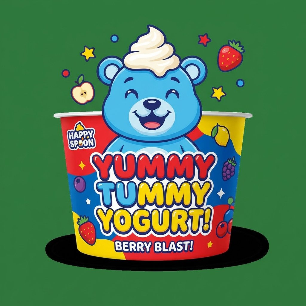
Character-based packaging introduces a mascot or illustrated figure that gives the brand a distinct, memorable personality. This idea works exceptionally well for yogurt Cup Packaging Design aimed at children or younger audiences. A friendly character can turn a simple cup into something kids look forward to seeing.
Consistent character use across a product line also helps build long-term brand recognition among younger customers. Over time, the character itself can become as recognizable as the logo, strengthening emotional loyalty to the brand.
Pastel Color Palette Ideas
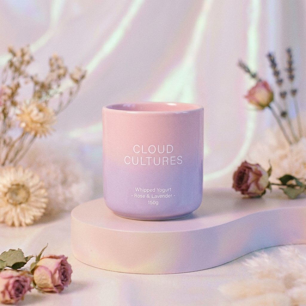
Pastel palettes bring a soft, gentle aesthetic that feels approachable without being overly bold or aggressive. Light pinks, mints, and lavenders often signal a sense of freshness and lightness, fitting well with Cup Packaging Design health-focused image. This idea works nicely for brands wanting a calm, feminine, or wellness-oriented tone.
Pastel packaging also photographs beautifully for social media, which matters increasingly for brands relying on visual platforms. The soft color story creates a cohesive, Instagram-friendly aesthetic across an entire product line.
Bold Typography Packaging Ideas
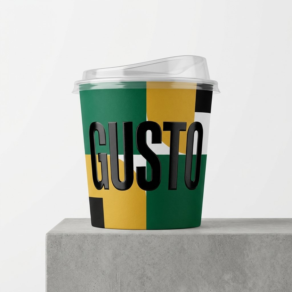
Typography-driven designs let the brand name or a bold statement dominate the cup, minimizing imagery almost entirely. This approach feels confident and modern, often appealing to brands with a strong, distinct voice. Oversized lettering can make even a small cup feel impactful on the shelf.
Contrasting fonts, unexpected color pairings, and creative letter spacing can all add personality to typography-first designs. This idea works well for brands wanting packaging that feels fashion-forward rather than traditionally food-focused.
Transparent Window Packaging Ideas
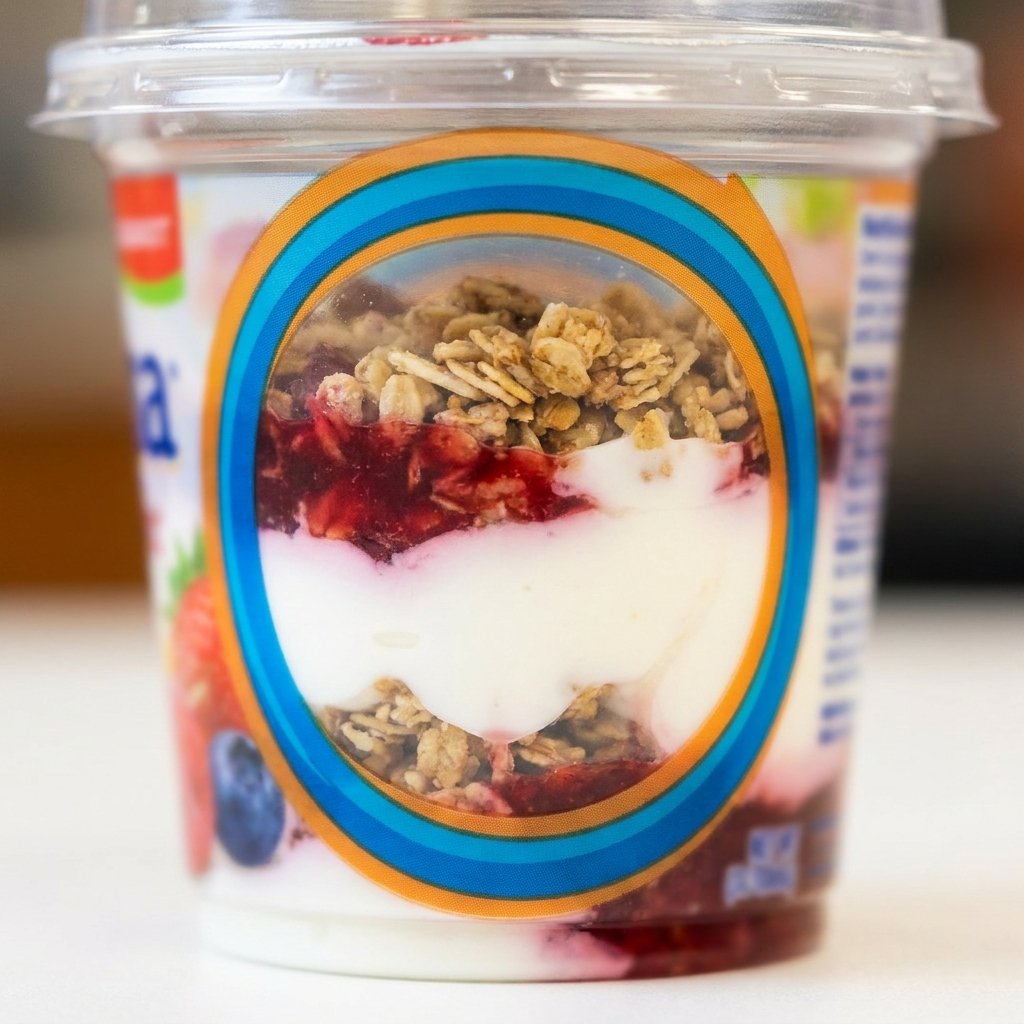
Transparent window packaging includes a clear cutout section, letting customers see the actual yogurt inside the cup. This builds trust by showing texture, color, and freshness before purchase, which can be reassuring for new customers. It also naturally highlights layered products like fruit-on-the-bottom varieties.
Designers often frame the transparent section with bold graphics or color blocking to balance visibility with branding. This idea works especially well for premium or artisanal yogurt brands wanting to emphasize authenticity.
Handwritten Font Label Ideas
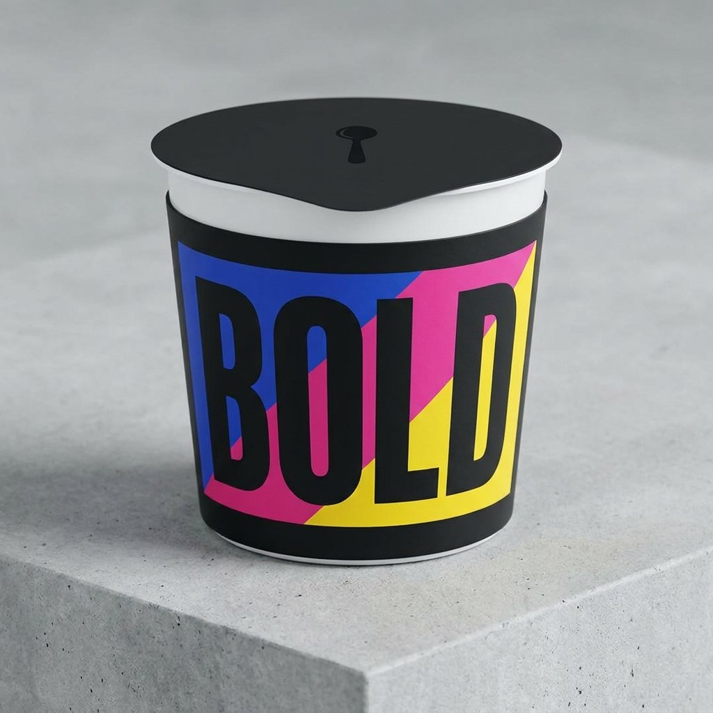
Handwritten-style fonts give packaging a personal, homemade feel that stands out among heavily digital, polished competitors. This idea suits small-batch or artisanal yogurt brands wanting to emphasize craftsmanship and a human touch. The imperfect, casual lettering style feels warm and approachable.
Pairing handwritten fonts with simple illustrations or muted colors enhances the homemade aesthetic even further. Customers often associate this style with smaller, more trustworthy producers rather than large industrial brands.
Geometric Pattern Packaging Ideas
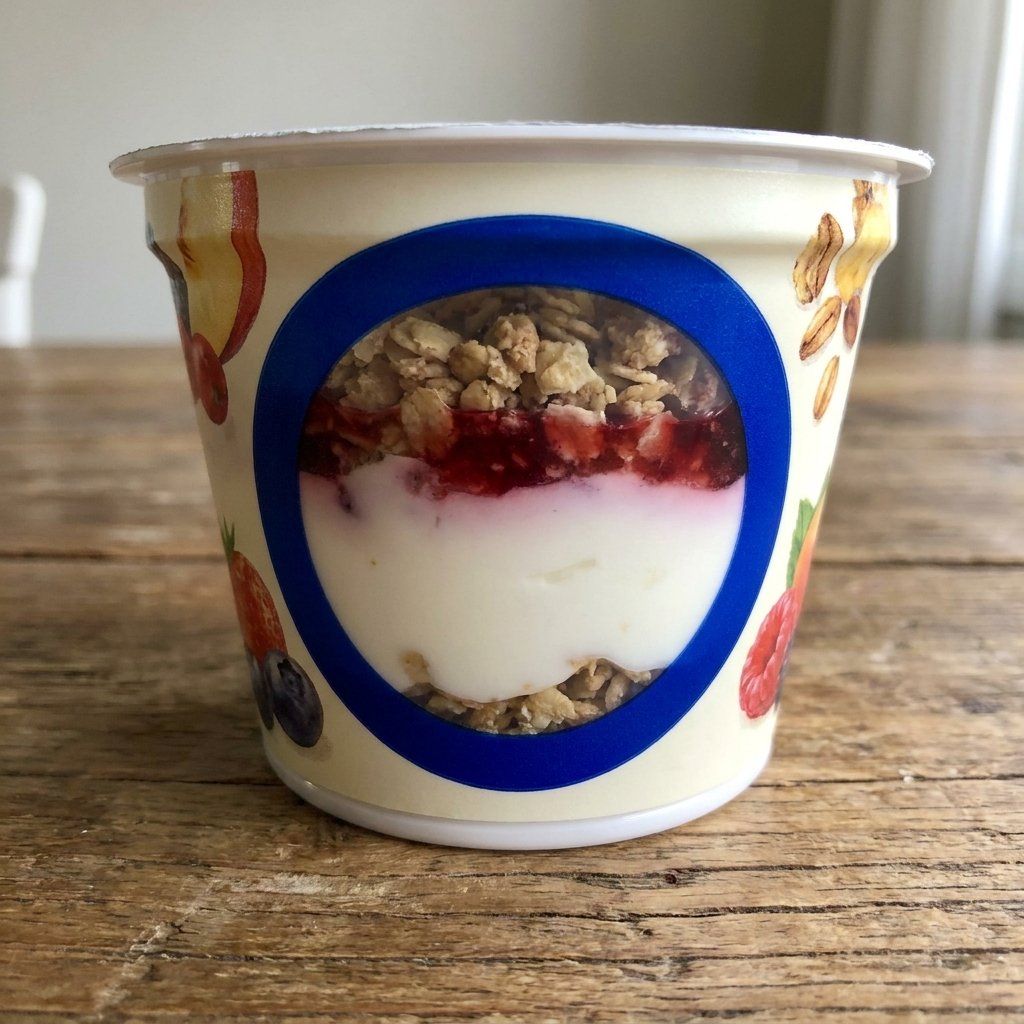
Geometric patterns use shapes like triangles, hexagons, or repeating lines to create a modern, structured visual identity. This idea suits brands wanting packaging that feels contemporary, energetic, and slightly edgy. Bold geometric backgrounds can make a cup instantly recognizable from a distance.
Combining geometric patterns with a limited color palette keeps the design sharp without feeling chaotic or overwhelming. This approach often appeals to younger, design-conscious audiences drawn to clean, structured visuals.
Farm-to-Table Themed Ideas
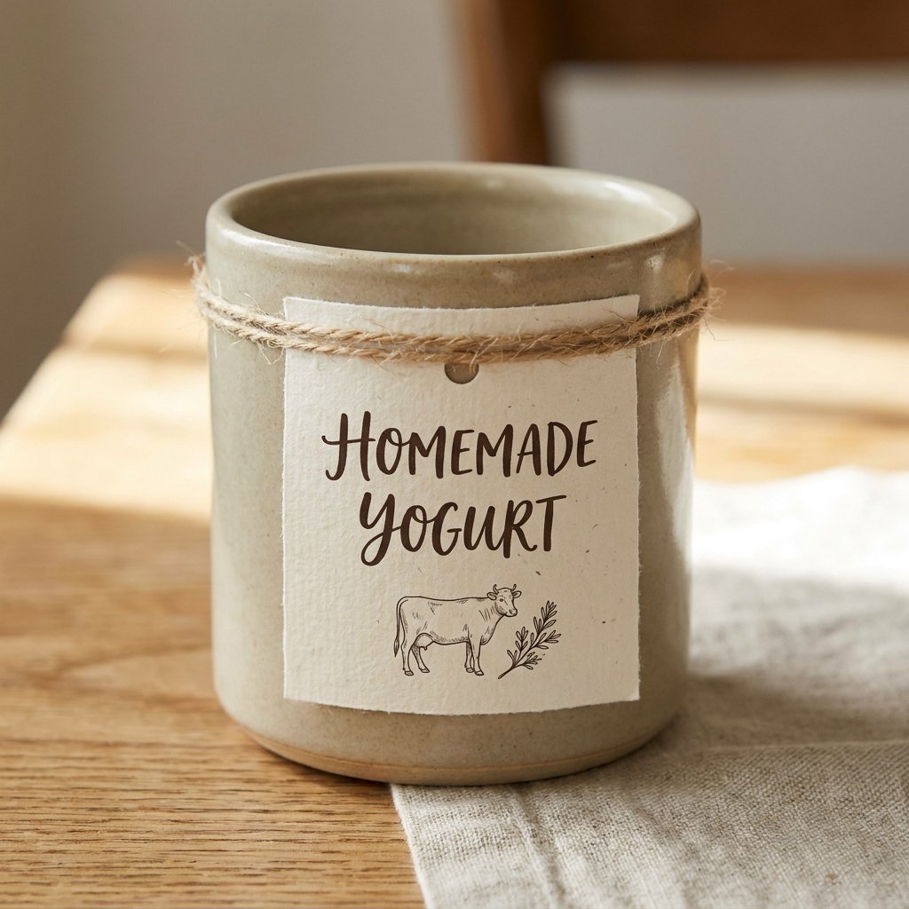
Farm-to-table packaging emphasizes origin, using imagery like barns, fields, or hand-drawn farm animals to tell a sourcing story. This idea works well for brands wanting to highlight local or small-scale dairy production. The visual language suggests freshness and traceability.
Earthy color tones paired with rustic illustrations reinforce the sense of authenticity behind farm-to-table branding. Customers drawn to transparency around sourcing often respond strongly to this warm, story-driven packaging style.
Luxury Yogurt Cup Packaging Design Ideas
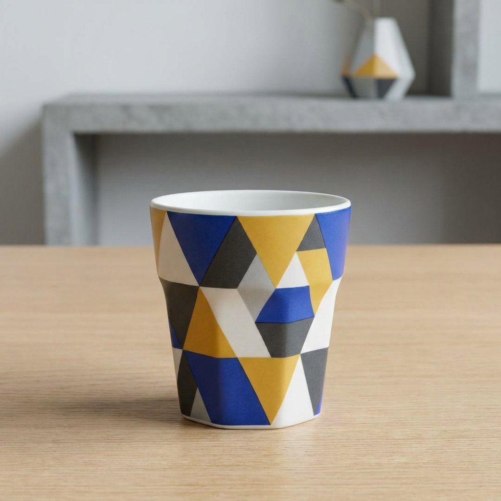
Luxury-inspired packaging uses metallic accents, matte finishes, and refined typography to elevate yogurt Cup Packaging Design into a premium category. This idea works well for brands targeting higher price points or gourmet positioning. The overall feel should suggest indulgence rather than everyday convenience.
Subtle details, like foil stamping or textured matte lids, can make a simple cup feel like a special treat. Luxury packaging often relies on restraint, using fewer elements but executing each one with noticeable precision.
Eco-Friendly Packaging Design Ideas

Eco-friendly packaging ideas focus on visually communicating sustainability through natural colors, recycled textures, and minimal print coverage. This direction appeals strongly to environmentally conscious customers seeking greener product choices. Visual cues like leaf icons or earthy kraft-paper tones reinforce this message.
Clear, honest labeling around recyclability also builds trust with customers increasingly skeptical of vague environmental claims. This idea works particularly well for brands built around a genuine sustainability mission rather than surface-level messaging.
Kids-Focused Yogurt Packaging Ideas
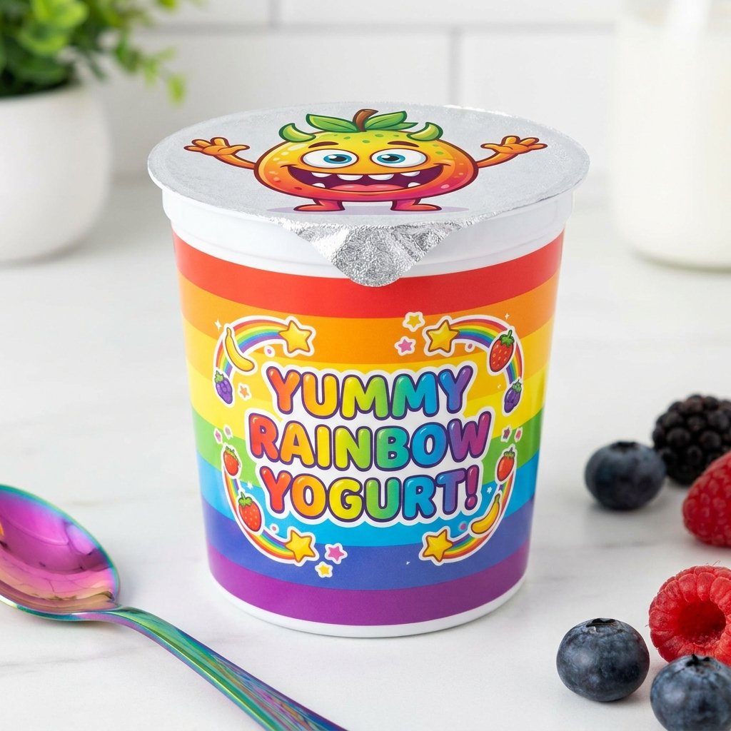
Kids-focused packaging uses bright colors, fun shapes, and playful imagery designed to appeal directly to younger audiences. This idea often includes interactive elements, like collectible characters or small games printed on the lid. The goal is to make the product feel exciting rather than purely nutritional.
Bold color contrasts and rounded, friendly typography help this style feel welcoming and easy for children to recognize. Parents often appreciate when playful packaging is balanced with clear, honest nutritional information for reassurance.
Seasonal Packaging Design Ideas
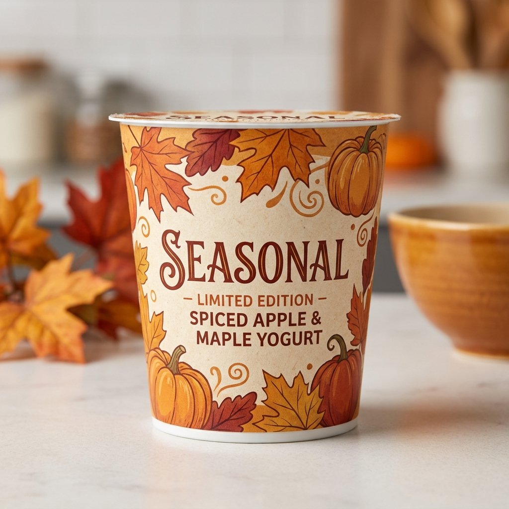
Seasonal packaging rotates design elements throughout the year, reflecting holidays, weather changes, or limited-time flavors. This idea keeps a brand feeling fresh and relevant, encouraging repeat purchases from returning customers. Autumn tones, winter motifs, or summer brights can all be used strategically.
Limited-edition seasonal designs also create a sense of urgency, encouraging customers to try a product before it disappears. This approach works well alongside seasonal flavor launches tied to specific times of year.
Monochrome Yogurt Packaging Ideas
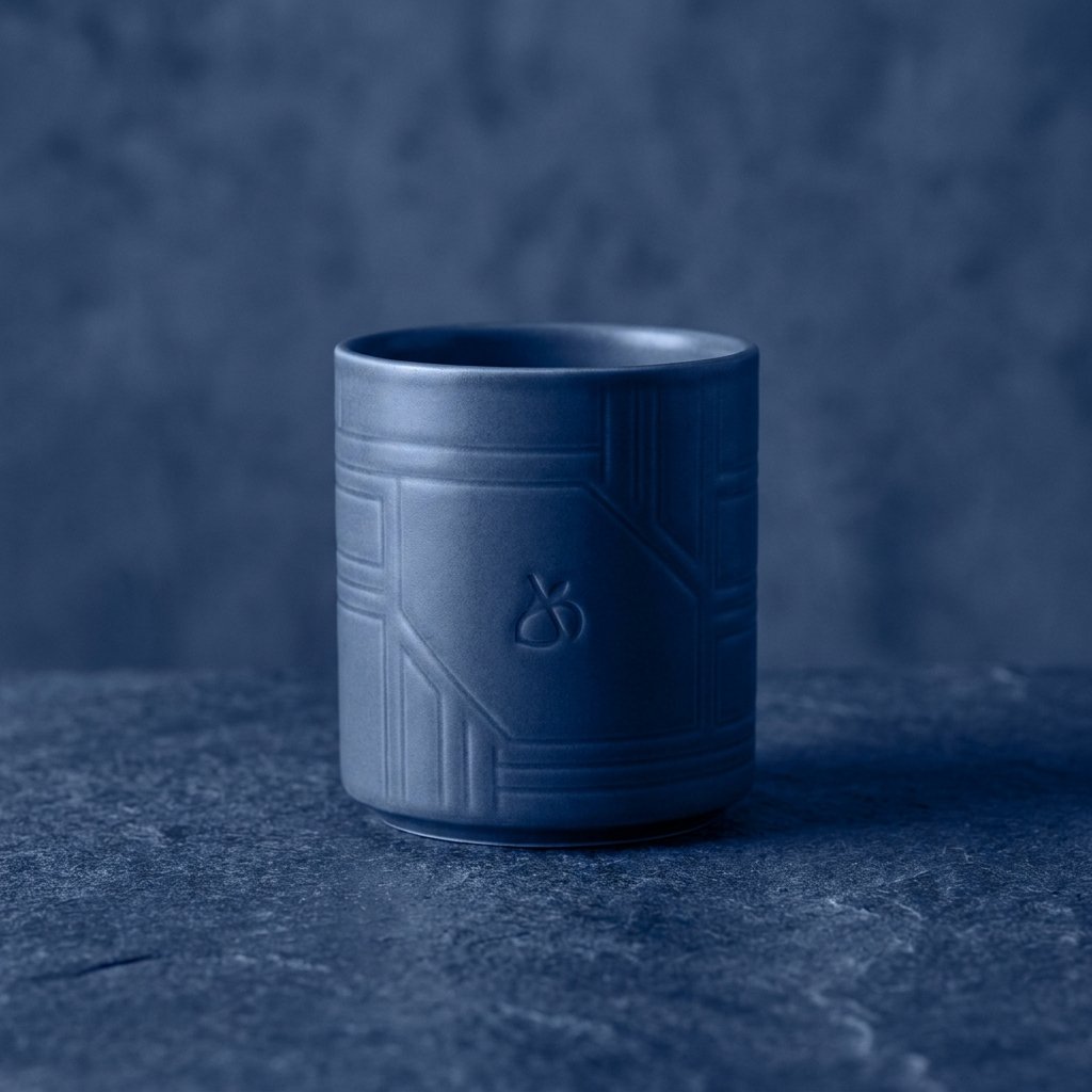
Monochrome packaging relies on a single color family, using different shades and tints to create depth and contrast. This idea feels sophisticated and cohesive, often appealing to design-forward or minimalist-leaning brands. A single strong color can also make shelf navigation easier for repeat customers.
Subtle texture or embossing can add visual interest without breaking the monochrome color scheme. This approach works especially well for brands wanting a bold, unmistakable shelf presence built entirely on color identity.
Illustrated Storytelling Packaging Ideas

Storytelling packaging uses illustrated scenes or sequential imagery to communicate a brand narrative across the cup’s surface. This idea invites customers to slow down and engage with the packaging rather than glance past it quickly. Illustrated storytelling works well for brands with a strong founding story or mission.
Wrapping a narrative around the cup, rather than confining it to one panel, encourages closer inspection and interaction. This idea often strengthens emotional connection, making the product feel more personal and less mass-produced.
Textured Cup Surface Ideas
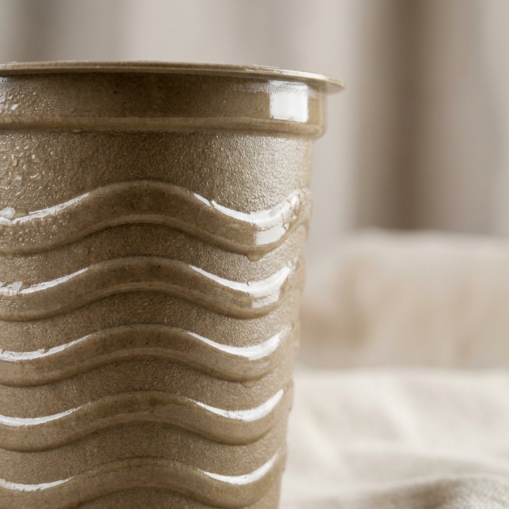
Textured surfaces add a tactile dimension to packaging, using embossing, ridges, or matte-and-glossy contrasts across the cup. This idea appeals to customers who respond to touch as much as visual appearance. A textured surface can make a product feel more premium simply through physical sensation.
Combining texture with subtle color variation creates a multisensory experience that stands out in a mostly smooth-surfaced category. This approach works particularly well for brands wanting packaging that feels crafted rather than mass-manufactured.
Retro Pop Art Packaging Ideas
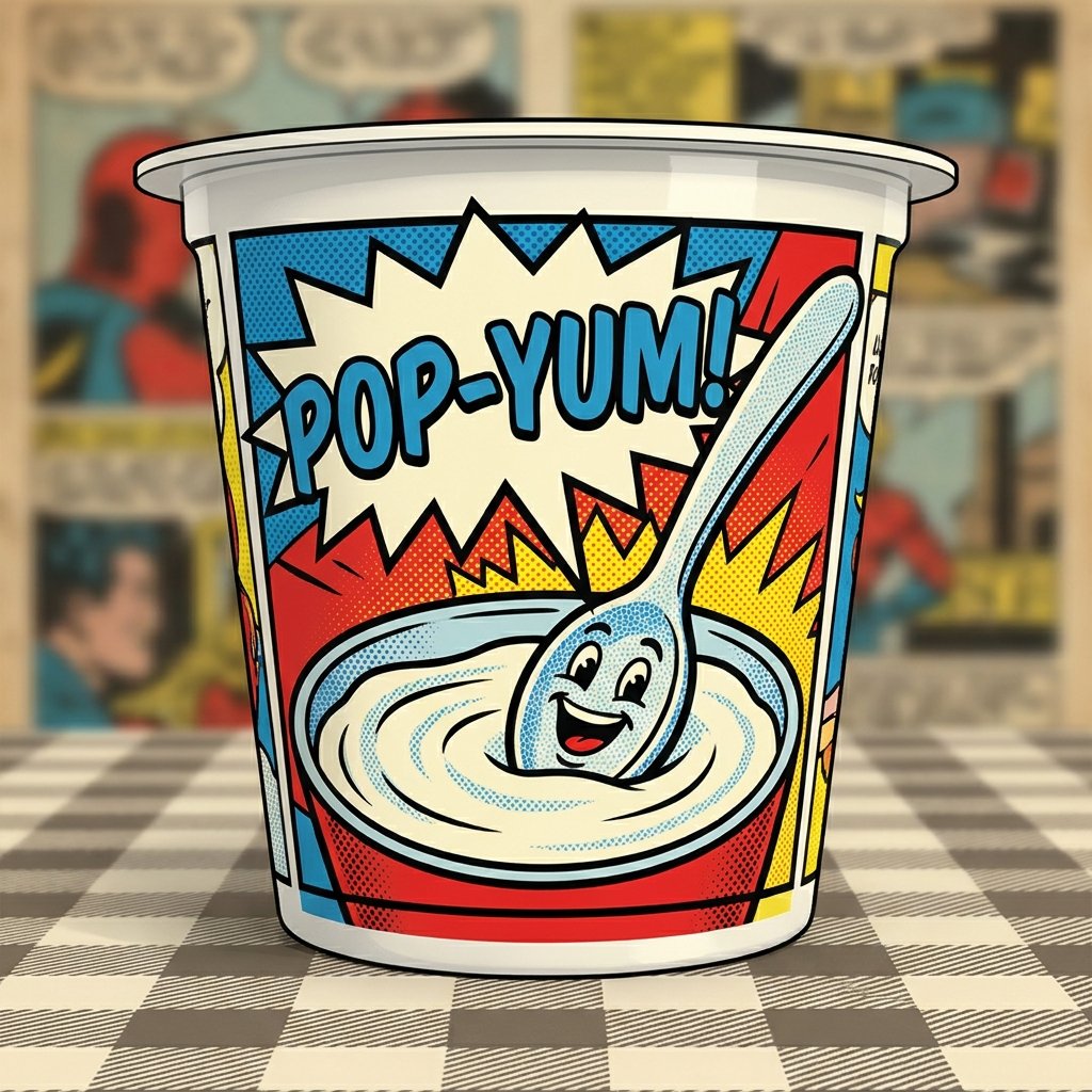
Pop art-inspired packaging uses bold outlines, bright color blocks, and comic-style illustrations to create an energetic, fun aesthetic. This idea works well for brands wanting to feel youthful, playful, and slightly rebellious against traditional dairy branding. Halftone dot patterns and speech-bubble graphics can enhance the retro comic feel.
This style often photographs well for marketing, giving brands a distinct visual identity across packaging and social media. Pop art packaging tends to appeal strongly to younger, trend-driven audiences seeking bold personality.
Gradient Color Packaging Ideas
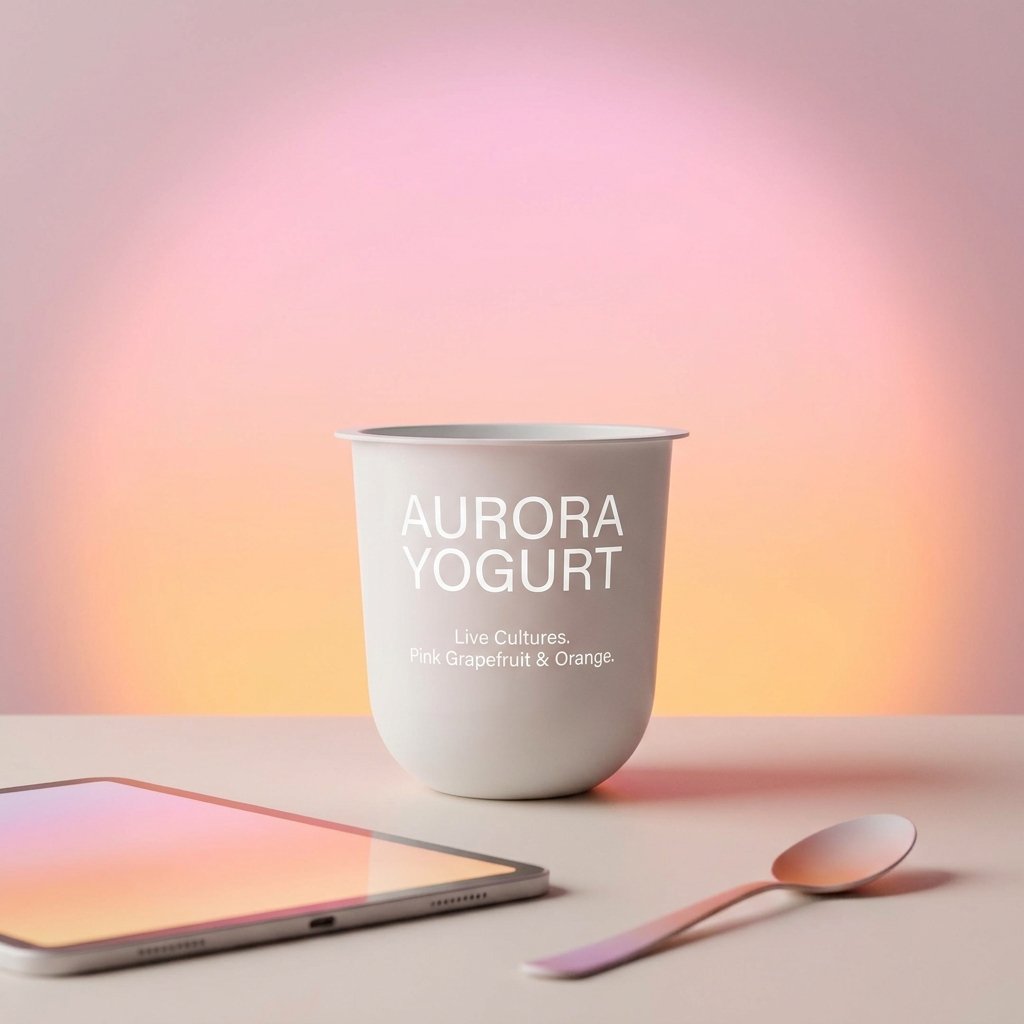
Gradient designs blend two or more colors smoothly across the cup, creating a soft, modern, and visually dynamic effect. This idea works well for brands wanting packaging that feels current without relying on illustrations or characters. Gradients can also be used to subtly indicate different flavors within a product line.
Pairing gradients with clean, simple typography keeps the design feeling polished rather than overly busy. This approach suits brands aiming for a fresh, digital-native aesthetic that feels distinctly modern.
Cultural Heritage-Inspired Packaging Ideas
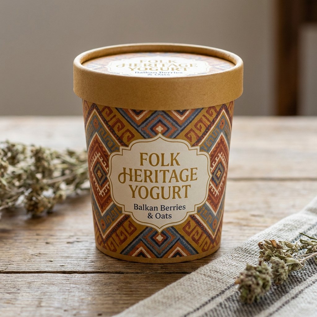
Culturally inspired packaging draws on traditional patterns, colors, or motifs tied to a specific region or heritage. This idea works well for brands wanting to celebrate authenticity, tradition, or a specific cultural connection to dairy-making. Thoughtful, respectful use of cultural design elements can create a genuinely distinctive product story.
This approach often resonates deeply with customers seeking products that feel rooted in something meaningful rather than purely trend-based. Cultural storytelling through packaging can also help a brand stand out in an increasingly homogenized market.
FAQs About Yogurt Cup Packaging Design Ideas
What makes yogurt cup packaging design stand out on shelves?
Strong color choices, clear branding, and a distinctive visual style help packaging stand out immediately among competitors. Consistency across a product line also builds recognition, making a brand easier to spot on a busy shelf.
Are minimalist yogurt packaging designs still popular?
Yes, minimalist designs remain popular because they feel premium, modern, and easy to recognize at a glance. Many brands use minimalism to suggest quality and confidence without relying on busy or cluttered visuals.
How do colors influence yogurt packaging design choices?
Colors shape first impressions and often signal flavor, quality, or brand personality before a customer reads any text. Bright colors suggest fun and flavor, while muted tones often suggest premium or natural qualities.
Can small brands use creative packaging without high costs?
Yes, small brands can achieve creative packaging by focusing on one strong design element rather than a full redesign. A distinctive color, illustration, or typography choice can create impact without requiring a large production budget.
What packaging design trends are shaping yogurt brands today?
Sustainability-focused visuals, playful storytelling, and bold color choices are currently shaping many yogurt packaging trends. Brands are increasingly blending creativity with authenticity to build stronger emotional connections with customers.
Conclusion
Yogurt cup packaging design offers nearly limitless room for creativity, from playful characters to refined, minimalist elegance. Each idea explored here reflects a different way brands can express personality while still communicating freshness, quality, and trust to customers.
Rather than settling for conventional packaging, brands willing to experiment with color, texture, and storytelling often create stronger, more memorable connections. Whatever direction feels right, the most successful yogurt cup packaging design ideas are the ones that feel authentic to the brand telling its story.