21 Paper Cup Design Ideas: Creative Looks Worth Saving
Paper cup design gives everyday coffee shops a small but powerful stage for creativity. A single cup can carry color, texture, and personality that customers notice within seconds. Brands like Starbucks have shown how a seasonal cup can spark conversation, photos, and free word-of-mouth marketing. That kind of attention starts with a design choice, not a marketing budget.
Cafes, bakeries, and event planners often look for paper cup design ideas that feel fresh without losing brand identity. The right pattern, color palette, or illustration can turn a plain takeaway cup into something people want to hold and share. This guide walks through a wide range of creative directions, from minimalist looks to bold seasonal themes, so you can find a style that fits your business.
Best Paper Cup Design Ideas to Try
This section brings together a mix of creative directions worth exploring for custom paper cup design. Some ideas lean toward clean, modern simplicity, while others bring in pattern, texture, or playful illustration to catch the eye.
Each idea reflects a different mood and audience, so a small independent cafe and a larger coffee chain may lean toward very different choices. Together, these paper cup design ideas offer a strong starting point for anyone planning a packaging refresh or a new coffee cup design from scratch.
Minimalist Paper Cup Design Ideas
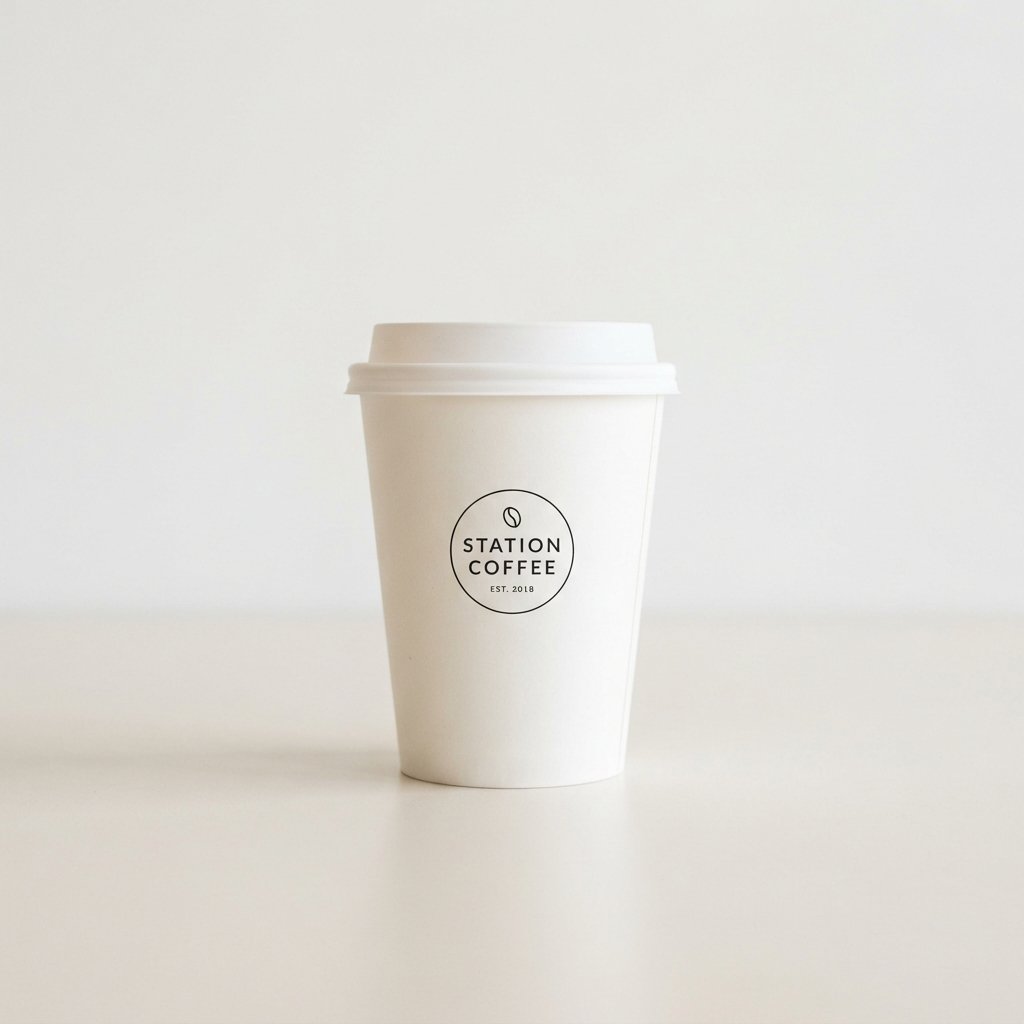
Minimalist paper cup design relies on clean lines, plenty of white space, and a restrained color palette. This approach lets a logo or single graphic element carry the entire design without visual clutter. Cafes that want to project a calm, premium feel often gravitate toward this style for their coffee cup design.
A minimalist cup can still feel warm rather than cold, especially when paired with soft kraft paper or muted earth tones. The simplicity also keeps printing costs lower, since fewer colors and details are involved in production.
Vintage Paper Cup Design Ideas
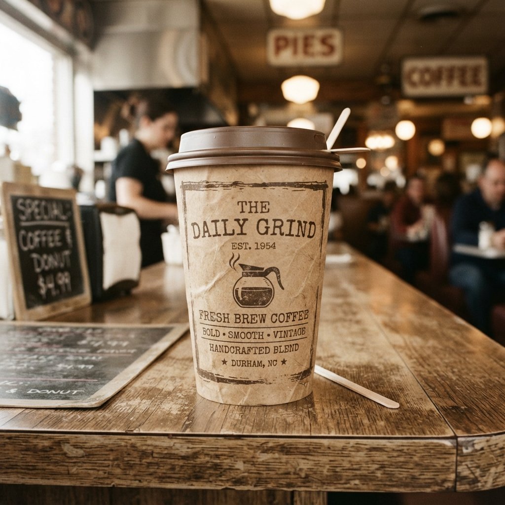
Vintage-inspired paper cup design borrows from old typewriter fonts, faded color palettes, and classic diner-style illustrations. This look works well for coffee shops that want to feel established, nostalgic, or rooted in tradition. A vintage cup can make a newer business feel like it has been around for decades.
Small design touches, like distressed textures or hand-drawn borders, help sell the vintage feel without looking dated or messy. Pairing this style with a simple, memorable logo keeps the overall coffee cup design from feeling too busy.
Watercolor Paper Cup Design Ideas
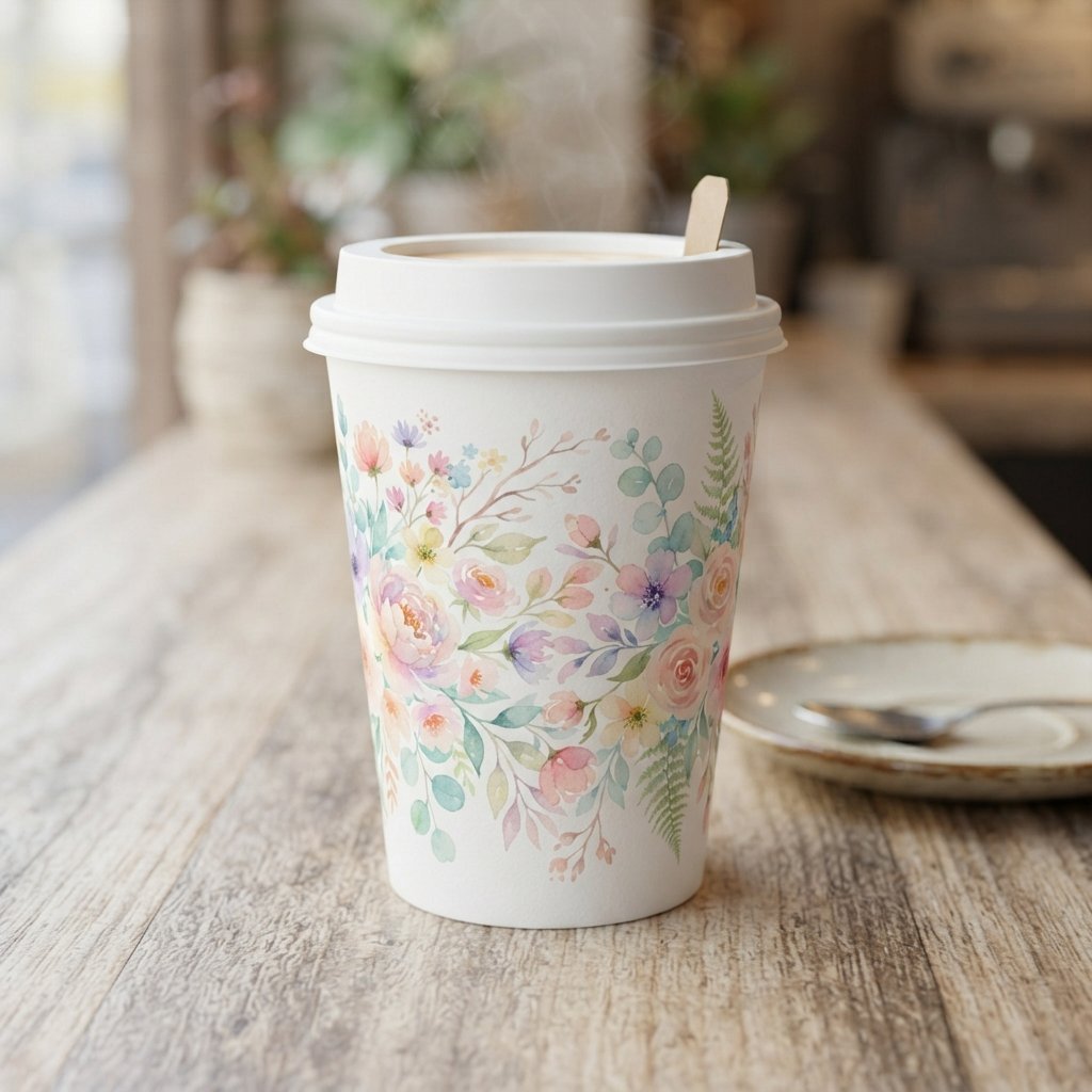
Watercolor paper cup design brings a soft, artistic quality that feels handmade rather than mass produced. Blended colors and organic shapes give the cup a personal, boutique feeling that appeals to specialty coffee shops. This style pairs especially well with floral or nature-themed illustrations.
Because watercolor effects rely on gradients, printing quality matters more here than with flat, solid-color designs. Working closely with a paper cup supplier who understands color blending helps the final print match the original artwork.
Geometric Pattern Cup Design Ideas
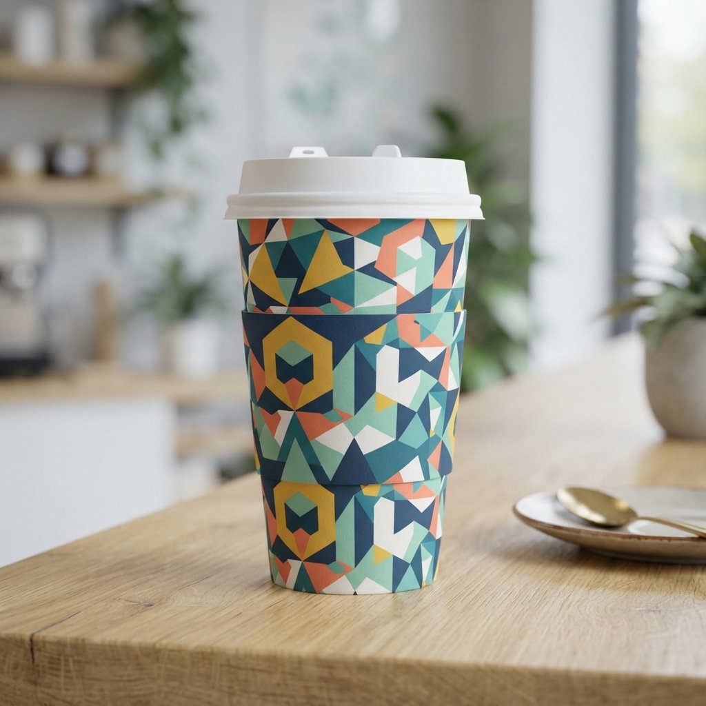
Geometric pattern cup design uses shapes like triangles, hexagons, or repeating lines to build a bold, modern look. This style tends to suit brands with a contemporary, design-forward identity, especially tech-adjacent or urban coffee shops. Repeating patterns also wrap nicely around the curved surface of a cup.
Because a paper cup is tapered rather than perfectly cylindrical, tight geometric patterns need careful spacing so lines still meet cleanly at the seam. Working with an experienced printer helps avoid awkward gaps or misaligned edges.
Hand-Lettered Typography Cup Design Ideas
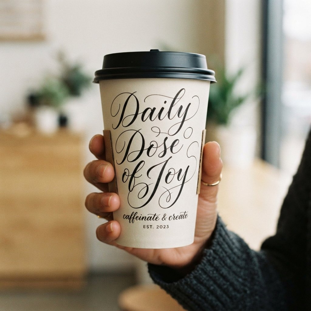
Hand-lettered typography turns a simple message, quote, or brand name into the main visual feature of the cup. This idea works well for cafes that want a personal, artisanal feel rather than a heavily illustrated design. A short tagline in custom script can say more than a full graphic.
Legibility still matters, since very small or overly decorative script can blur once printed on curved paper. Keeping key text large and simple ensures the coffee cup design stays readable in daily use.
Seasonal Holiday Cup Design Ideas

Seasonal holiday cup design ideas follow the model made famous by Starbucks, whose yearly cup releases build anticipation among customers. Snowflakes, warm color palettes, and festive icons help a paper cup feel tied to a specific time of year. This approach naturally encourages sharing on social media.
Rotating designs a few times a year also gives regular customers a reason to keep noticing your coffee cup design instead of tuning it out. Even a modest seasonal refresh, like a new color accent, can renew interest without a full redesign.
Botanical Print Cup Design Ideas
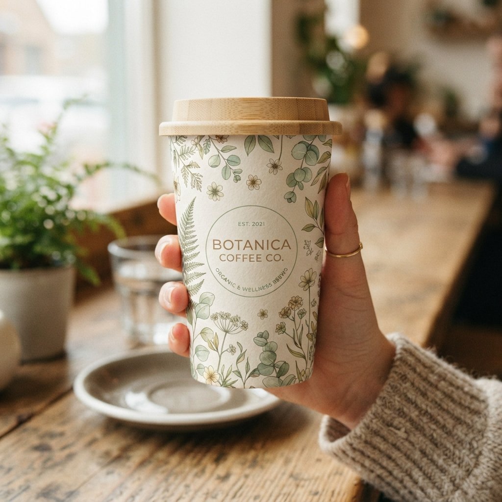
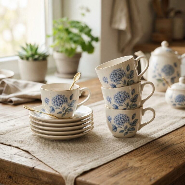
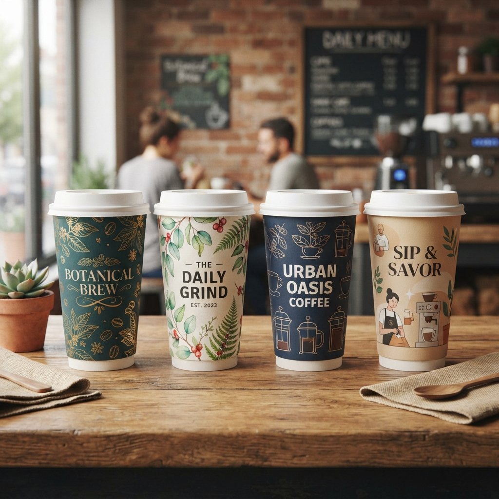
Botanical print cup design features leaves, flowers, or plant illustrations that bring a natural, calming quality to the packaging. This style suits cafes with an organic, wellness-focused, or plant-based brand identity. Soft green tones paired with simple line art often feel fresh rather than overdone.
Botanical patterns also work well repeated across the full surface of the cup, creating a cohesive wraparound look. This kind of paper cup design pairs naturally with eco-friendly materials and sustainable packaging messaging.
Monochrome Cup Design Ideas
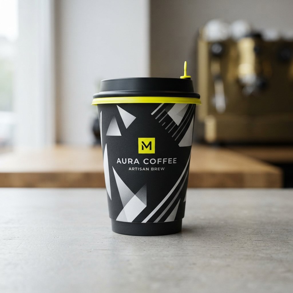
Monochrome cup design sticks to a single color family, using different shades and tints to create contrast and depth. This approach gives a coffee cup design a sleek, controlled look that photographs well for marketing. Black and white, or a single bold accent color, are common choices.
Because monochrome designs rely on tonal contrast rather than multiple colors, print quality and paper texture become more noticeable. A slightly textured kraft base can add visual interest that a fully white cup might lack.
Cultural Pattern Cup Design Ideas
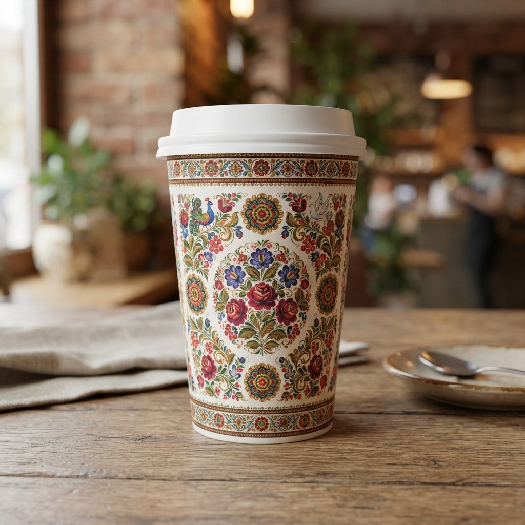
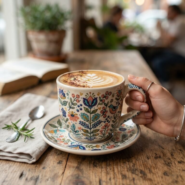
Cultural pattern cup design incorporates traditional motifs, folklore symbols, or region-specific artwork into the packaging. Done thoughtfully, this approach can show genuine appreciation for a community’s visual heritage while adding real depth to a brand’s story. It also gives customers something worth noticing and discussing.
Researching the meaning behind specific patterns before using them helps avoid careless or disrespectful design choices. When handled with care, cultural patterns can make a paper cup feel more meaningful than a purely decorative graphic.
Illustrated Character Cup Design Ideas
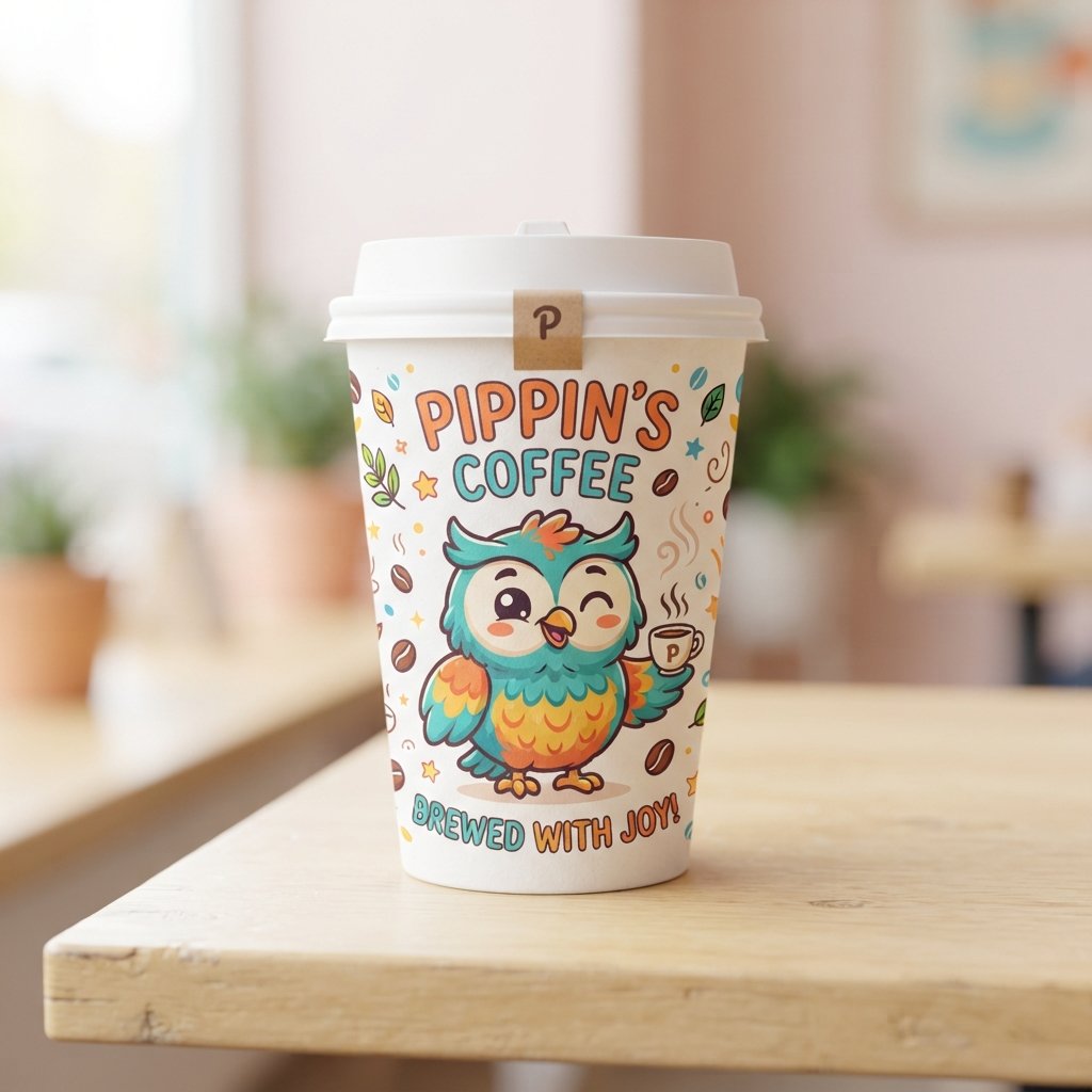
Illustrated character cup design gives a brand a recognizable mascot or figure that appears across cups, menus, and signage. A friendly character can make packaging feel approachable, especially for cafes targeting families or younger customers. Repetition across different products builds recognition over time.
Consistency matters here, since a character that looks different across each print run can weaken rather than strengthen brand identity. Keeping a clear style guide ensures the illustration stays consistent across every custom paper cup run.
Gradient Color Cup Design Ideas
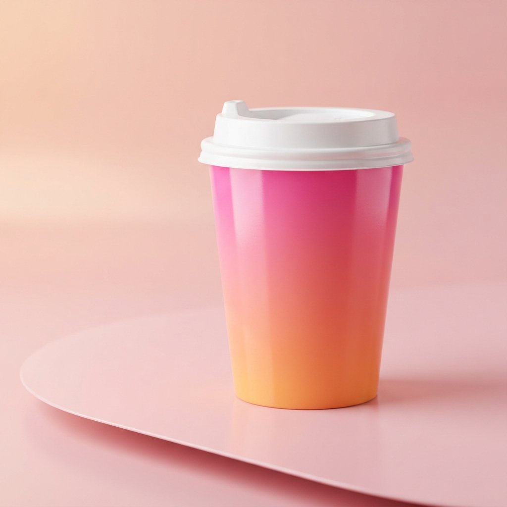
Gradient color cup design blends two or more colors smoothly across the surface of the cup for a modern, eye-catching effect. This style photographs particularly well and stands out against plain white or brown packaging on a shelf. Bright gradients suit energetic, youthful coffee shop branding.
Gradients require close attention to print quality, since banding or uneven color transitions can make the final result look cheap. Testing a physical sample before a full production run helps catch these issues early.
Eco-Friendly Cup Design Ideas
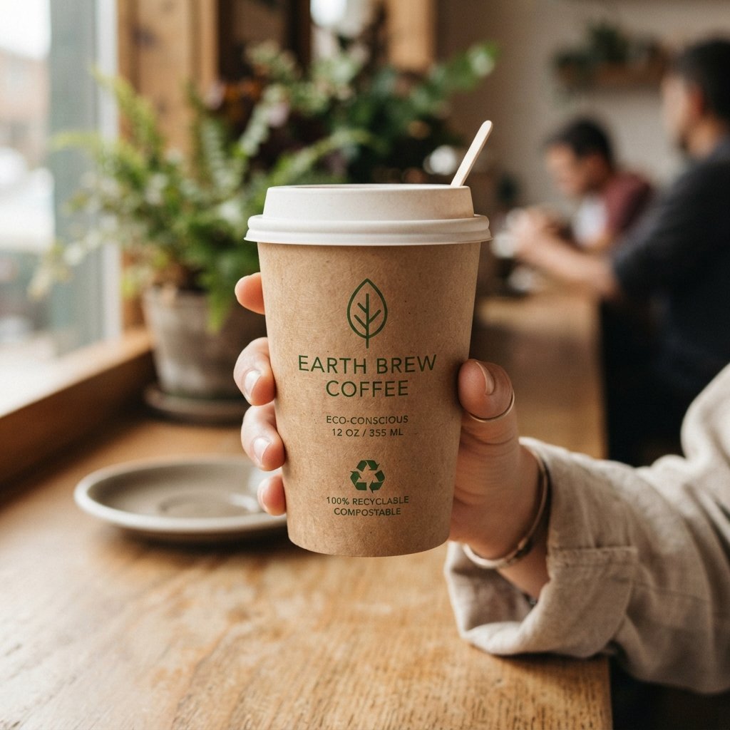
Eco-friendly cup design pairs sustainable messaging with visuals that reflect a brand’s environmental commitments. Earth tones, leaf icons, and simple recyclable symbols communicate sustainability without needing lengthy text explanations. This approach increasingly matters to customers who care about packaging waste.
Many brands now highlight PLA linings or plastic-free construction directly on the cup itself, alongside compliance markers tied to regulations like the EUDR. Pairing clear sustainability claims with an honest supply chain builds trust rather than just appearances.
Kraft Paper Cup Ideas
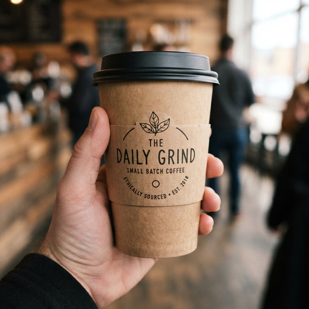
Kraft cup design uses the natural brown paper base as part of the visual identity, rather than covering it entirely. This look feels rustic, honest, and closely tied to sustainable packaging trends. Minimal printing on kraft paper also tends to lower production costs.
A single color of ink against the natural kraft background can create strong contrast without needing a fully printed surface. This makes kraft-based paper cup a practical option for smaller cafes with tighter budgets.
Retro Pop Art Cup Design Ideas
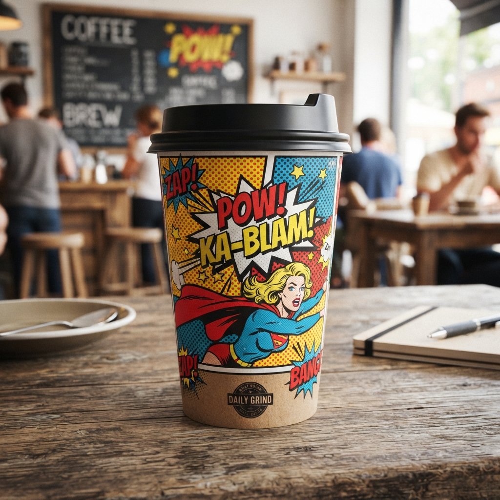
Retro pop art cup design borrows bold outlines, bright primary colors, and comic-style illustration techniques. This playful, energetic look suits cafes that want their coffee cup design to feel fun rather than formal. Halftone dot patterns and thick borders are common visual signatures of this style.
Because pop art relies on strong color contrast, it tends to stand out clearly against competitors using softer, muted palettes. This makes it a strong choice for brands trying to stand apart on a crowded shelf or counter.
Metallic Foil Cup Design Ideas
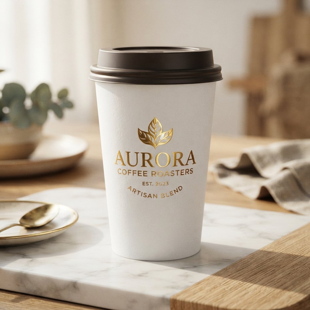
Metallic foil cup design adds a reflective, premium finish using gold, silver, or copper accents on key design elements. This technique works well for logos, borders, or small decorative details rather than covering an entire cup. The added shine signals a higher-end coffee cup design.
Foil printing typically costs more than standard ink, so many brands reserve it for limited editions or premium product lines. Even a small foil accent can elevate the perceived value of an otherwise simple design.
Logo Pattern Repeat Cup Design Ideas
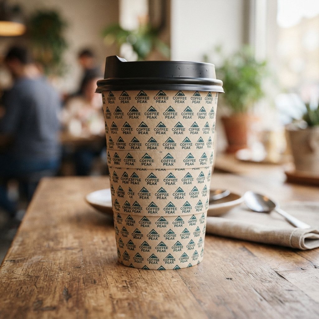
Logo pattern repeat cup design turns a single brand mark into a continuous, wraparound pattern across the entire cup. This idea works especially well for brands with a distinctive, simple logo that reads clearly even in small sizes. Repetition reinforces recognition every time the cup is seen.
Spacing between each repeated logo needs careful planning so the pattern lines up correctly once the cup is formed. A slightly uneven seam is common in production, so allowing a small margin for movement prevents awkward gaps.
Coffee Bean Print Cup Design Ideas
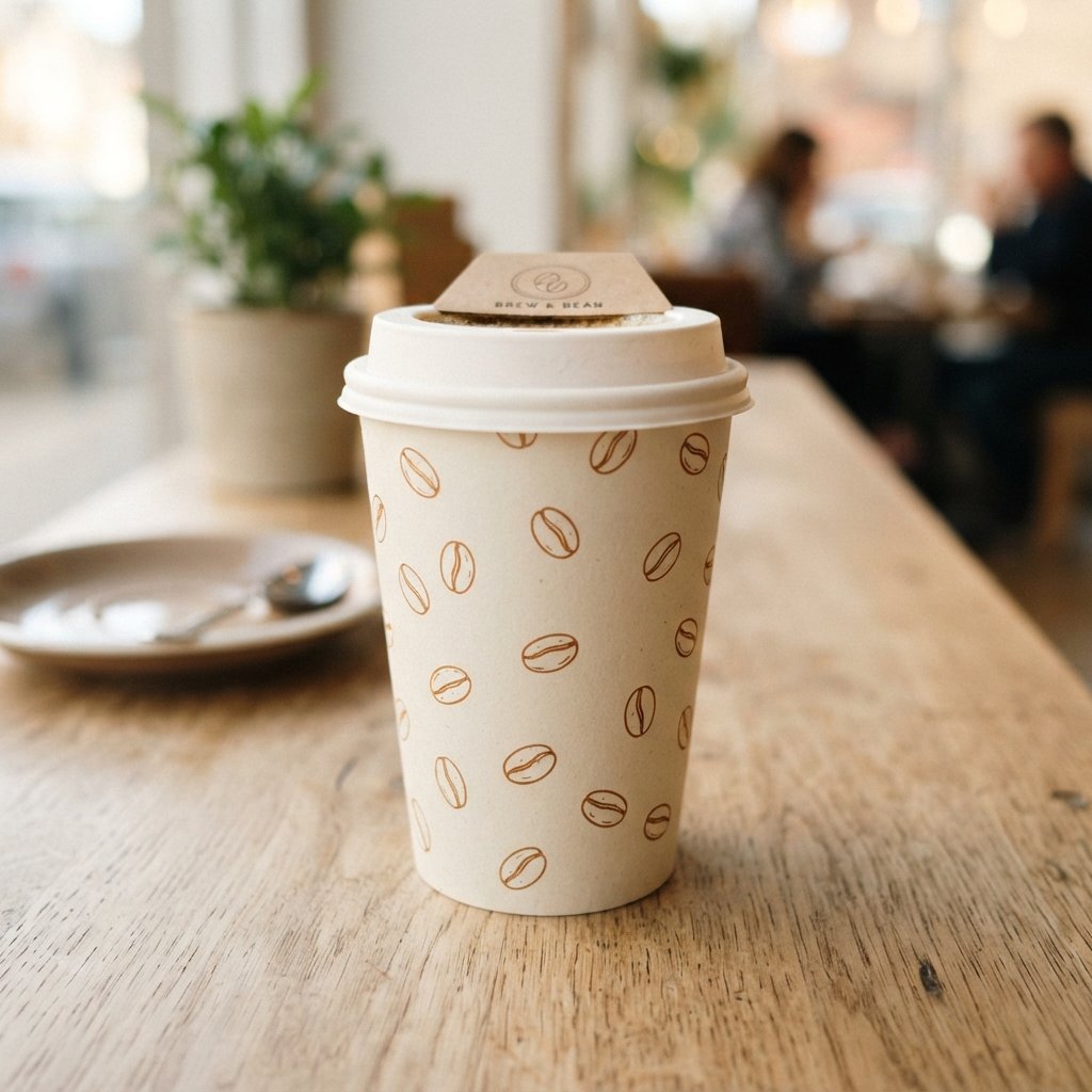
Coffee bean print cup design uses illustrated or photographic beans as a direct, literal nod to the product inside. This straightforward approach works well for brands that want their packaging to instantly communicate what they sell. Simple line-drawn beans often look cleaner than overly detailed illustrations.
Pairing bean illustrations with a warm brown or cream color palette keeps the overall coffee cup design feeling cohesive rather than cluttered. This idea suits cafes that prioritize clarity over abstract branding concepts.
QR Code Interactive Cup Design Ideas
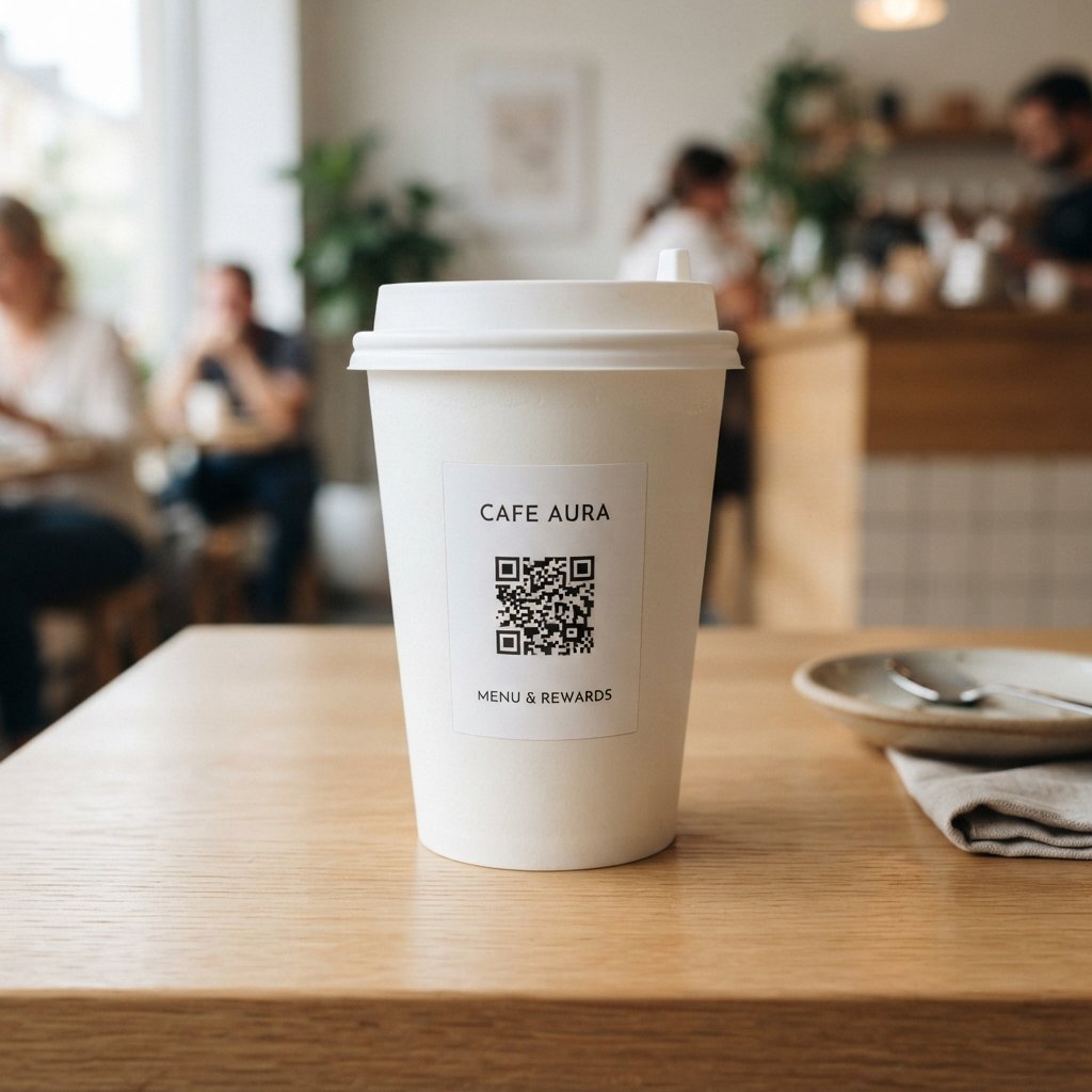
QR code interactive cup design adds a scannable element that connects the physical cup to a digital experience. A code might link to a loyalty program, a special offer, or a short brand story. This turns the cup into a bridge between packaging and marketing.
Placement matters here, since a QR code needs a flat, uncluttered space to scan reliably from a curved surface. Testing the code on an actual printed cup, not just a digital mockup, helps confirm it works as intended.
Sustainable Materials Cup Design Ideas
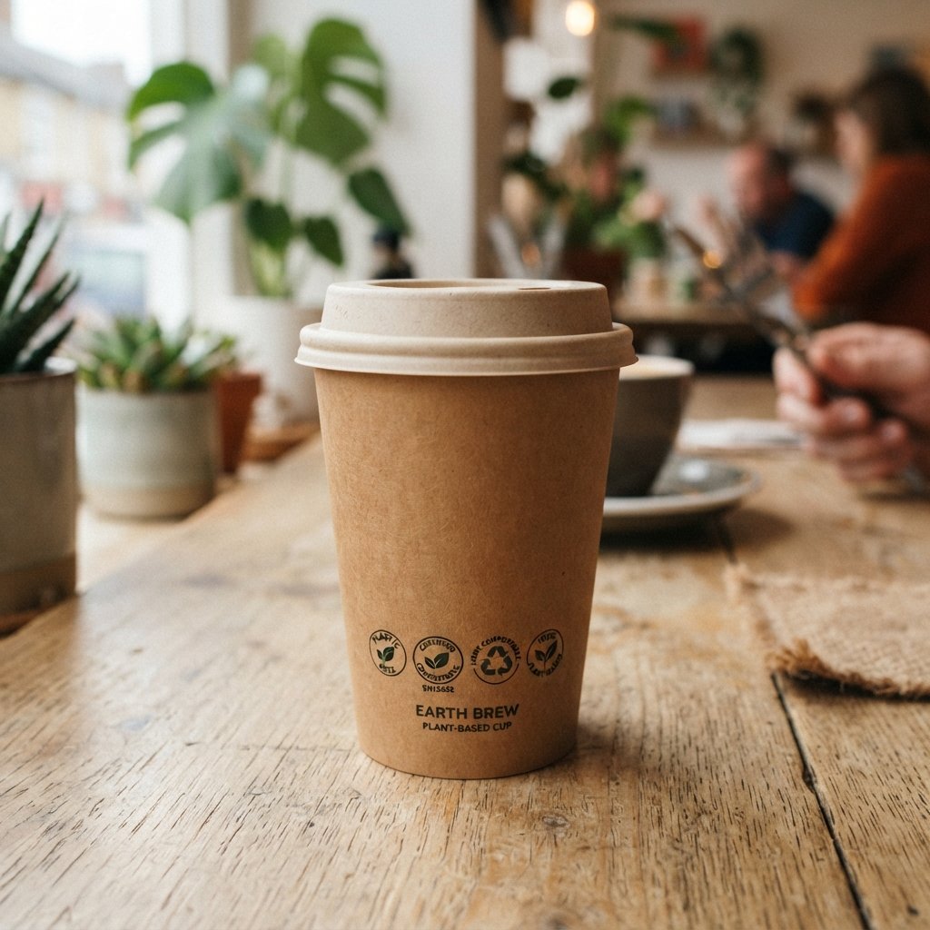
Sustainable materials cup design focuses on the physical composition of the cup as much as the printed graphics. Compostable linings, recycled fiber content, and plastic-free construction all support broader environmental goals. Highlighting these materials visually reassures customers who actively look for greener packaging options.
Some suppliers now print compliance details tied to regulations like the EUDR directly on the cup, alongside recycling or composting instructions. This transparency turns the packaging itself into a small piece of customer education.
Playful Doodle Cup Design Ideas
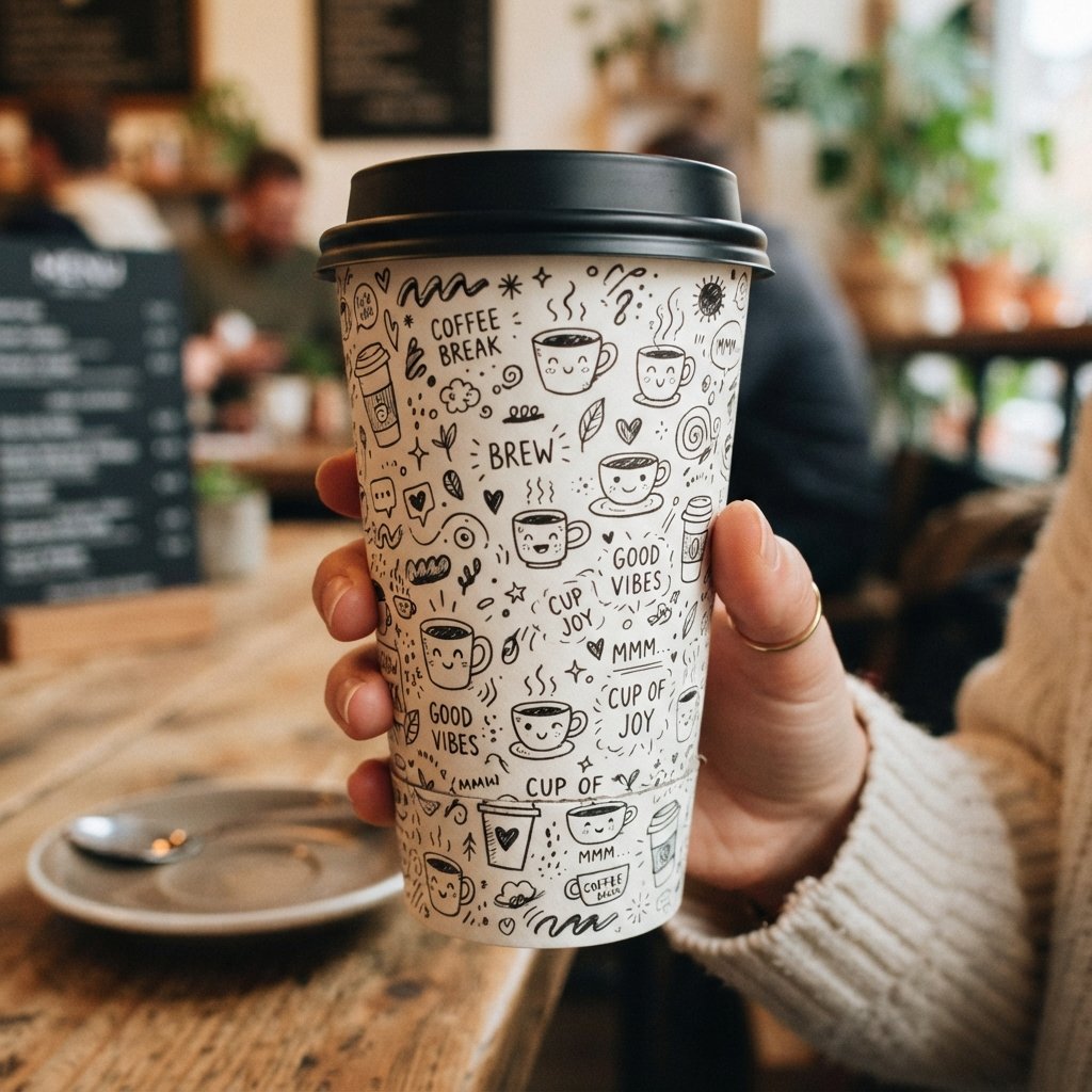
Playful doodle cup design uses loose, hand-drawn illustrations scattered across the cup for a casual, friendly feel. This style suits cafes with a laid-back, community-focused atmosphere rather than a polished corporate look. Doodles can include anything from coffee cups to abstract shapes and expressions.
Because doodles rely on a hand-drawn quality, keeping the illustration style consistent across every design element matters for brand identity. A single illustrator or clear style guide helps maintain that consistency across future print runs.
Bold Color Block Cup Design Ideas
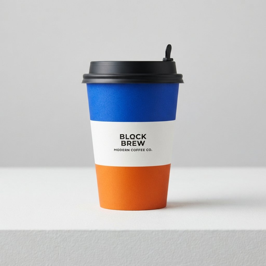
Bold color block cup design divides the cup into large, distinct sections of solid color rather than blending or patterning. This creates a strong, confident look that stands out even from a distance. High-contrast color combinations work particularly well for this approach.
Color blocking also simplifies production, since large flat areas of color are generally easier and cheaper to print accurately. This makes it a practical option for brands wanting bold visuals without a complicated print process.
FAQs About Paper Cup Design Ideas
What makes a paper cup stand out to customers?
Strong contrast, clear branding, and a distinct color palette help a cup catch attention quickly. Simplicity often works better than an overloaded design with too many competing elements. A cup that photographs well also tends to spread further through social sharing.
Which cup design style works best for small cafes?
Minimalist or kraft paper styles usually work well for smaller cafes with limited printing budgets. These approaches use fewer colors, which keeps production costs lower without sacrificing visual appeal. A simple, well-placed logo can still leave a strong impression.
Can paper cup support sustainability goals?
Yes, sustainable cup design can combine plastic-free materials with visuals that highlight eco-friendly claims. Compliance with regulations like the EUDR reassures customers that sourcing practices meet current environmental standards. Clear, honest messaging matters more than decorative green icons alone.
How much does custom paper cup typically cost?
Cost depends on the number of colors, print technique, and order quantity requested from your paper cup supplier. Simple one or two-color designs on kraft paper generally cost less than full-color or foil-accented cups. Requesting a quote directly gives the most accurate pricing for your specific design.
What size text is safe to print on a paper cup?
Text smaller than six points often becomes difficult to read once printed on curved paper cup surfaces. Keeping key text large, simple, and free of tiny symbols helps maintain legibility during everyday use. Testing a physical print sample before full production catches readability issues early.
Conclusion
Paper cup offers far more creative range than most people expect from something so small and disposable. From minimalist looks to bold seasonal themes, each idea in this list gives a brand a different way to express its personality. Choosing a direction that fits your coffee shop’s identity helps every cup work as a small, ongoing piece of marketing.
There is no single correct approach, since the best coffee cup design always depends on your audience, budget, and brand story. Whether you lean toward vintage charm, clean minimalism, or playful illustration, the goal stays the same: a cup customers notice, remember, and want to be seen holding.