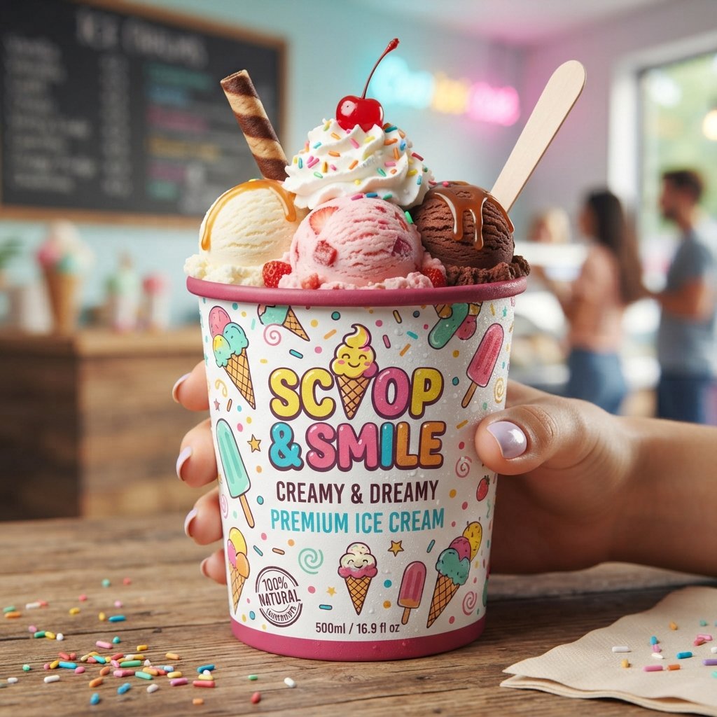
22 Ice Cream Cup Design Ideas to Inspire Your Next Pin
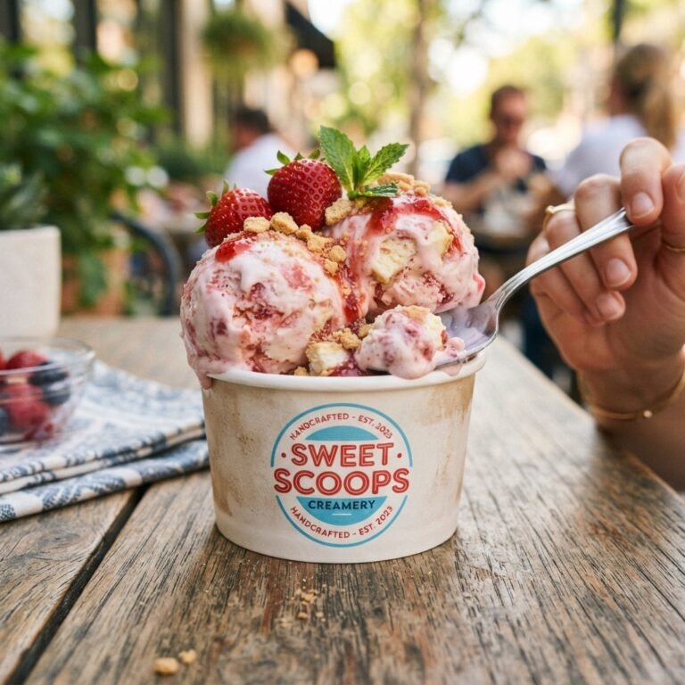
Ice cream cup design is where flavor meets first impression, long before anyone takes a bite. A cup can whisper elegance, shout playfulness, or simply feel warm and familiar in someone’s hand. The right design turns a simple container into a small piece of joy people remember. This is exactly why so many brands treat packaging as part of the actual product experience.
Every cup on a shelf is competing for a split second of attention from a busy shopper. That’s why creativity matters so much when shaping how your ice cream looks before it’s even opened. From colors to shapes to tiny printed details, small choices add up to something memorable. Let’s explore a wide range of design directions worth considering for your next batch.
Best Ice Cream Cup Design Ideas to Try
Ice cream cup design ideas come in endless shapes, moods, and visual styles worth exploring. Some brands lean into soft, dreamy pastels while others prefer loud colors that demand attention. There’s no single right answer, only the direction that fits your brand’s personality best. What matters most is choosing a style that feels authentic rather than copied from someone else.
Below you’ll find twenty-two design directions, each offering a different feeling and visual story. Some ideas suit playful kids’ brands, while others fit upscale gelato shops or eco-friendly startups. Mix and match elements from a few different ideas to create something entirely your own. Think of this list as a starting point, not a strict set of rules to follow.
Minimalist Ice Cream Cup Ideas
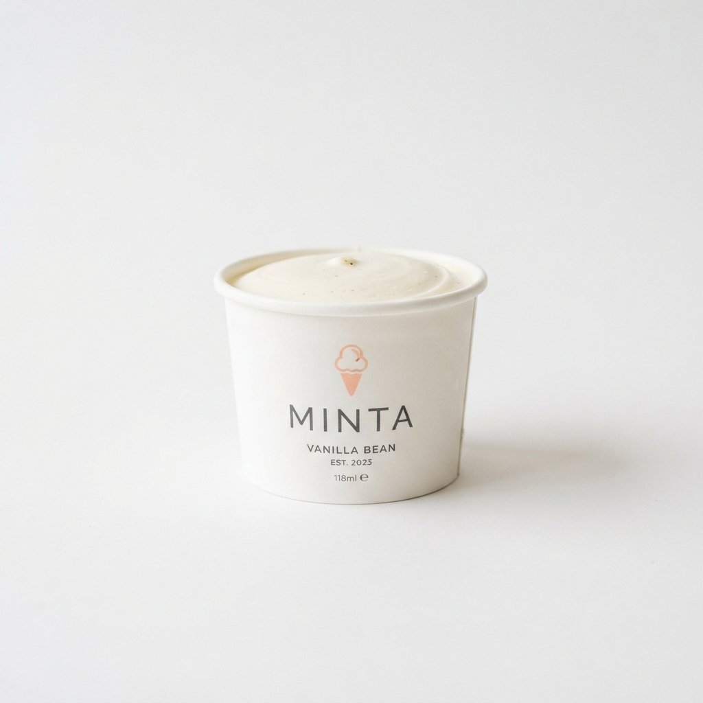
Minimalist ice cream cup ideas rely on clean lines, plenty of white space, and simple typography. Instead of cramming the cup with graphics, the focus stays on one strong visual element. A single color, one small icon, or a clean logo often says more than clutter ever could. This style photographs beautifully for social media, giving your product a polished, premium feel.
Brands using minimalist packaging often build trust through simplicity rather than flashy visuals or bold claims. Customers associate clean design with quality, especially in the premium ice cream and gelato space. If your brand values sophistication over noise, this direction deserves serious consideration for your next redesign.
Colorful Ice Cream Cup Ideas
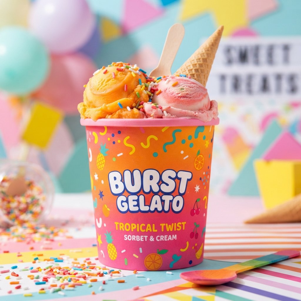
Colorful ice cream cup ideas use bold, saturated hues to instantly grab attention on crowded shelves. Bright colors signal fun, energy, and flavor variety, making them perfect for family-friendly ice cream brands. Combining multiple colors across a single cup can also hint at the different flavors inside. This approach works especially well for brands targeting kids or younger, playful audiences.
Color psychology plays a real role here, since different shades trigger different emotional responses in shoppers. Warm tones like orange and red feel energetic, while cool blues and greens feel calm and refreshing. Choosing colors that match your flavor lineup creates a subtle, satisfying connection between design and taste.
Vintage Ice Cream Cup design Ideas
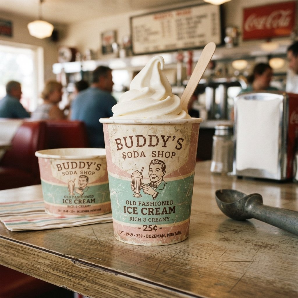
Vintage ice cream cup ideas borrow visual cues from decades past, think old typewriter fonts and faded tones. This style taps into nostalgia, reminding customers of classic soda shops and old-fashioned neighborhood ice cream parlors. Distressed textures, muted color palettes, and retro illustrations all contribute to this warm, familiar feeling. Brands wanting to feel established and trustworthy often lean toward this timeless aesthetic.
Vintage design also works well for storytelling, especially if your brand has genuine roots or family history. Adding small details like a founding year or hand-drawn illustrations strengthens this old-world charm even further. This style tends to stand apart from the sea of modern, ultra-clean packaging everywhere else.
Rustic Ice Cream Cup Ideas
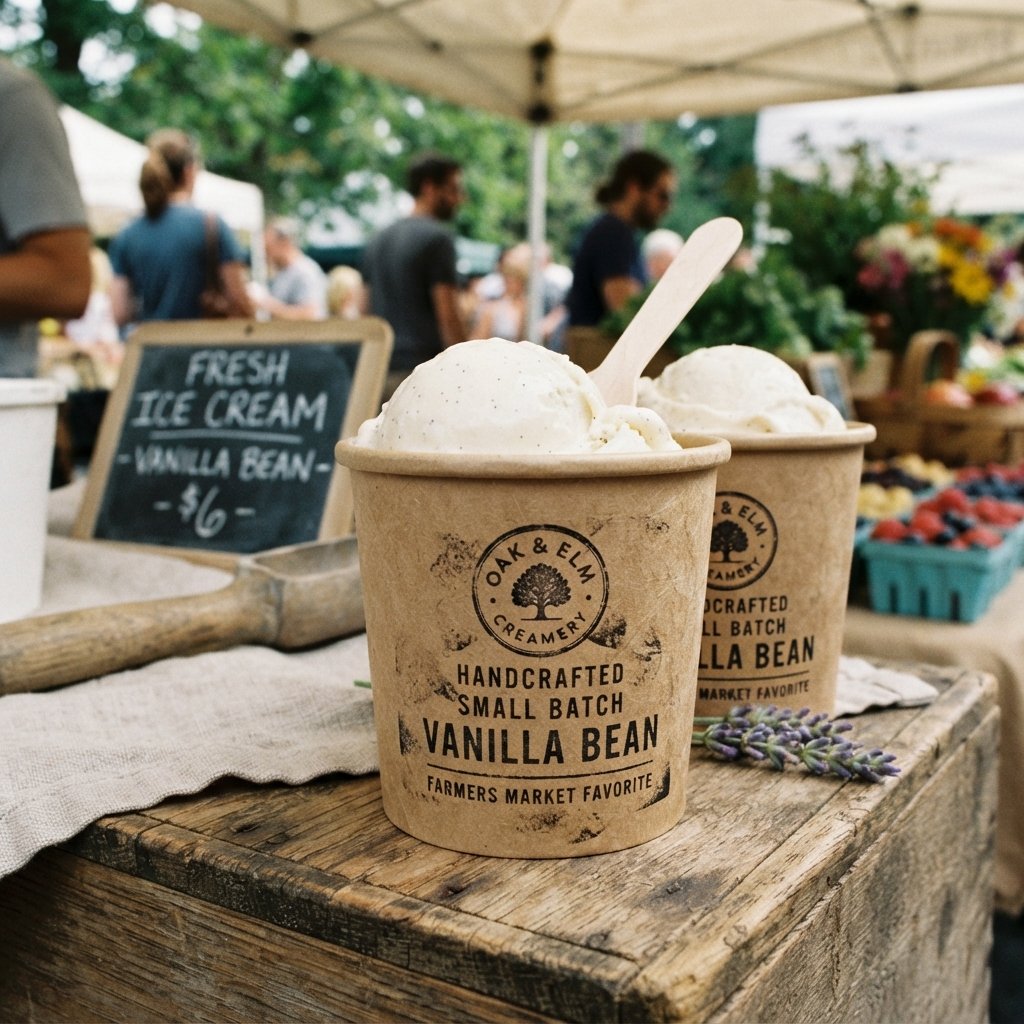
Rustic ice cream cup design ideas use earthy tones, textured paper stock, and handcrafted-looking design elements throughout. This style suggests natural ingredients, small-batch production, and a homemade quality customers genuinely appreciate. Kraft paper backgrounds paired with simple black text often create an honest, no-frills visual impression. Farmers market vendors and artisan ice cream makers frequently gravitate toward this authentic, grounded look.
The rustic approach pairs beautifully with ingredient-focused branding, especially for organic or locally sourced ice cream products. Customers seeking a farm-to-table experience respond well to packaging that feels unpolished but genuinely trustworthy. This design direction communicates care and craftsmanship without needing flashy graphics or excessive decoration.
Pastel Ice Cream Cup Ideas
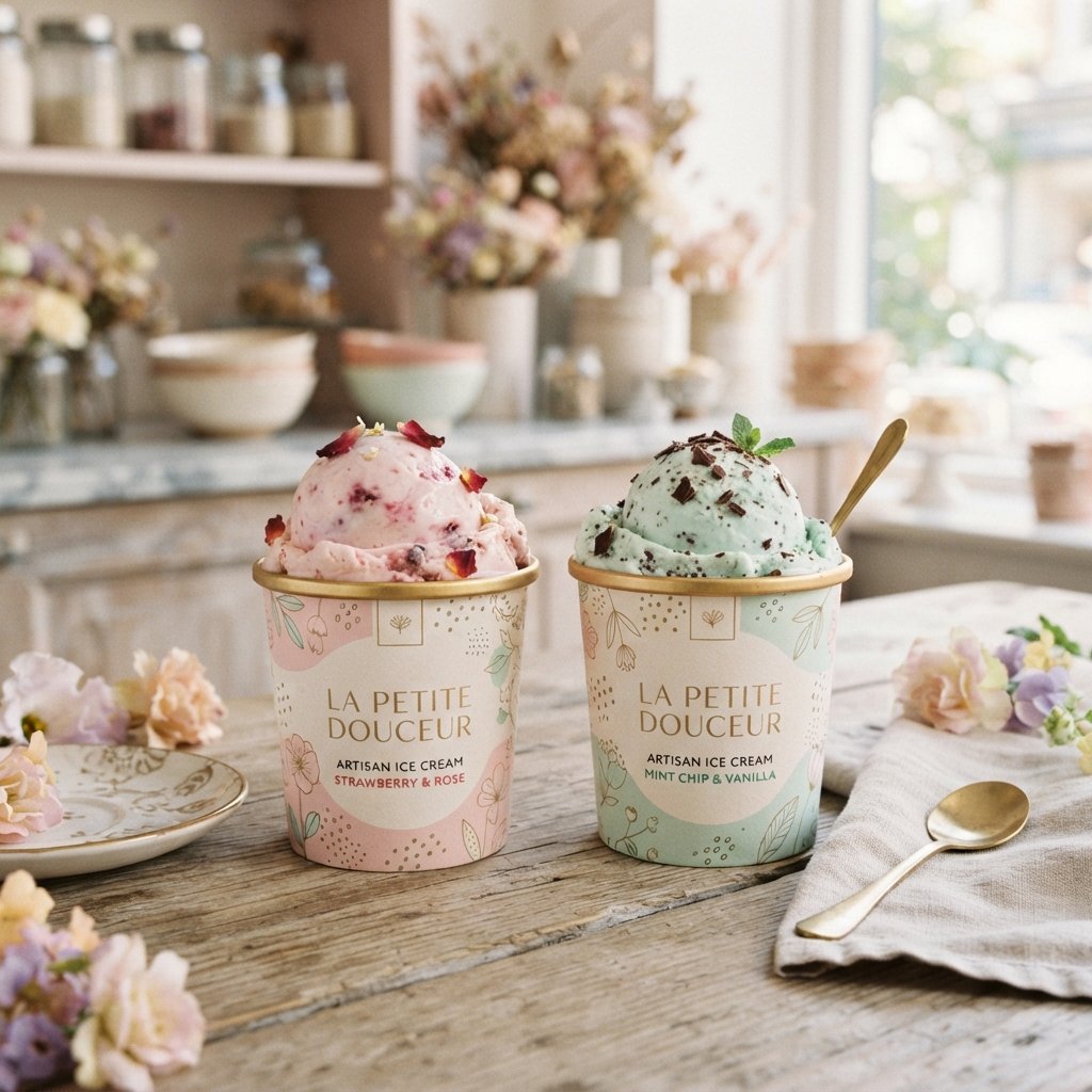
Pastel ice cream cup design ideas soften the overall look using light pinks, mint greens, and baby blues throughout. This palette feels gentle, sweet, and approachable, making it a favorite among boutique dessert brands. Pastel tones also photograph wonderfully under natural light, which matters greatly for social-first ice cream brands. The soft color scheme creates a calming contrast against the often-bold world of dessert packaging.
Pairing pastels with delicate typography enhances the overall feminine, dreamy quality many customers find genuinely appealing. This design direction suits brands targeting a younger demographic or those selling specialty, Instagram-friendly ice cream flavors. Soft colors rarely overwhelm, allowing the product itself to remain the visual centerpiece.
Cartoon Character Ice Cream Cup Ideas
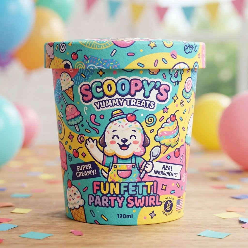
Cartoon character ice cream cup ideas bring playful mascots and illustrated figures directly onto the packaging itself. A friendly character can become instantly recognizable, helping kids and parents alike identify your brand quickly. These characters often carry personality traits that mirror your brand’s tone, whether silly, adventurous, or sweet. Over time, a strong mascot can become just as valuable as your logo itself.
This approach works particularly well for brands targeting children, school cafeterias, or family entertainment venues. A well-designed character creates emotional connection, encouraging repeat purchases simply through familiarity and charm. Just make sure the character stays consistent across all packaging sizes and marketing materials.
Floral Ice Cream Cup Ideas
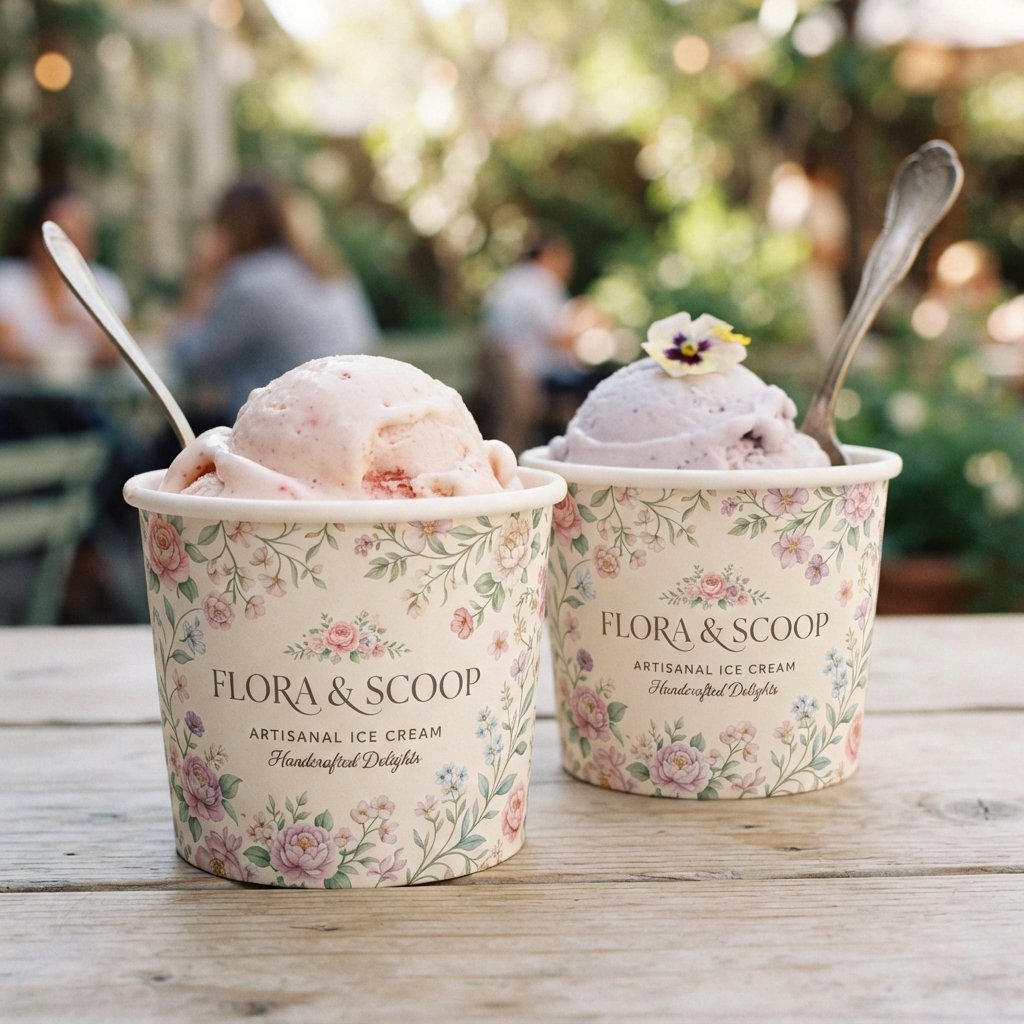
Floral ice cream cup ideas incorporate delicate flower illustrations, vines, or botanical patterns across the packaging surface. This style feels fresh, feminine, and closely tied to natural or fruit-based ice cream flavors. Floral patterns work beautifully alongside pastel color schemes, creating a cohesive and elegant overall design. Brands selling flavors like rose, lavender, or berry often find floral packaging enhances flavor storytelling.
Botanical illustrations also suggest quality ingredients and a connection to nature that resonates with health-conscious customers. This design direction tends to feel timeless rather than trendy, giving it lasting appeal across different seasons. Floral packaging photographs especially well for spring and summer marketing campaigns.
Geometric Ice Cream Cup Ideas
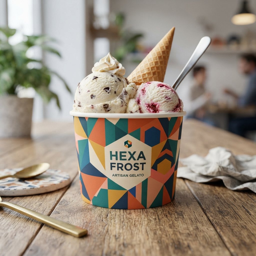
Geometric ice cream cup design ideas rely on shapes, patterns, and angular designs to create bold visual structure. Triangles, hexagons, and repeating patterns give the packaging a modern, structured, and intentional feeling. This style often pairs well with contemporary branding that wants to feel fresh and forward-thinking. Geometric design also allows for creative use of negative space, adding visual sophistication without extra clutter.
Brands targeting design-conscious or younger urban audiences often gravitate toward this structured, modern aesthetic choice. The style works especially well when combined with bold, contrasting color palettes for maximum shelf impact. Geometric patterns also scale nicely across different cup sizes without losing their visual coherence.
Handwritten Font Ice Cream Cup Ideas
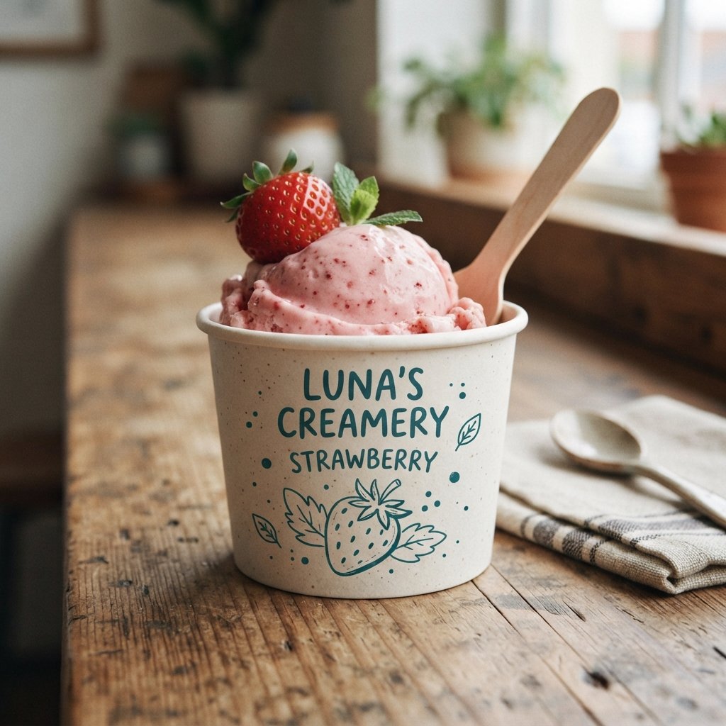
Handwritten font ice cream cup ideas use script-style or casual lettering to create a personal, homemade feeling. This style suggests warmth, authenticity, and a small-batch approach that mass-produced brands often struggle to replicate. Handwritten fonts work especially well paired with simple illustrations or a single accent color. Customers often associate this style with genuine care, as if the recipe came from someone’s kitchen.
This design direction suits family-owned ice cream shops or brands wanting to emphasize their personal, human story. Handwritten elements also create a sense of intimacy, making packaging feel less corporate and more relatable. Just ensure the font remains legible, especially on smaller single-serve cup sizes.
Tropical Ice Cream Cup Ideas
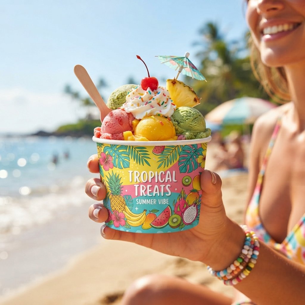
Tropical ice cream cup ideas bring vibrant palm leaves, bright fruit illustrations, and sunny color palettes together beautifully. This style instantly evokes vacation vibes, making it perfect for fruit-based or exotic flavor ice cream lines. Bold yellows, pinks, and greens work together to create an energetic, summery visual experience. Tropical packaging often performs especially well during warmer months and beachside retail locations.
This design direction pairs naturally with flavors like mango, coconut, and passionfruit, reinforcing the tropical theme further. Customers associate this style with escape and indulgence, making it emotionally appealing beyond just visual attraction. Tropical packaging also stands out strongly against more neutral or minimalist competitor designs nearby.
Monochrome Ice Cream Cup Ideas
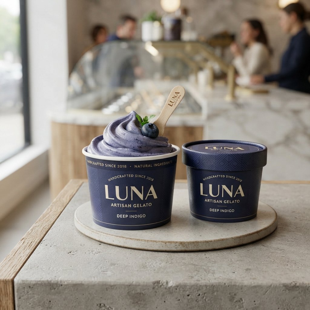
Monochrome ice cream cup design ideas use a single color in varying shades to create sleek, sophisticated packaging. This approach feels intentional and premium, often used by upscale gelato or artisan ice cream brands. Working within one color family forces stronger design decisions around texture, typography, and negative space. The result is packaging that feels cohesive, confident, and instantly recognizable on crowded shelves.
Monochrome design also photographs exceptionally well, giving brands a strong, consistent visual identity across marketing channels. This style works particularly well for brands wanting to feel modern, minimal, and slightly luxurious overall. Choosing the right single color becomes crucial, since it will carry the entire visual identity.
Eco-Friendly Ice Cream Cup Ideas
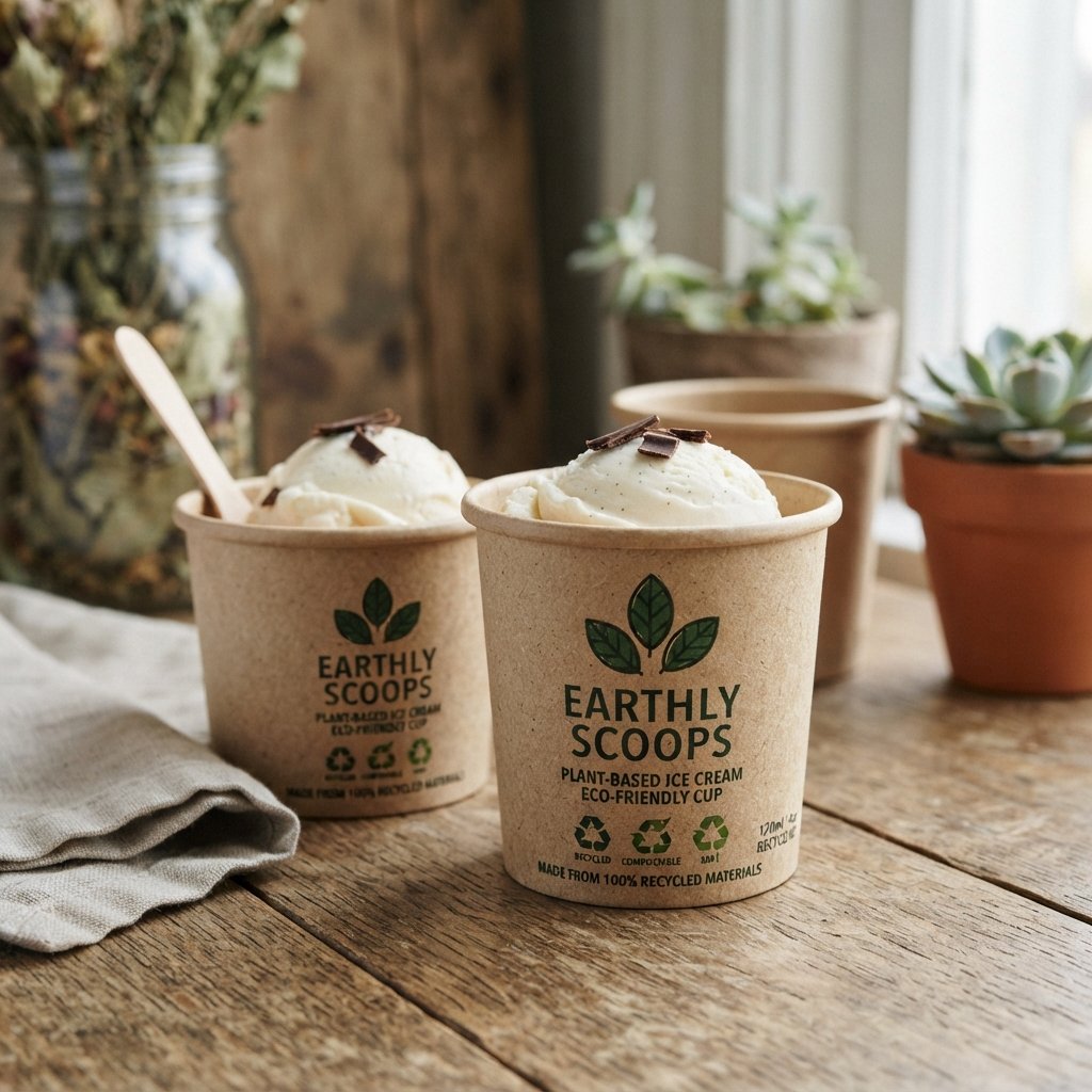
Eco-friendly ice cream cup design ideas focus on natural textures, recycled materials, and earthy, sustainable-feeling visual cues. This style often uses kraft paper, green accents, and simple leaf or nature-inspired illustrations throughout. Customers increasingly value brands that visually communicate sustainability, even before reading the actual packaging materials. This design direction builds trust with environmentally conscious shoppers looking for greener everyday choices.
Pairing eco-friendly visuals with actual sustainable materials strengthens brand credibility and avoids appearing purely decorative. This approach works well for brands genuinely committed to reducing plastic use and environmental impact. The design should feel honest and simple, avoiding overly polished or artificial-looking visual elements.
Transparent Window Ice Cream Cup Ideas
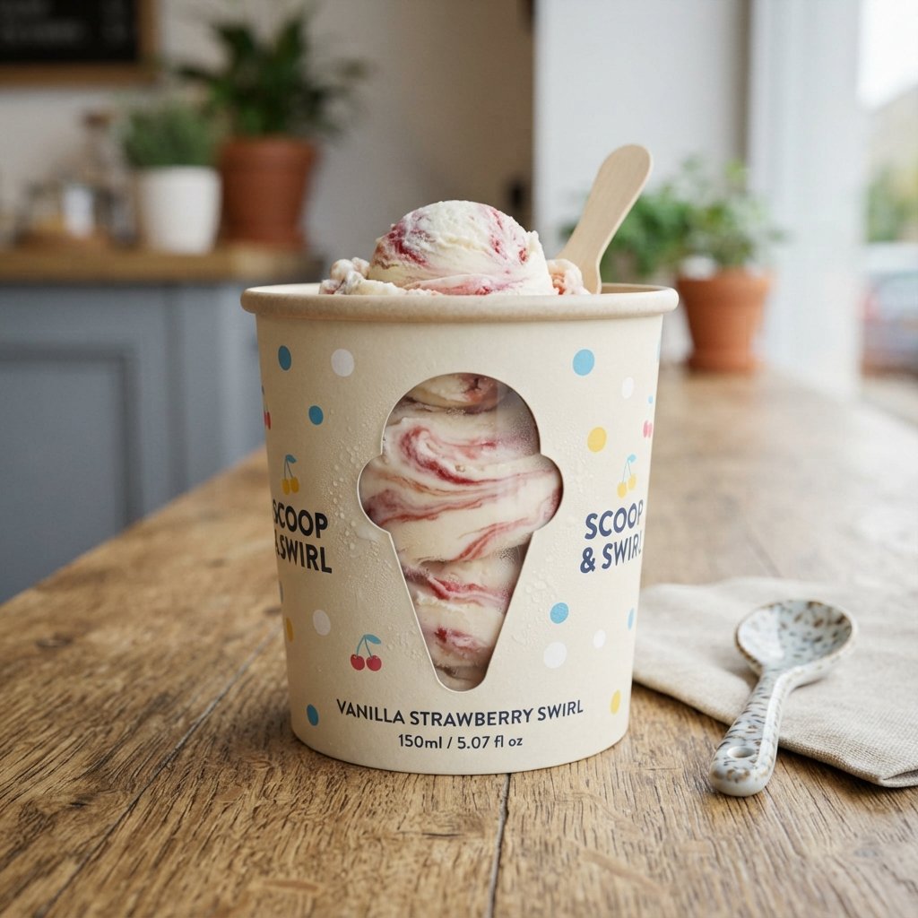
Transparent window ice cream cup ideas add a clear cutout, letting customers see the actual product inside. This design choice builds trust instantly, since shoppers can view texture, color, and toppings before buying. A small window also creates visual variety across a product line, since each flavor looks slightly different. This style works especially well for brands with visually appealing mix-ins, swirls, or toppings.
Transparent windows require careful packaging structure to maintain both visual appeal and proper product protection. This design direction suits brands wanting to emphasize genuine ingredients rather than relying solely on illustrated graphics. It also creates a satisfying, honest shopping experience that many customers genuinely appreciate.
Kids-Themed Ice Cream Cup Ideas
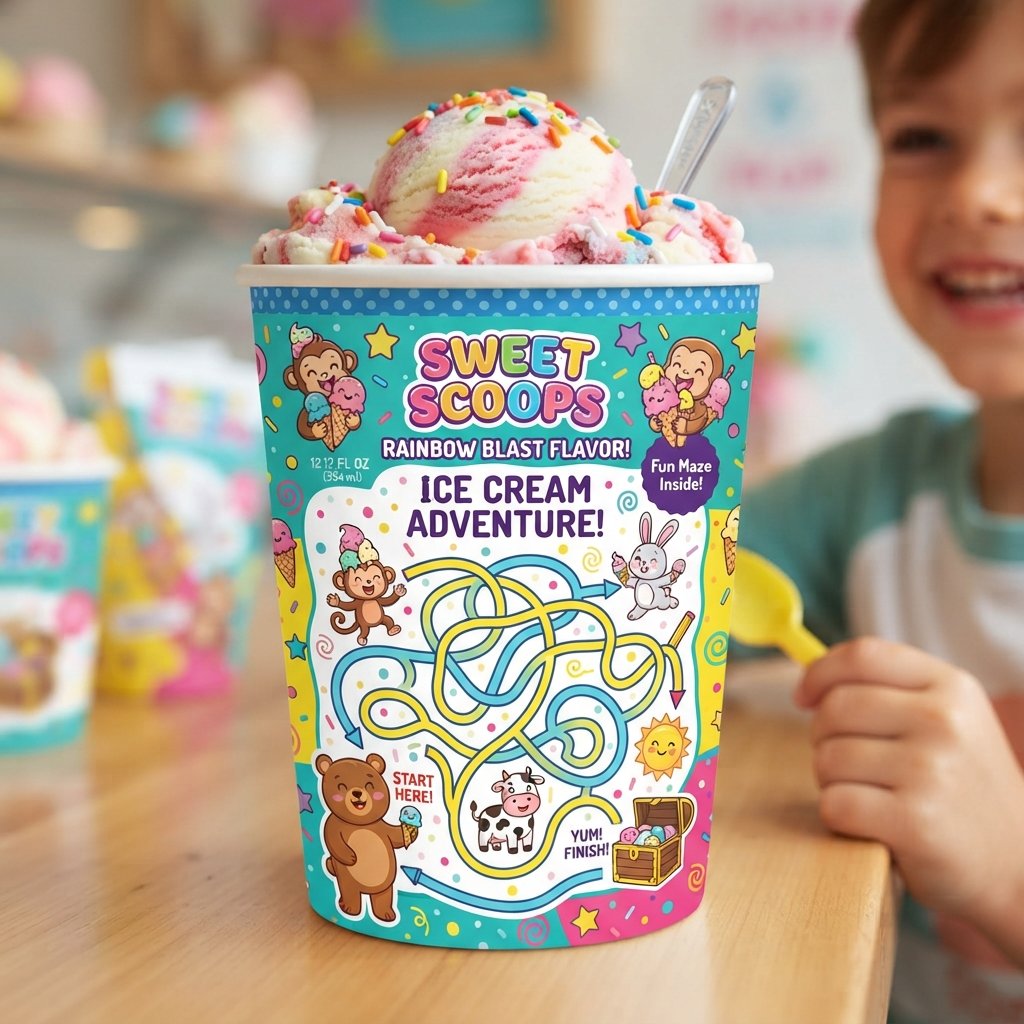
Kids-themed ice cream cup ideas use playful shapes, bright colors, and fun illustrations designed specifically for children. This style often includes simple games, mazes, or characters printed directly onto the cup itself. Adding an interactive element encourages kids to engage with the packaging beyond just eating the product. Parents also respond positively to packaging that feels safe, cheerful, and clearly designed with children in mind.
This design direction works well for school lunch programs, birthday parties, and family entertainment venue partnerships. Bright, bold visuals paired with friendly characters create instant appeal for younger customers browsing store shelves. Keeping the design colorful yet uncluttered helps maintain visual clarity for smaller audiences.
Luxury Ice Cream Cup Ideas
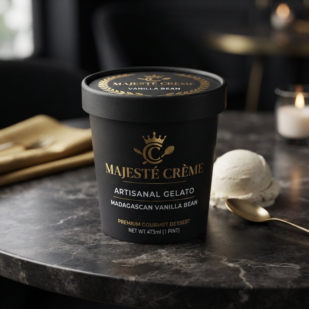
Luxury ice cream cup ideas use metallic accents, matte finishes, and elegant typography to signal premium quality. This style often includes gold or silver foil detailing paired with darker, richer background color choices. Simplicity remains important here too, since luxury design relies on restraint rather than visual excess. Customers associate this aesthetic with higher price points and carefully crafted, small-batch ice cream products.
This design direction suits gourmet gelato brands, dessert boutiques, or specialty flavors marketed as indulgent treats. Premium packaging materials, thicker cup walls, and refined finishes all reinforce this elevated overall impression. Luxury design invites customers to slow down and savor the entire experience, not just the flavor.
Seasonal Ice Cream Cup Ideas
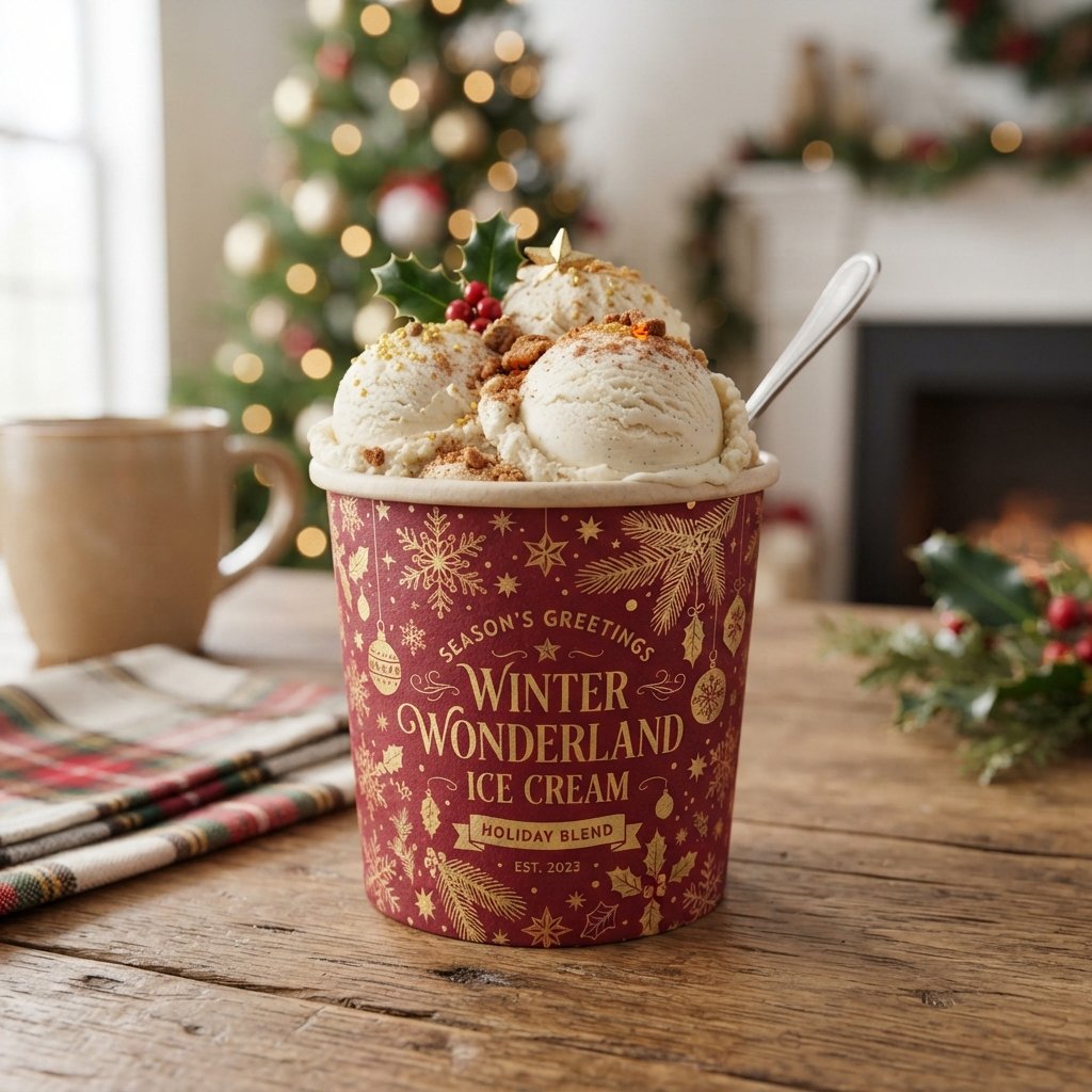
Seasonal ice cream cup ideas rotate design elements throughout the year to match holidays and changing weather. Summer designs might feature bright suns and beach themes, while winter versions lean toward cozy, warm tones. This approach keeps packaging feeling fresh and gives customers a reason to look forward to new releases. Seasonal design also creates natural marketing opportunities tied to holidays, festivals, and limited-time flavors.
Rotating designs throughout the year encourages repeat purchases from customers curious about each new seasonal release. This strategy works especially well for brands with strong social media presence and engaged, loyal customer bases. Seasonal packaging keeps your brand feeling current without requiring a complete visual identity overhaul.
Retro Pop Art Ice Cream Cup Ideas
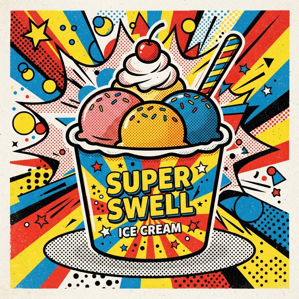
Retro pop art ice cream cup ideas use bold outlines, comic-style dots, and bright primary color combinations. This style feels energetic, nostalgic, and slightly rebellious compared to more traditional or minimalist packaging approaches. Thick black outlines paired with punchy colors create strong visual contrast that catches attention quickly. Brands wanting to feel bold, youthful, and a little unconventional often gravitate toward this aesthetic.
Pop art design works particularly well for brands with playful marketing voices and confident, attention-grabbing personalities. This style also stands out dramatically against more subdued competitor packaging on crowded store shelves. Retro pop art rewards brands willing to take visual risks and embrace loud, expressive design choices.
Nature-Inspired Ice Cream Cup Ideas
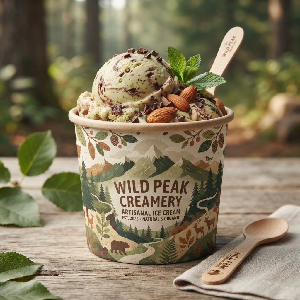
Nature-inspired ice cream cup ideas draw from landscapes, leaves, and organic textures found in the natural world. This style often blends earthy greens, browns, and blues to create a calm, grounded visual feeling. Illustrations of mountains, forests, or simple botanical elements reinforce a connection to fresh, natural ingredients. This approach suits brands emphasizing quality sourcing and a genuine relationship with nature and land.
Nature-inspired packaging pairs beautifully with flavors highlighting real fruit, herbs, or locally sourced dairy ingredients. This design direction feels calming rather than flashy, appealing to customers seeking simplicity and authenticity. The overall tone should feel peaceful, honest, and closely tied to the product’s natural origins.
Bold Typography Ice Cream Cup Ideas
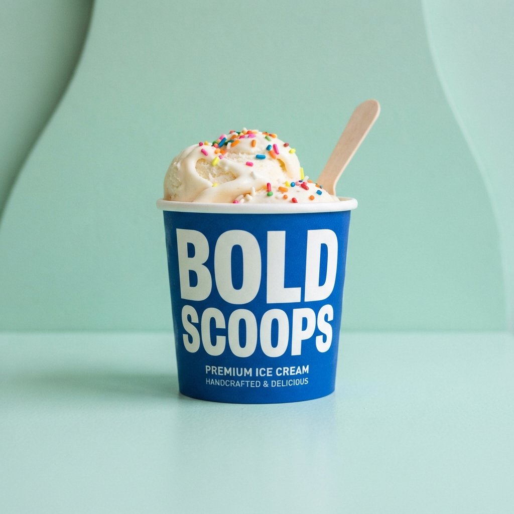
Bold typography ice cream cup ideas place large, striking text front and center as the main visual focus. Instead of relying on illustrations, the brand name or flavor becomes the standout design element itself. Thick, oversized fonts paired with a simple background create strong, confident shelf presence instantly. This style works well for brands with catchy names or short, punchy flavor descriptions worth highlighting.
Typography-driven design also simplifies production, since fewer illustrated elements are needed across different packaging sizes. This approach suits modern, confident brands wanting their name to do most of the visual talking. Bold text remains legible from a distance, helping products stand out in busy retail environments.
Animal Print Ice Cream Cup Ideas
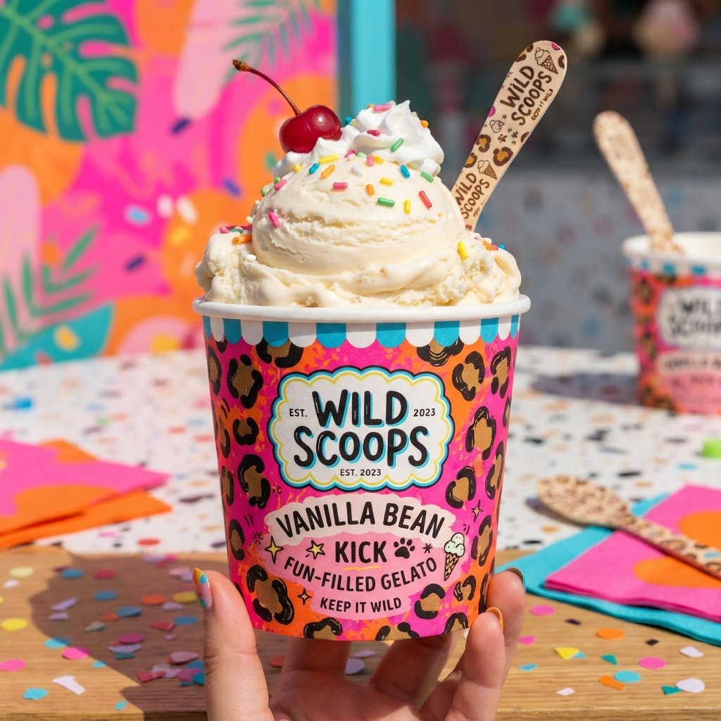
Animal print ice cream cup ideas use patterns like leopard spots, zebra stripes, or cow print for visual fun. This style feels playful, bold, and slightly quirky, appealing to brands wanting a distinctive personality. Animal prints work especially well paired with bright accent colors or simple, clean background choices. This design direction often surprises customers, creating memorable packaging that stands apart from typical dessert branding.
This style suits brands with a fun, confident voice unafraid to experiment with unexpected design choices. Animal print packaging photographs well for social media, often sparking curiosity and conversation among customers. Used sparingly, this pattern adds personality without overwhelming the overall packaging design.
Gradient Color Ice Cream Cup Ideas
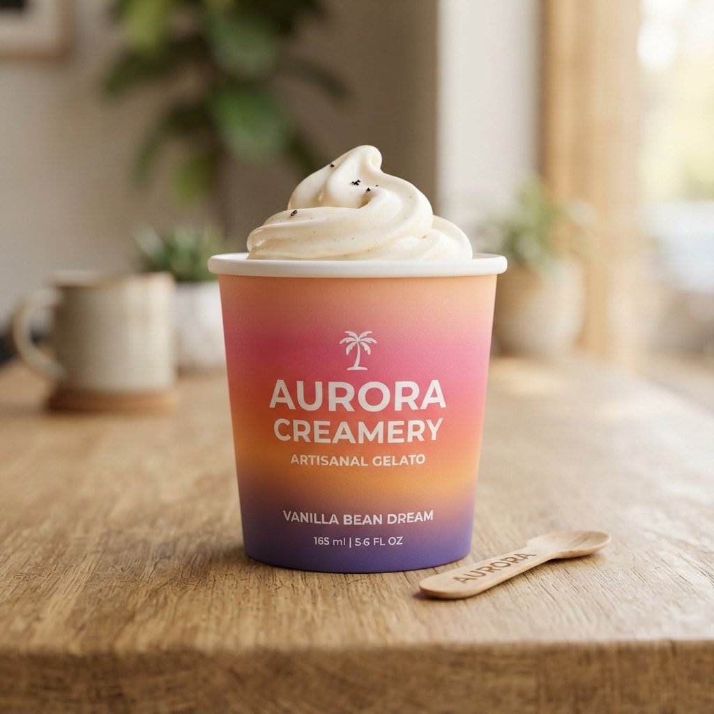
Gradient color ice cream cup ideas blend two or more colors smoothly across the packaging surface. This technique creates depth and movement, making the cup feel more dynamic than flat, single-color designs. Sunset-inspired gradients, pastel blends, or bold contrasting transitions all offer different visual moods worth exploring. This style has grown increasingly popular across modern branding, especially among younger, trend-focused ice cream companies.
Gradients pair beautifully with minimalist typography, letting the color transition itself become the main visual interest. This design direction feels fresh and contemporary, fitting brands wanting a bold yet polished overall look. Choosing complementary color pairs ensures the gradient feels intentional rather than random or mismatched.
Personalized Ice Cream Cup Ideas
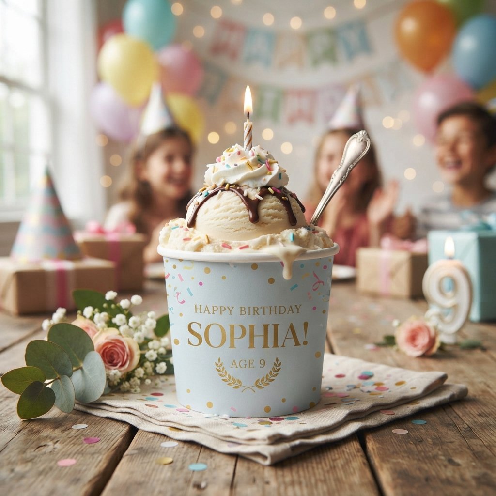
Personalized ice cream cup ideas allow customers to add names, messages, or custom designs to their packaging. This approach works wonderfully for birthdays, weddings, corporate events, or other special occasion ice cream orders. Offering personalization creates a memorable, shareable experience customers genuinely value beyond the product itself. Small-batch or made-to-order ice cream brands often use this strategy to build deeper customer loyalty.
Personalized packaging also encourages social sharing, since customers love showing off custom designs made just for them. This design direction requires flexible printing capabilities but rewards brands with stronger emotional customer connections. Even simple personalization, like a name or date, can significantly boost perceived product value.
FAQs About Ice Cream Cup Design
What are the most creative ice cream cup design ideas?
Minimalist, gradient, and personalized designs currently stand out as some of the most creative options available. Each brings a different mood, so choose based on your brand’s personality and target audience.
How do I choose an ice cream cup design for my brand?
Start by considering your brand’s tone, target customer, and flavor lineup before selecting a visual direction. Testing a few design concepts with real customers often reveals which style resonates most strongly.
What colors work best for ice cream cup designs?
Bright colors suit playful, family-friendly brands, while pastels and monochrome tones fit premium or minimalist positioning. Choosing colors that reflect your flavors also creates a stronger, more intuitive customer experience.
Are minimalist ice cream cup designs still popular?
Yes, minimalist design remains popular, especially among premium and boutique ice cream brands seeking sophistication. Its clean, timeless look continues performing well across social media and in-store retail environments alike.
How can I make my ice cream cup design stand out?
Focus on one strong visual element, whether color, typography, or illustration, rather than combining too many ideas. Consistency across your packaging line also helps strengthen brand recognition over time.
Conclusion
Ice cream cup design offers nearly unlimited room for creativity, letting every brand express its own unique personality. From playful cartoon characters to elegant monochrome finishes, each direction tells a different story to customers. The right design choice depends less on trends and more on genuine alignment with your brand’s values. Experimenting with different styles often reveals unexpected combinations that feel authentic and memorable.
Whatever direction you choose, remember that packaging is often a customer’s very first impression of your product. Investing time into thoughtful, creative design pays off through stronger recognition, loyalty, and shelf appeal. Let inspiration guide your next redesign, and don’t be afraid to try something a little different.