

24 Cup Sleeve Design Ideas You’ll Want to Pin Now
Cup sleeve design offers a small but powerful canvas for creativity, turning an everyday coffee cup into something worth noticing. A single wrap of paper can carry color, pattern, and personality that reflects a brand or a moment being celebrated.
From cozy café branding to one-time party favors, the possibilities stretch far beyond a plain paper band. This post walks through a wide range of cup sleeve design ideas so you can find the direction that fits your project best.
Best Cup Sleeve Design Ideas to Try
This collection brings together cup sleeve design ideas suited for businesses, celebrations, and personal projects alike. Some styles lean toward simple, clean visuals, while others embrace bold color and playful pattern work.
Every idea here can be adjusted to match your cup size, material choice, and printing method. Explore a few that catch your eye and picture how they might look wrapped around your own cup.
Minimalist Cup Sleeve Design Ideas

A minimalist cup sleeve design relies on clean lines, plenty of white space, and a single focal point like a logo or word. This style feels calm and modern, making it a favorite among specialty coffee shops and boutique brands.
Simplicity doesn’t mean boring here; a well-placed accent color or subtle texture can still make the sleeve feel intentional. Less clutter often means more attention lands exactly where you want it.
Many brands choose this direction because it ages well and rarely feels dated after a few years. A minimalist sleeve also gives you room to swap small details, like a seasonal color, without redesigning the whole layout.
Kraft Paper Cup Design Ideas
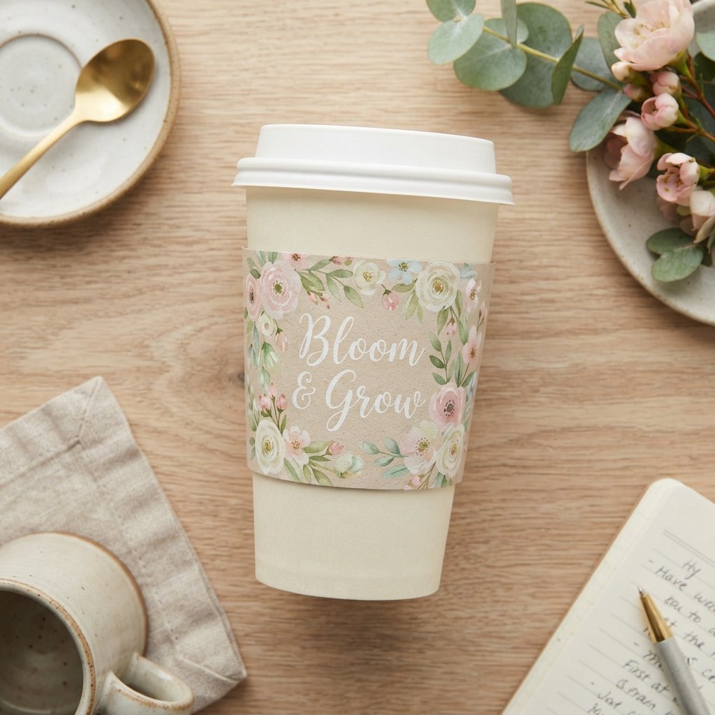
Kraft paper brings a warm, natural texture that pairs beautifully with earthy tones and simple typography. Its raw, unbleached look feels honest and approachable, which many small coffee shops find appealing.
Printing in a single dark ink over kraft paper creates a rustic yet polished appearance without much extra effort. This option also tends to photograph well for social media, adding another layer of appeal.
Because kraft paper carries a slightly imperfect, organic surface, it tends to suit brands that want to feel handmade rather than mass-produced. It also blends easily with other packaging elements, like paper bags or stamped labels, for a coordinated look.
Floral Cup Design Ideas
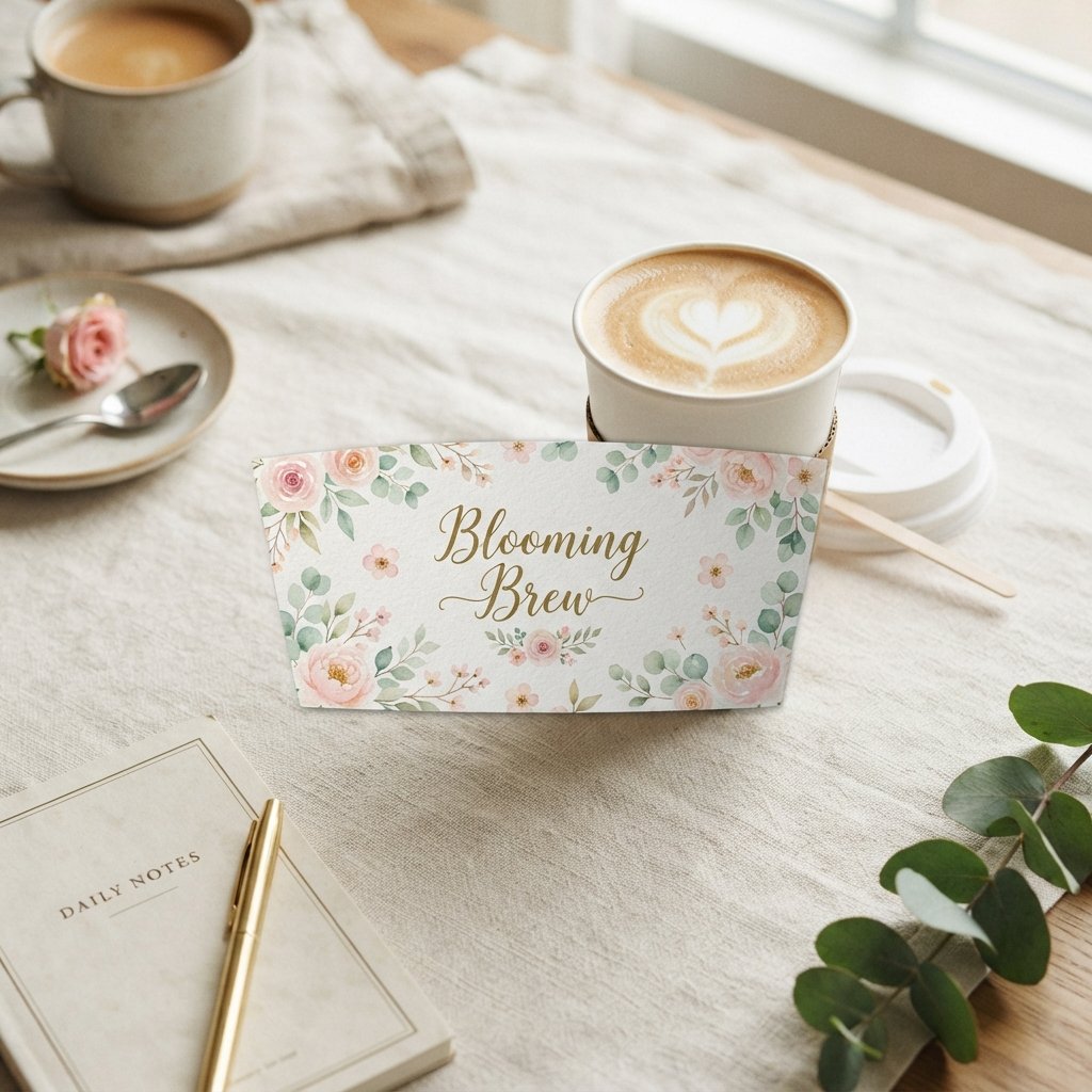
Floral patterns bring softness and charm to a cup sleeve, especially when paired with pastel or muted color palettes. Small repeating blossoms or a single watercolor bloom can both work depending on the mood you want.
This style suits spring pop-ups, garden-themed events, or brands wanting a gentle, feminine touch. Floral designs also pair nicely with cursive or handwritten-style fonts for added warmth.
A single oversized bloom placed off-center often reads as more elegant than an all-over pattern crowding the whole sleeve. Sticking to two or three colors keeps the floral design feeling cohesive rather than busy.
Read more : 21 Cup Art Ideas You’ll Want to Pin Right Now
Wedding Cup Sleeve Ideas
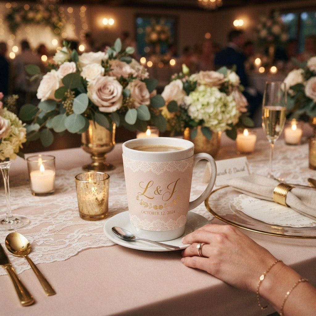
Wedding-themed sleeves often include the couple’s names, wedding date, or a short personal message printed in elegant script. Soft colors like blush, sage, or ivory tend to dominate this category.
Guests appreciate small keepsakes, and a thoughtfully designed sleeve adds a personal touch without a large budget. Pairing the sleeve design with other wedding stationery keeps the overall look cohesive.
Some couples also add a short thank-you line or their wedding hashtag, giving guests a reason to hold onto the sleeve. Matching the sleeve to the invitation suite makes it feel like part of the bigger celebration rather than an afterthought.
Birthday Cup Design Ideas

Birthday-themed cup sleeves lean into bright colors, playful shapes, and sometimes the celebrant’s name or age. Confetti patterns, balloons, or simple party motifs work well for this occasion.
These sleeves double as party favors, giving guests something fun to hold onto during the celebration. A bold color palette here usually reads more festive than a muted one.
Milestone birthdays often call for a specific number printed large across the sleeve, making it feel extra special. Adding a small illustration tied to the celebrant’s interests, like music notes or sports gear, personalizes the design further.
Holiday Cup Sleeve Ideas

Holiday-themed sleeves capture seasonal spirit through color, iconography, and festive typography. Deep reds, greens, and golds often dominate winter holiday designs, while pastels suit spring occasions.
Rotating your cup design around the calendar keeps a coffee shop feeling fresh and connected to the season. Customers often look forward to seeing what a café rolls out next.
Planning these releases a few weeks ahead of each holiday gives enough lead time for printing without last-minute rushes. Limited-run holiday sleeves can also encourage repeat visits from customers eager to collect each seasonal design.
Christmas Cup Design Ideas

Christmas cup sleeves often feature snowflakes, pine branches, or simple line-art ornaments paired with a classic red or green palette. Gold foil accents can elevate the design without overwhelming the layout.
Many cafés use this window to reinforce brand identity while still leaning into festive charm. A limited seasonal run also creates a sense of novelty for returning customers.
Keeping the base logo visible somewhere on the sleeve, even during a festive redesign, helps maintain brand recognition throughout the busy holiday season. A simple two-color print often works better than an overly detailed illustration at small cup sizes.
Halloween Cup Sleeve Ideas

Halloween designs invite playful, spooky elements like bats, pumpkins, or moody purple and orange color schemes. This is a great opportunity for brands to show a more lighthearted, fun side.
Hand-drawn illustrations work especially well here, giving the sleeve a slightly whimsical, non-mass-produced feel. Even subtle nods, like a single spider web accent, can set the seasonal tone.
Brands that usually keep a serious visual identity often use Halloween as a chance to loosen up and show some personality. Limiting the design to two or three spooky elements keeps it fun without looking cluttered.
Coffee Shop Branding Sleeve Design Ideas
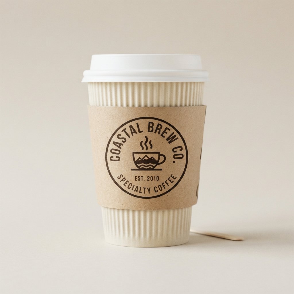
Branding-focused sleeves prioritize logo placement, consistent color use, and recognizable typography across every cup. This approach builds familiarity, helping customers spot your cups from across a room.
Consistency matters more than complexity in this category, since the goal is brand recall rather than novelty. A repeated visual identity across cups, bags, and signage strengthens overall recognition.
Sticking to the same one or two fonts and a defined color palette across every touchpoint builds a stronger, more trustworthy impression over time. Customers begin to associate that visual pattern with quality and reliability, even before tasting the coffee.
Logo-Focused Cup Design Ideas
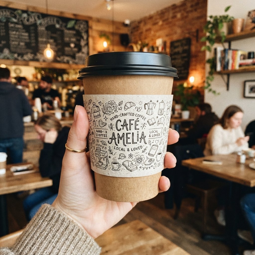
A logo-focused design places the brand mark front and center, often surrounded by generous negative space. This keeps the sleeve clean while ensuring the logo remains the clear visual anchor.
Some brands repeat a smaller version of the logo in a subtle pattern across the sleeve for texture. Either approach keeps the identity strong without pulling focus from the product itself.
This style tends to work best when the logo itself is already strong and doesn’t need extra decoration to feel complete. Overloading the sleeve with additional graphics can actually weaken the impact of a bold, standalone mark.
Hand-Drawn Cup Sleeve Ideas
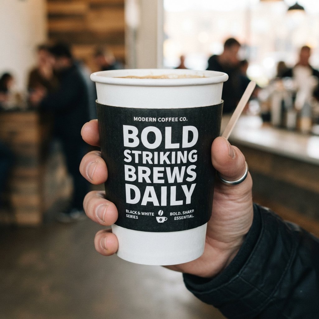
Hand-drawn illustrations give a cup sleeve a personal, artisanal quality that feels distinct from digital-only graphics. Small doodles, line work, or sketch-style icons can add real character to the design.
Independent coffee shops often use this style to reflect a homegrown, community-focused identity. Customers tend to notice and appreciate the extra creative effort behind hand-drawn details.
Working with a local artist for this kind of design can also strengthen ties to the surrounding community. Even simple, imperfect line work often feels more genuine than a polished, machine-made graphic.
Watercolor Cup Design Ideas
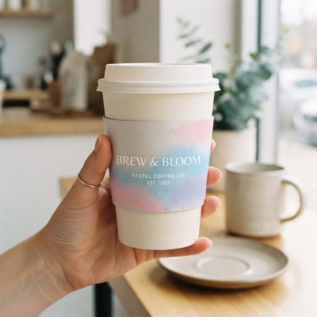
Watercolor designs bring soft gradients and organic textures that feel gentle and artistic on a cup sleeve. Blended colors, especially in floral or landscape motifs, work particularly well with this technique.
This style suits brands wanting a dreamy, relaxed aesthetic rather than sharp, graphic visuals. Watercolor also pairs nicely with light, airy typography for a cohesive finished look.
Reproducing watercolor detail well requires a print method capable of handling subtle gradients without losing softness. Testing a physical proof before a full production run helps confirm the colors translate accurately onto paper.
Geometric Pattern Cup Design Ideas
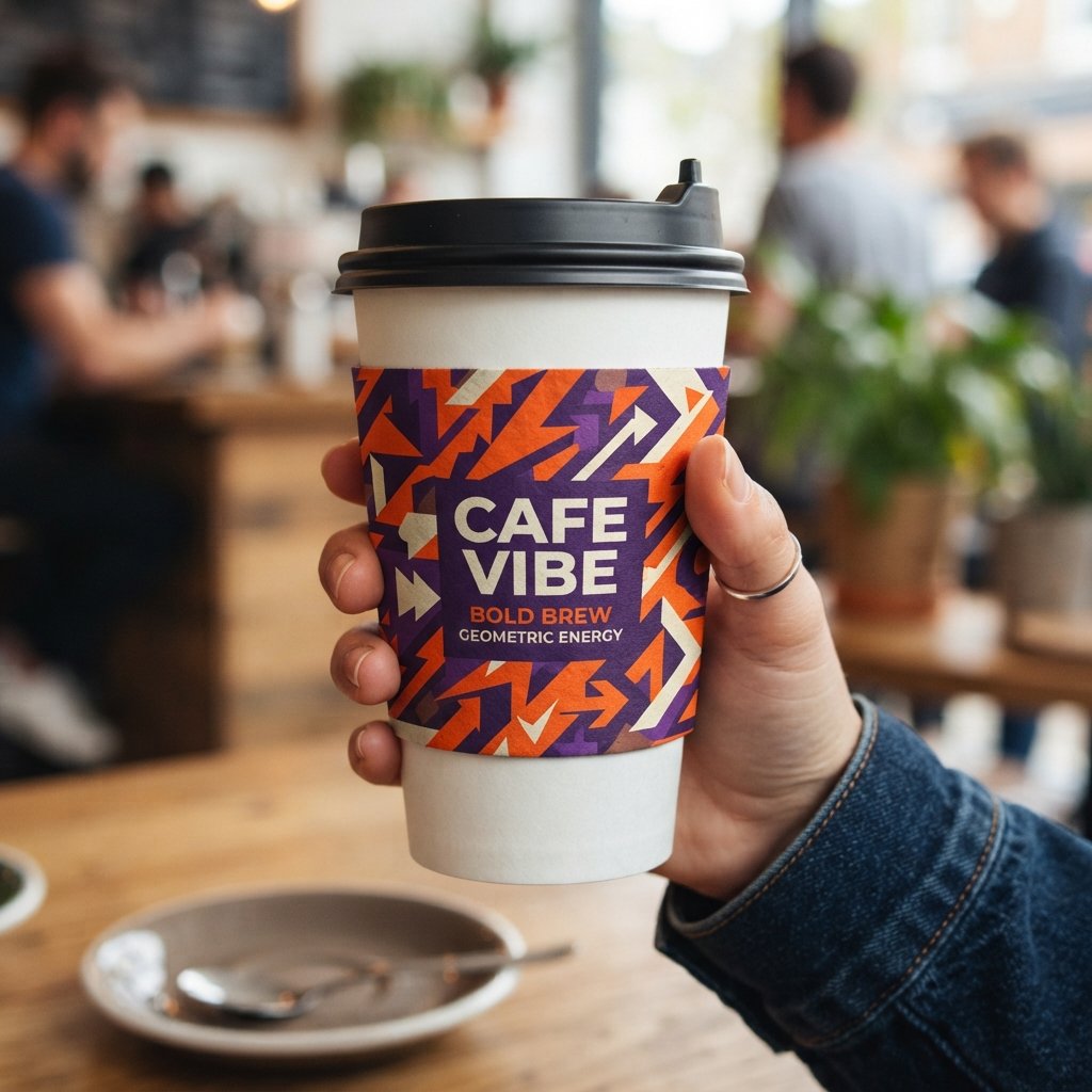
Geometric patterns rely on repeated shapes, angles, and clean lines to create a modern, structured visual rhythm. Triangles, hexagons, and grid-based layouts are common choices within this style.
This approach suits brands with a sleek, contemporary identity looking to stand apart from softer, organic designs. Bold color contrast within geometric shapes can make the sleeve feel especially eye-catching.
Repeating a single shape at varying sizes across the sleeve often creates rhythm without feeling repetitive or flat. This style also scales well across different cup sizes since the pattern adjusts naturally to the surface.
Vintage Cup Sleeve Ideas

Vintage-inspired sleeves borrow from retro color palettes, aged textures, and classic typography styles from past decades. Muted tones and slightly distressed graphics help create that nostalgic, well-worn feel.
Coffee shops going for a cozy, old-world charm often gravitate toward this style. Vintage design also pairs well with kraft paper for an even more authentic, timeworn appearance.
Borrowing details from a specific decade, like mid-century lettering or old advertising layouts, can give the sleeve a stronger sense of story. Keeping the color palette limited helps the vintage feel stay authentic rather than cartoonish.
Modern Typography Cup Design Ideas
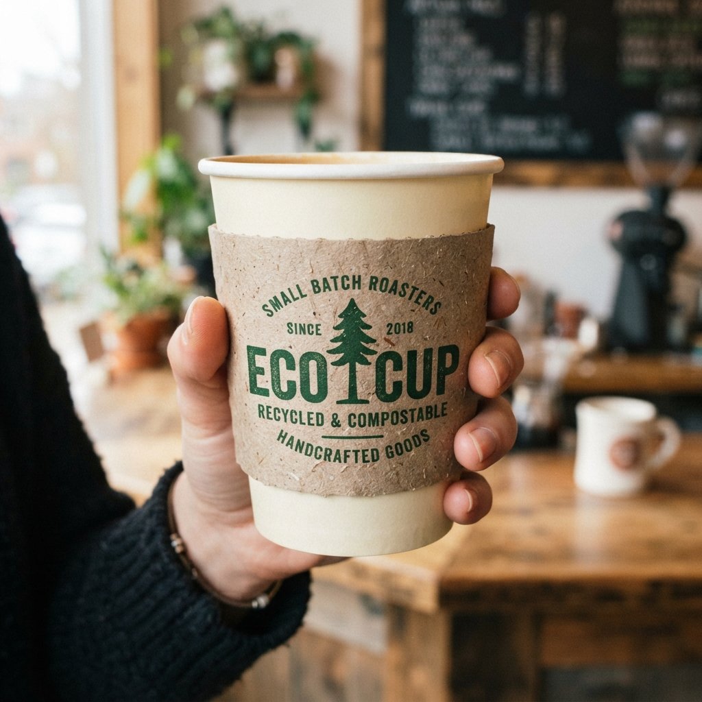
Typography-driven sleeves let bold, well-chosen fonts carry the entire design without relying on illustrations or icons. A short phrase, brand name, or single word in striking type can be surprisingly memorable.
This minimalist yet expressive approach works well for brands with a strong verbal identity or tagline. Careful font pairing and spacing make all the difference in keeping this style sharp rather than plain.
Mixing a bold serif with a lighter sans-serif can add contrast and visual interest without adding extra graphics. Leaving generous margins around the text keeps the message the clear focus of the sleeve.
Pastel Color Cup Sleeve Ideas

Pastel palettes bring a soft, approachable feel to cup sleeve often used for spring or feminine-leaning brands. Light pinks, blues, and lavenders create a gentle, calming visual impression.
This color direction pairs well with minimalist layouts or delicate floral patterns for added cohesion. Pastels also photograph softly, which many brands find appealing for social sharing.
Pairing pastel tones with a slightly deeper accent color helps prevent the overall design from looking washed out. This palette also works well across multiple seasons, not just spring, when paired with the right imagery.
Bold Color Cup Design Ideas

Bold, saturated colors demand attention and work well for brands wanting an energetic, confident presence. Bright oranges, deep purples, or high-contrast combinations can make a sleeve instantly recognizable.
This style suits younger, trend-forward brands or businesses wanting to stand out on a crowded shelf. Pairing bold color with simple typography keeps the design impactful rather than overwhelming.
Limiting the palette to two strong colors usually reads more confident than combining several competing bright tones. This direction also tends to perform well in busy retail settings where a sleeve needs to catch attention quickly.
Eco-Friendly Cup Sleeve Ideas
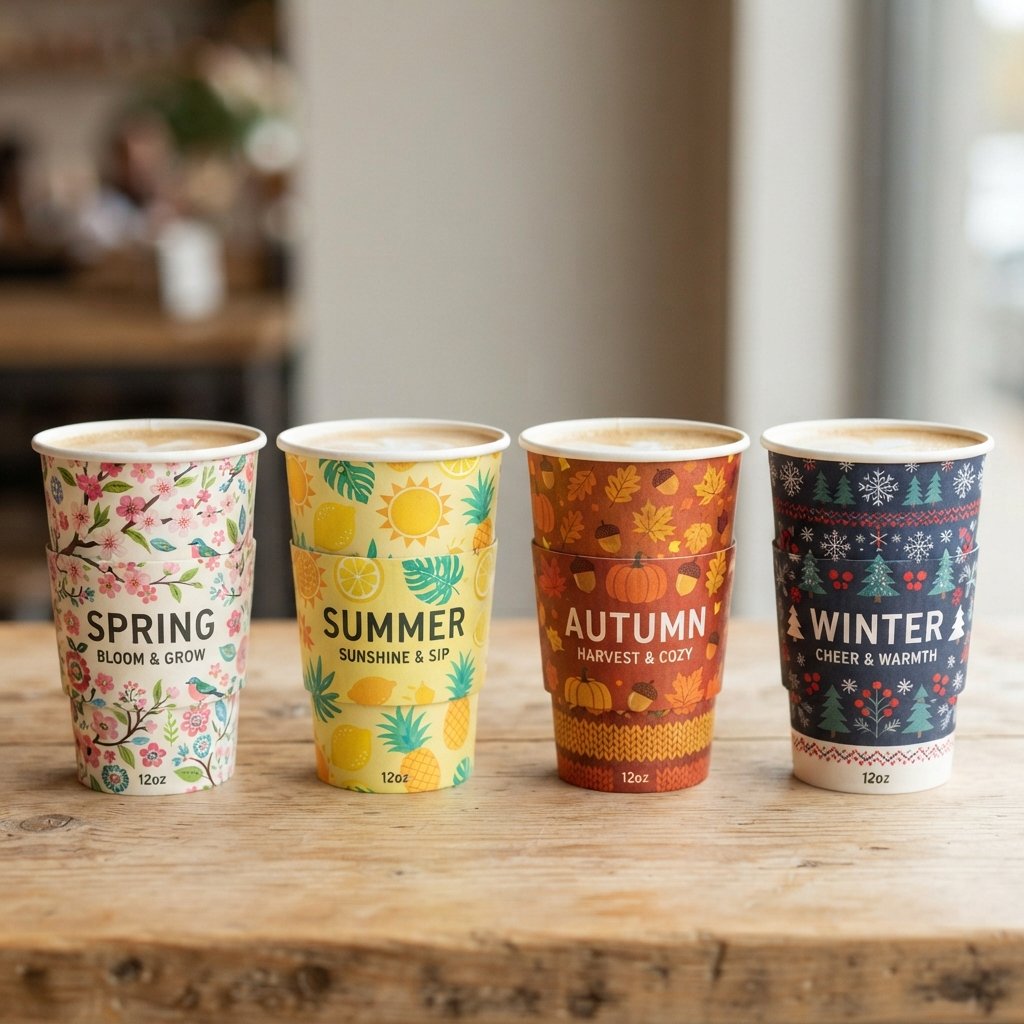
Eco-conscious designs often use earthy tones, recycled textures, and messaging that highlights sustainable materials. Simple green accents or leaf motifs can subtly reinforce the environmental angle without overdoing it.
Brands prioritizing sustainability often pair this visual direction with recycled or biodegradable sleeve materials. This alignment between message and material builds trust with environmentally aware customers.
Including a short line about the material’s recycled content or compostability gives customers a reason to feel good about their purchase. Understated, natural imagery usually communicates sustainability more convincingly than heavy-handed slogans.
Recycled Material Cup Design Ideas
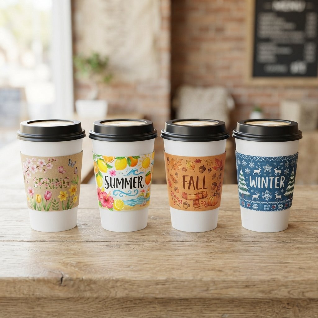
Designing for recycled materials means working with slightly textured, less uniform surfaces compared to standard paper stock. Embracing that natural imperfection, rather than fighting it, often produces a more authentic final look.
Simple, bold ink colors tend to print best against these textured surfaces. This approach appeals to brands wanting their packaging choices to reflect genuine environmental responsibility.
Testing print legibility on recycled stock ahead of a full order helps avoid faded or uneven results once production begins. A slightly heavier ink weight often compensates for the more absorbent surface of recycled paper.
Personalized Cup Design Ideas
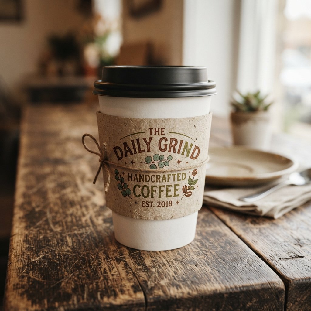
Personalized sleeves include names, initials, or custom messages tailored to a specific person or event. This option turns a simple cup into a small, meaningful keepsake rather than generic packaging.
Fonts and colors can be adjusted to match the recipient’s style or the occasion’s overall theme. Personalization works especially well for gifts, celebrations, or milestone moments worth remembering.
Even a short, handwritten-style phrase can make a mass-printed sleeve feel like it was made for one specific person. This idea works well in small batches, since digital printing makes short personalized runs affordable.
Baby Shower Cup Design Ideas
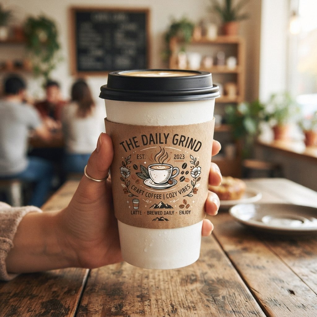
Baby shower sleeves often use soft blues, pinks, or neutral tones alongside cute icons like stars or tiny footprints. Simple phrases welcoming the new baby add a warm, celebratory touch.
These sleeves double as party favors guests can keep as a small memory of the occasion. Coordinating the sleeve design with other shower decor helps tie the whole event together visually.
Gender-neutral color schemes, like sage green or soft yellow, are increasingly popular for showers before the baby’s gender is revealed. Simple line-art illustrations of baby items tend to read as sweet without feeling overly childish for adult guests.
Corporate Event Cup Sleeve Ideas
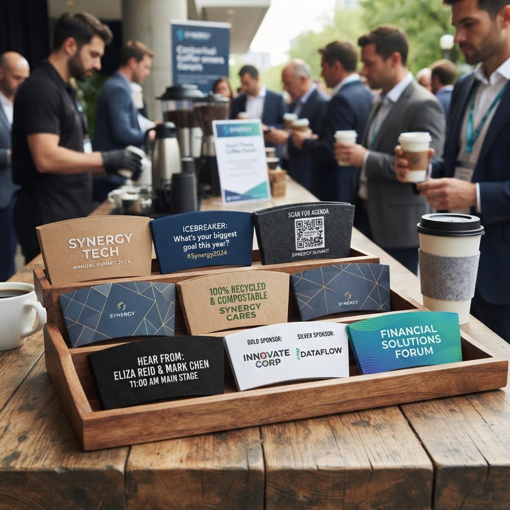
Corporate event sleeves usually prioritize brand logos, event names, and professional color schemes over playful graphics. Clean layouts help maintain a polished, business-appropriate appearance throughout the event.
This style works well for conferences, product launches, or company milestones needing consistent branding. A well-designed sleeve here reinforces professionalism while still functioning as a small marketing touchpoint.
Including a website address or social handle in small type can turn a simple sleeve into a subtle promotional tool. Sticking closely to existing brand guidelines ensures the sleeve feels like a natural extension of other event materials.
Seasonal Cup Sleeve Design Ideas
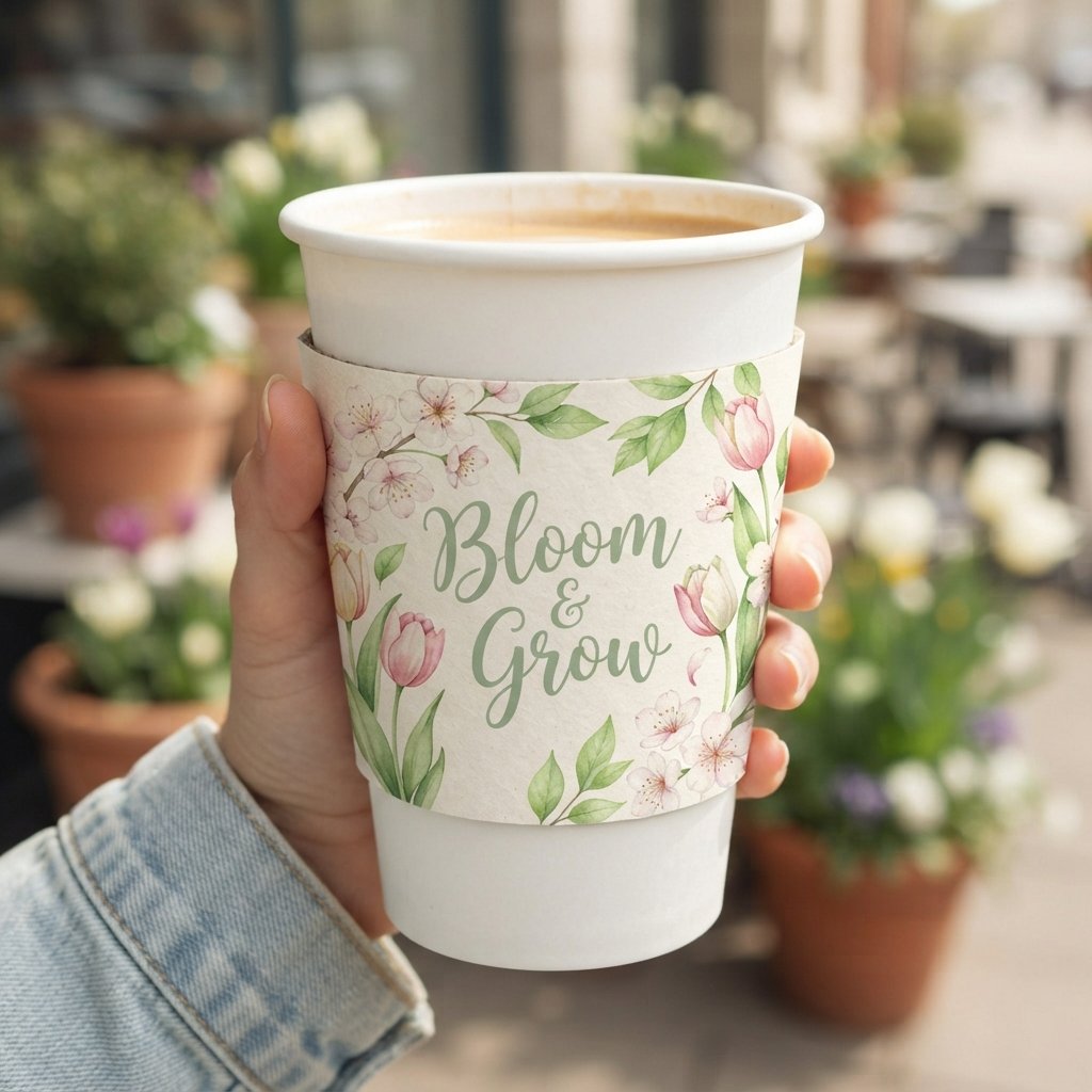
Seasonal designs shift with the calendar, incorporating colors and motifs tied to spring, summer, fall, or winter. Rotating these designs keeps a brand’s packaging feeling fresh throughout the year.
This approach gives returning customers something new to notice each time they visit. Seasonal sleeves also offer a simple way to test different styles without committing to one permanent look.
Tracking which seasonal designs get the most social media attention can guide future decisions about color and theme. A predictable rotation schedule also helps with planning print orders well ahead of each season.
Rustic Cup Sleeve Design Ideas
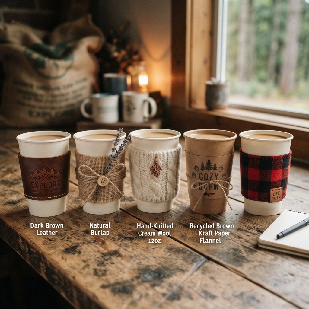
Rustic designs lean on natural textures, muted earth tones, and simple hand-lettered or serif typography. This style feels grounded and cozy, often paired with kraft paper or textured cardstock.
Farm-to-table cafés or countryside-inspired brands often gravitate toward this aesthetic direction. The overall effect feels warm and unpolished in a way that still looks intentional and well designed.
Nature-Inspired Cup Sleeve Design Ideas
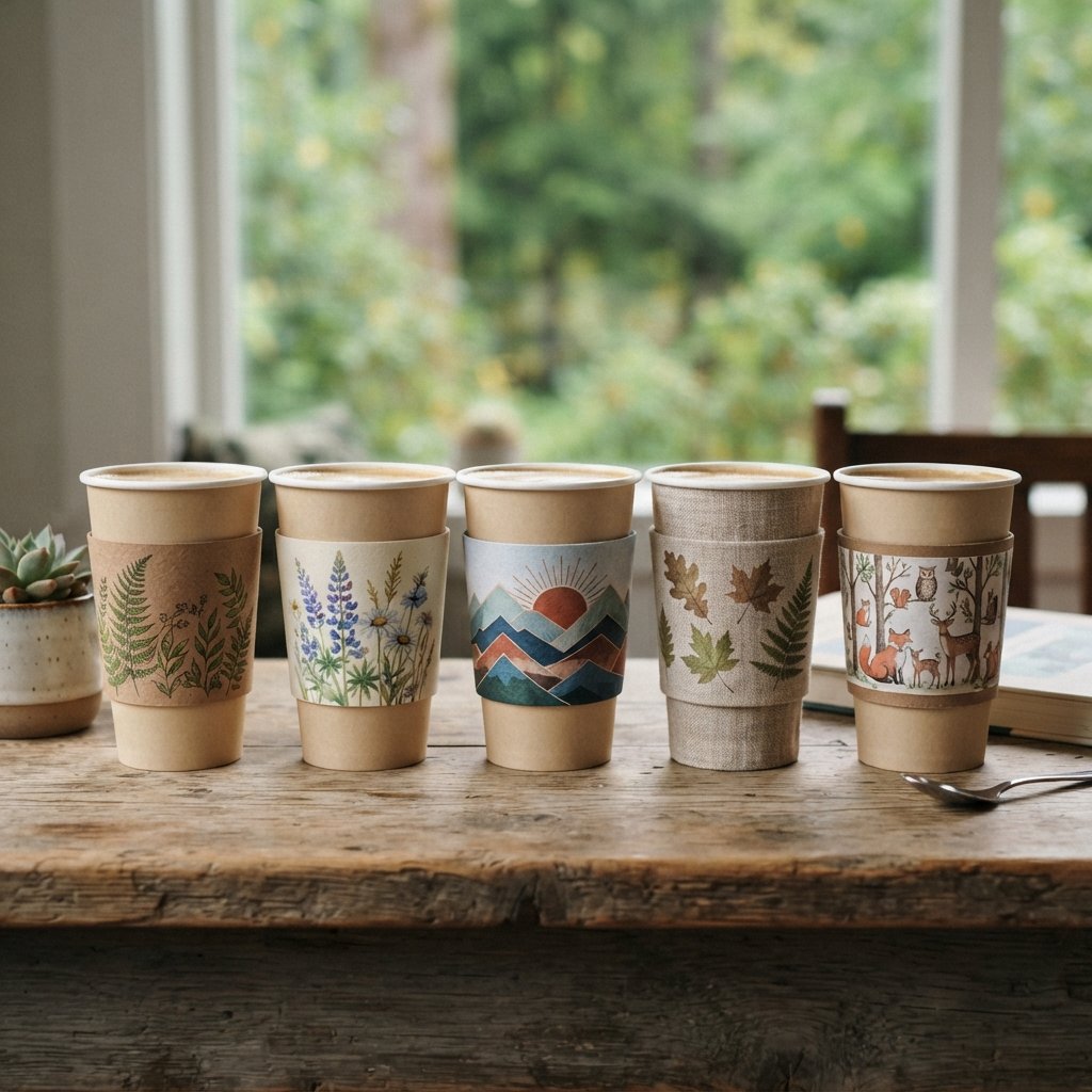
Nature-inspired sleeves draw on elements like leaves, mountains, or simple botanical line art for their visual direction. Green and brown tones dominate this category, creating a calm, outdoorsy impression.
Brands connected to the outdoors, wellness, or sustainable living often find this style aligns naturally with their identity. Simple, organic shapes keep the design feeling fresh rather than cluttered.
FAQs About Cup Sleeve Design
What size should a cup sleeve design be for standard coffee cups?
Most sleeves are designed to fit 8oz, 12oz, or 16oz cups, with height around four inches. Checking your specific cup dimensions before finalizing artwork helps avoid printing or fitting issues later.
Which materials work best for creative cup sleeve designs?
Kraft paper, corrugated cardboard, and recycled stock are popular choices for both texture and sustainability. The right material depends on your desired look, budget, and how the sleeve will be used.
Can cup sleeve designs be customized for specific events?
Yes, sleeves can easily be personalized with names, dates, or event-specific colors and graphics. This makes them a popular choice for weddings, birthdays, and other celebrations needing a personal touch.
What color combinations work well for cup sleeve design?
Pastels suit soft, gentle themes, while bold contrasting colors work well for energetic, eye-catching designs. The right combination depends on your brand personality or the mood of your event.
How do seasonal themes influence cup sleeve design ideas?
Seasonal themes bring shifting colors, icons, and motifs tied to holidays or times of year. Rotating designs seasonally keeps a brand’s visual identity feeling current and engaging for returning customers.
Conclusion
Cup sleeve design proves that even the smallest packaging detail can carry real creative weight. From minimalist branding to festive, personalized touches, there’s a style suited to nearly every occasion and audience.
Exploring different themes, materials, and color palettes opens up endless directions worth considering for your next project. Let these ideas serve as a starting point, then adapt them until the design feels distinctly your own.
2 Comments