20 Cup Logo Ideas: Creative Inspiration for Every Brand Style
Cup logo design opens up a huge range of creative directions once you stop thinking about rules and start thinking about style. Every cup that leaves a coffee shop, tea bar, or juice stand carries a small piece of art on it. That art shapes how people remember the brand long after the drink is gone.
The best part about cup logo design is how many directions you can take it. Some brands lean into bold color and playful shapes, while others go quiet and minimal. There’s no single correct path, only the one that fits your brand’s personality best.
Best Cup Logo Ideas to Try
Cup logos come in dozens of styles, and picking the right direction often comes down to matching your brand’s personality with a visual approach. Some ideas lean playful and colorful, while others lean clean and understated. Below, you’ll find a wide mix of directions worth exploring, grouped loosely by style, icon choice, and color approach.
These ideas work whether you’re running a small coffee shop, a tea brand, a juice bar, or a beverage startup just getting off the ground. Mix and match elements from different categories to land on something that feels genuinely yours instead of a copy of a competitor’s cup.
Minimalist Cup Logo Ideas
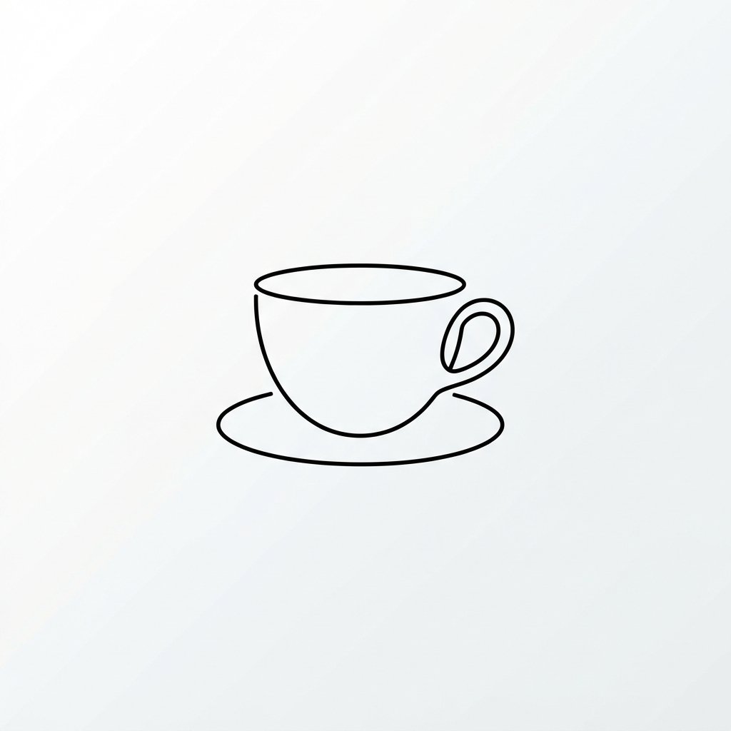
Minimalist cup logos strip everything down to the essentials, often just one shape or one line. This approach works especially well for cups, since the design stays sharp and legible even at a small size. Brands that want to feel modern and premium often gravitate toward this style.
A minimalist logo doesn’t mean boring. A single curved line suggesting steam, or one clean circle representing a cup rim, can carry more personality than a busy illustration. The trick is choosing one strong element and letting it breathe with plenty of empty space around it.
Vintage Cup Logo Ideas
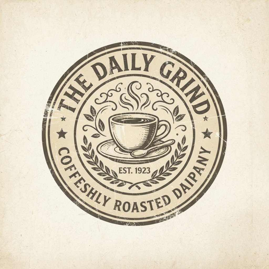
Vintage-style cup logos borrow from old print advertisements, hand-lettered signage, and retro packaging design. Think worn textures, classic serif fonts, and muted earthy tones. This style works well for brands wanting to feel established, nostalgic, or rooted in tradition.
Circular badge shapes paired with vintage typography give off an old-world feel that customers often associate with craft and quality. Adding subtle texture, like a faded ink effect, pushes the vintage feeling even further without making the logo hard to read.
Mascot Cup Ideas
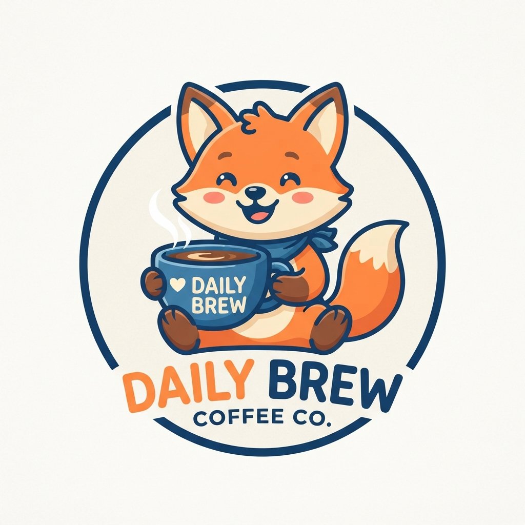
Mascot logos feature a character, often an animal, person, or friendly creature, as the centerpiece of the design. This approach gives a brand personality and makes the logo instantly memorable, especially for younger or more playful audiences.
A well-designed mascot needs to work at small sizes just like any other cup logo. Simplify the character’s features so they hold up when printed on a small paper cup. Overly detailed mascots tend to blur or lose clarity once shrunk down for everyday use.
Read More: 21 Cup Coffee Design Ideas You’ll Want to Pin Today
Line Art Cup Ideas
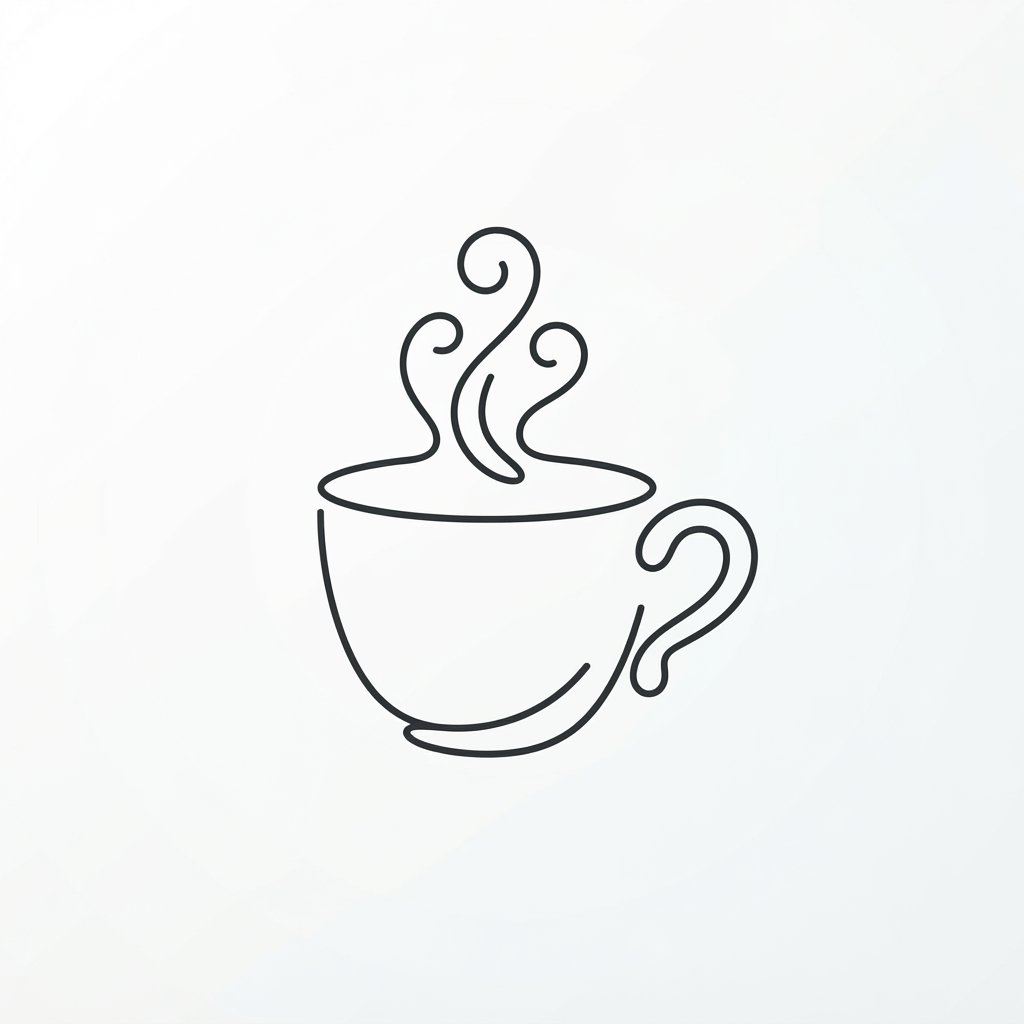
Line art logos use continuous or minimal strokes to form a shape, often without any fill color at all. This style has grown popular recently because it feels modern, artistic, and effortlessly clean on packaging.
Coffee cups, leaves, and steam lines translate especially well into line art form. Since there’s no solid fill, this style also prints cheaply and clearly across a wide range of surfaces, from napkins to tote bags to signage.
Geometric Cup Ideas
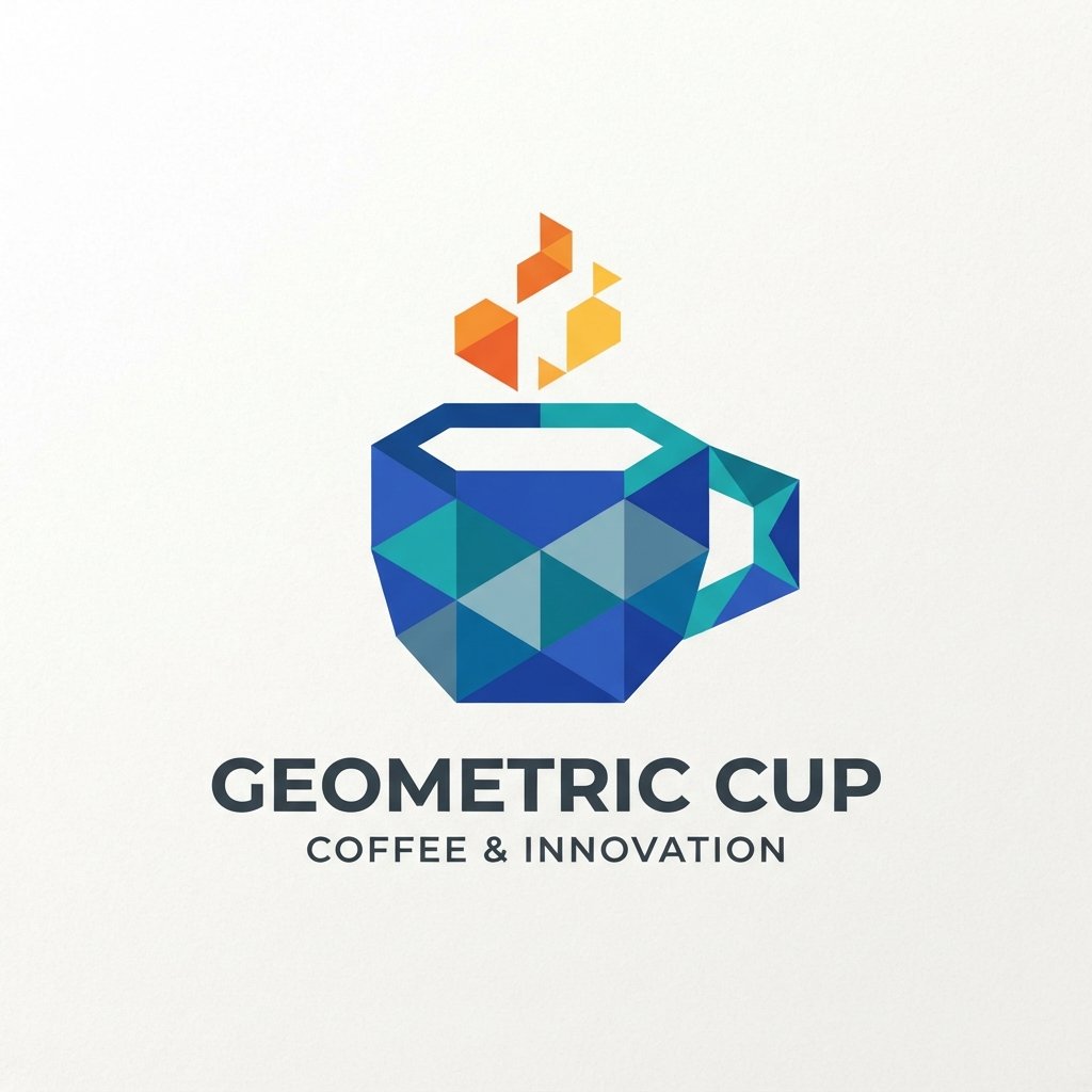
Geometric cup build shapes out of triangles, circles, hexagons, or other clean forms. This style feels structured, contemporary, and often appeals to brands wanting a tech-forward or design-conscious image.
Combining a geometric cup icon with a bold, simple typeface creates a striking, balanced look. Geometric logos also scale beautifully, since their shapes are built from clean mathematical forms rather than intricate freehand details.
Hand-Drawn Cup Ideas
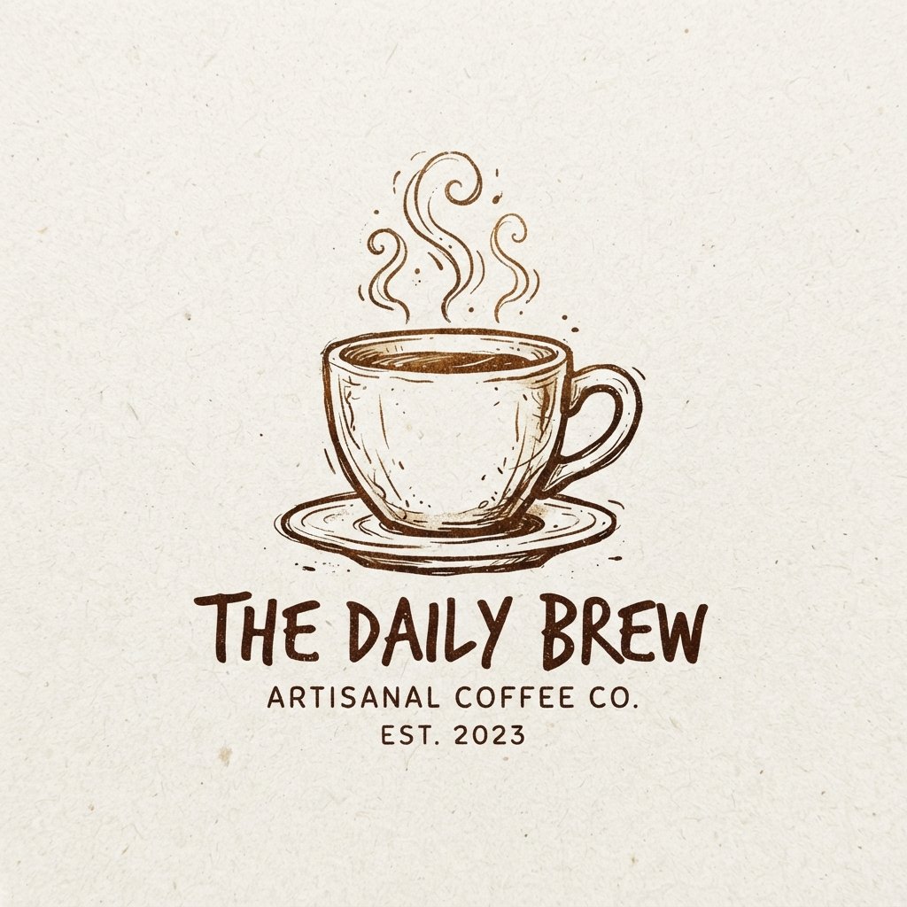
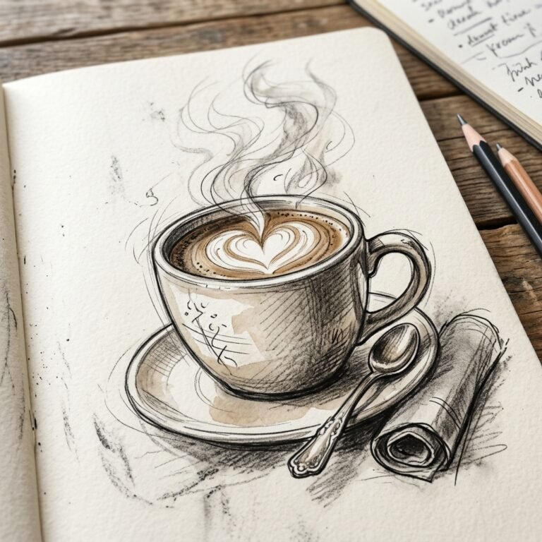
Hand-drawn cup bring warmth and personality that polished vector designs sometimes lack. This style suits brands wanting to feel artisanal, personal, or handmade, especially independent coffee shops and small-batch beverage brands.
The slightly imperfect lines of hand-drawn art actually work in your favor here, giving the logo a human touch. Just make sure the final design gets converted into a clean vector file so it still scales properly for printing.
Steam Icon Cup Ideas
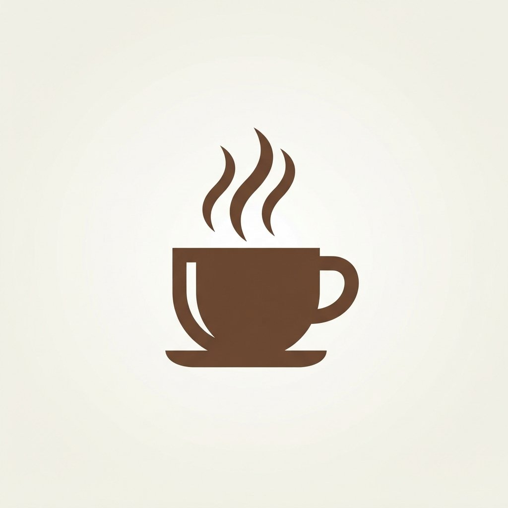
Steam icons are one of the most recognizable symbols in beverage branding, instantly signaling warmth and freshness. A few curved lines rising from a cup shape communicate “hot drink” faster than almost any other visual element.
Designers often pair steam icons with minimal cup outlines to keep the overall logo simple. This combination works particularly well for espresso bars, tea shops, and any brand wanting to emphasize a freshly made, hot beverage experience.
Coffee Bean Cup Ideas
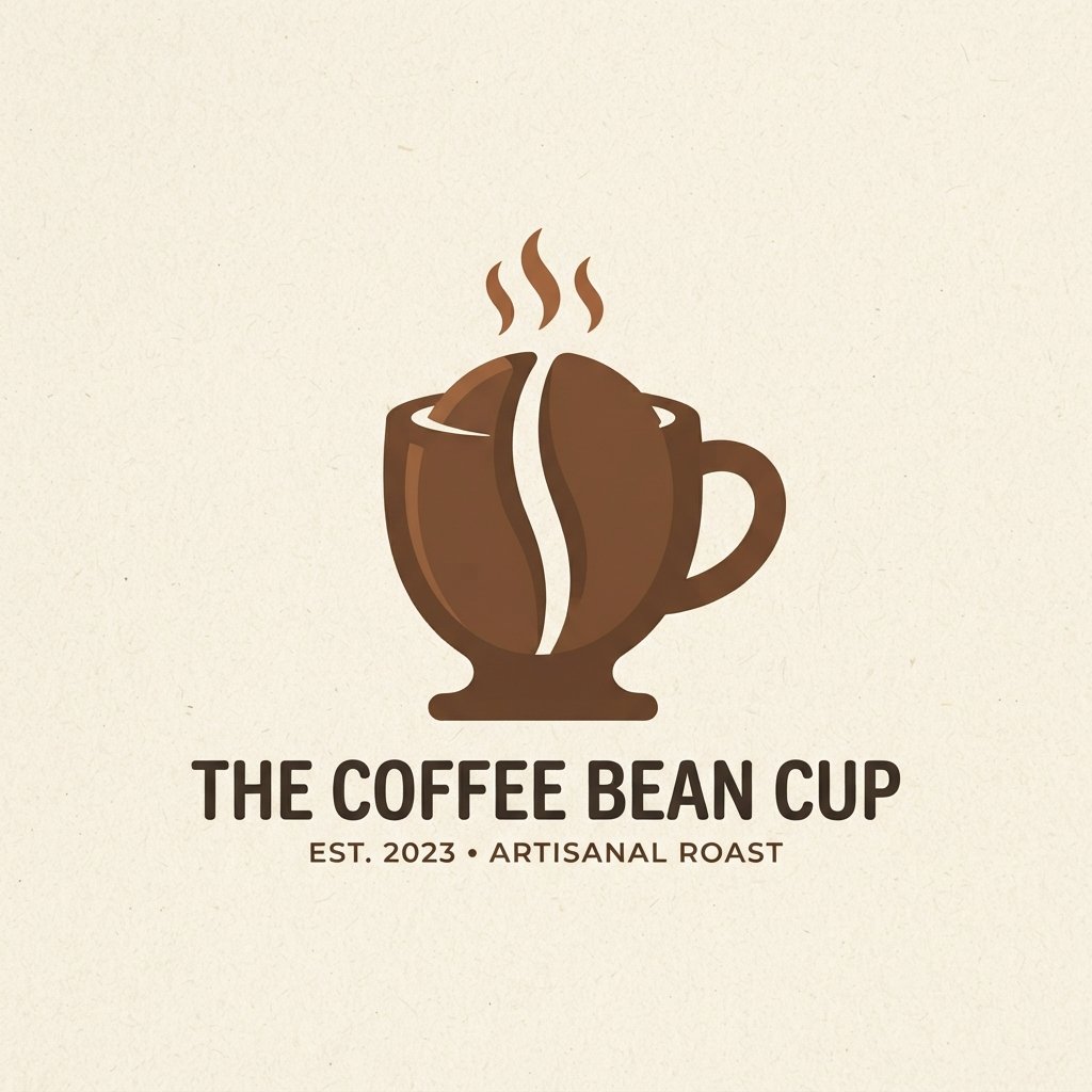
Coffee bean icons remain a classic choice for coffee-focused brands, instantly communicating what’s inside the cup. A single bean, a cluster of beans, or a bean silhouette worked into negative space all offer strong visual options.
Pairing a coffee bean icon with earthy brown or deep green tones reinforces the natural, roasted feel many coffee brands want to project. This combination feels familiar to customers while still leaving room for a distinctive twist.
Leaf and Nature Cup Ideas
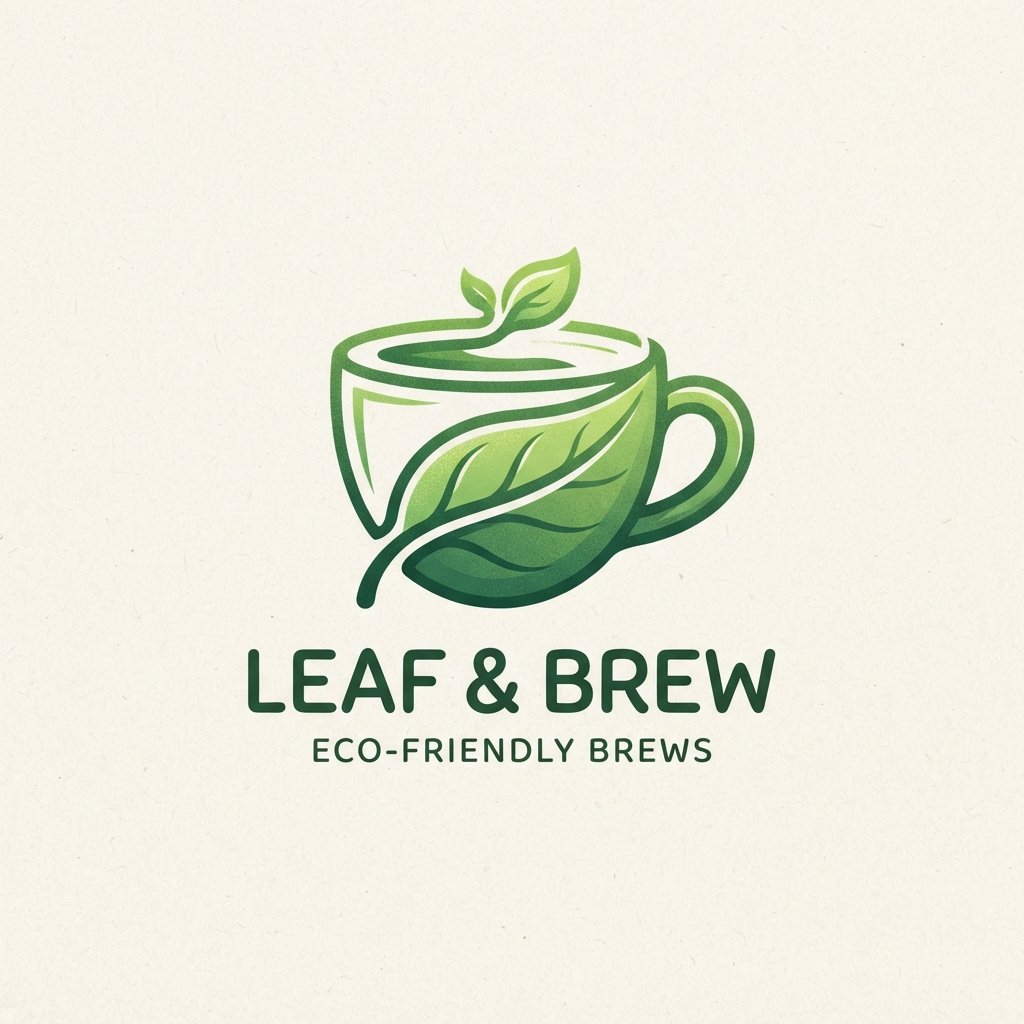
Leaf and nature-inspired cup work well for tea brands, organic beverage companies, and any business wanting to emphasize sustainability. A single leaf, a sprig, or a subtle branch shape can communicate freshness without saying a word.
Green tones paired with simple leaf iconography create an immediate association with natural ingredients. This style also pairs nicely with eco-conscious packaging, reinforcing a consistent, sustainable brand story across every touchpoint.
Emblem Cup Ideas
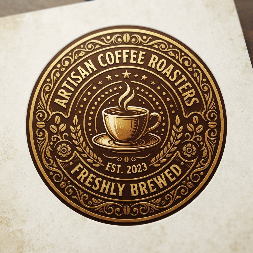
Emblem logos combine text and imagery inside a contained shape, often a circle, shield, or badge outline. This style feels traditional and trustworthy, making it a popular choice for established or premium beverage brands.
Because emblems pack more detail into one design, they need extra attention to stay legible at small sizes. Testing the emblem on an actual cup mockup before finalizing it helps catch legibility issues early.
Badge Cup Ideas
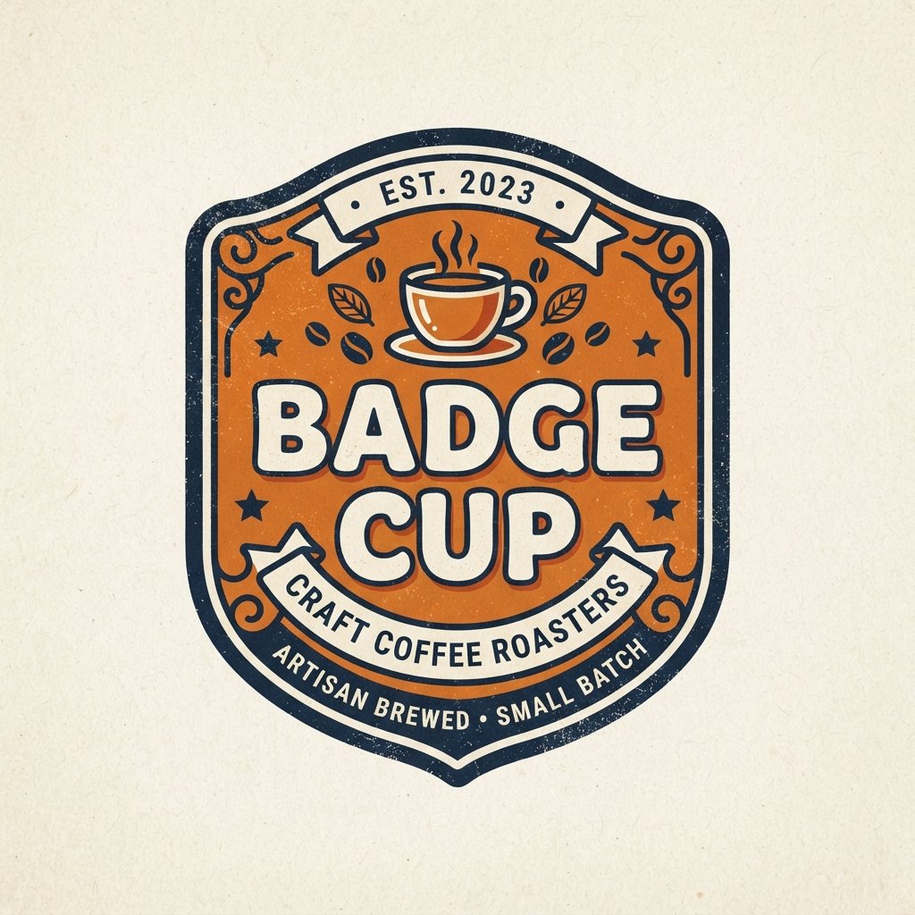
Badge-style cup share similarities with emblems but often feel more casual and modern, especially when paired with playful typography. Circular or shield-shaped badges give off a sense of quality and craftsmanship customers tend to trust.
Badges work particularly well for brands wanting to include a founding year, location name, or short tagline within the logo itself. Just keep the text minimal so the design doesn’t feel cluttered at cup size.
Typography-Only Cup Ideas
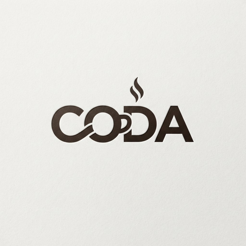
Typography-only logos skip icons entirely and let the brand name carry the entire design. This approach works best when the business name itself is short, distinctive, and memorable on its own.
Custom lettering, unique letter spacing, or a distinctive font choice can turn plain text into a genuinely striking logo. Since there’s no icon to lean on, font selection becomes the single most important decision in this style.
Monogram Cup Ideas
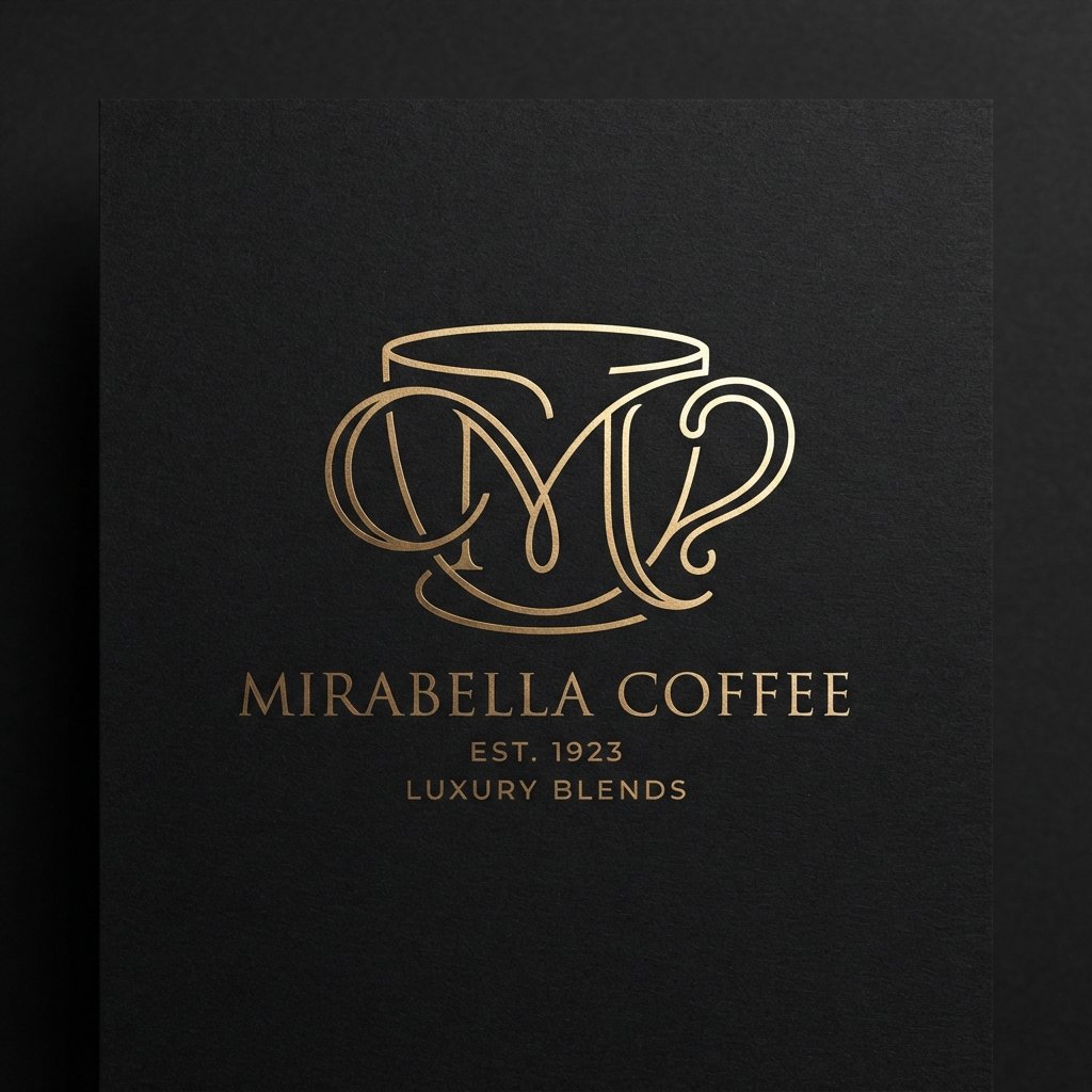
Monogram logos use one or two letters, often the brand’s initials, styled into a compact, memorable mark. This approach works especially well for brands with longer names that don’t fit cleanly into a small cup sleeve.
A well-designed monogram feels elegant and premium, particularly when paired with clean, simple linework. Many high-end coffee and tea brands lean toward monograms specifically because they photograph beautifully on packaging and social media.
Retro Cup Ideas
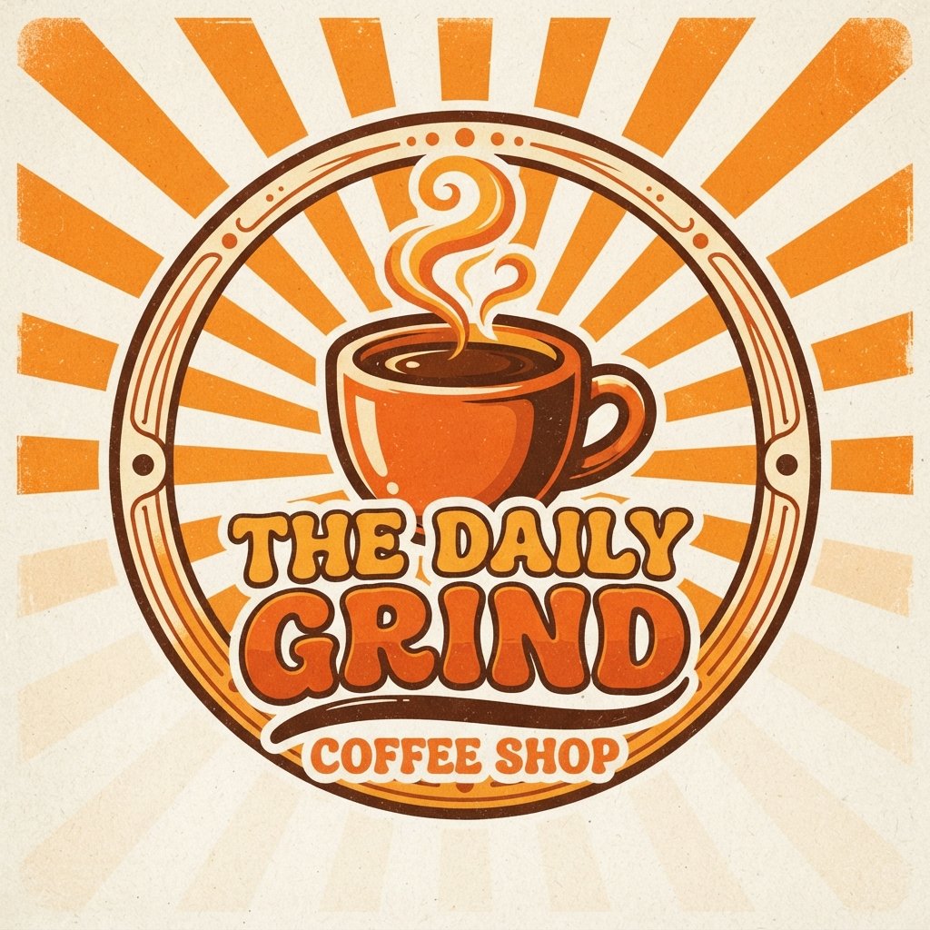
Retro cup pull inspiration from specific decades, whether 1950s diner aesthetics or 1970s bold color palettes. This style instantly signals personality and stands out against the sea of modern minimalist competitors.
Bright, saturated colors paired with rounded, chunky typography capture that retro feeling effectively. This approach suits brands wanting to feel fun, nostalgic, and a little rebellious against overly polished modern branding trends.
Watercolor Cup Ideas
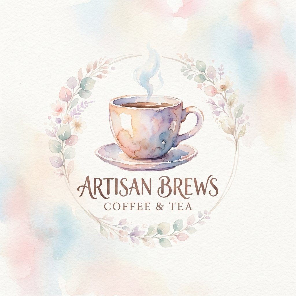
Watercolor-style cup logos bring a soft, artistic, handmade quality that feels distinctly different from sharp vector designs. Soft color blends and organic edges give the logo a painterly, boutique feeling customers often associate with craft beverages.
This style requires careful conversion into a clean printable file, since watercolor textures can get muddy at small sizes. Working with a designer experienced in this technique helps preserve the artistic feel without sacrificing print clarity.
Bold Color Cup Ideas
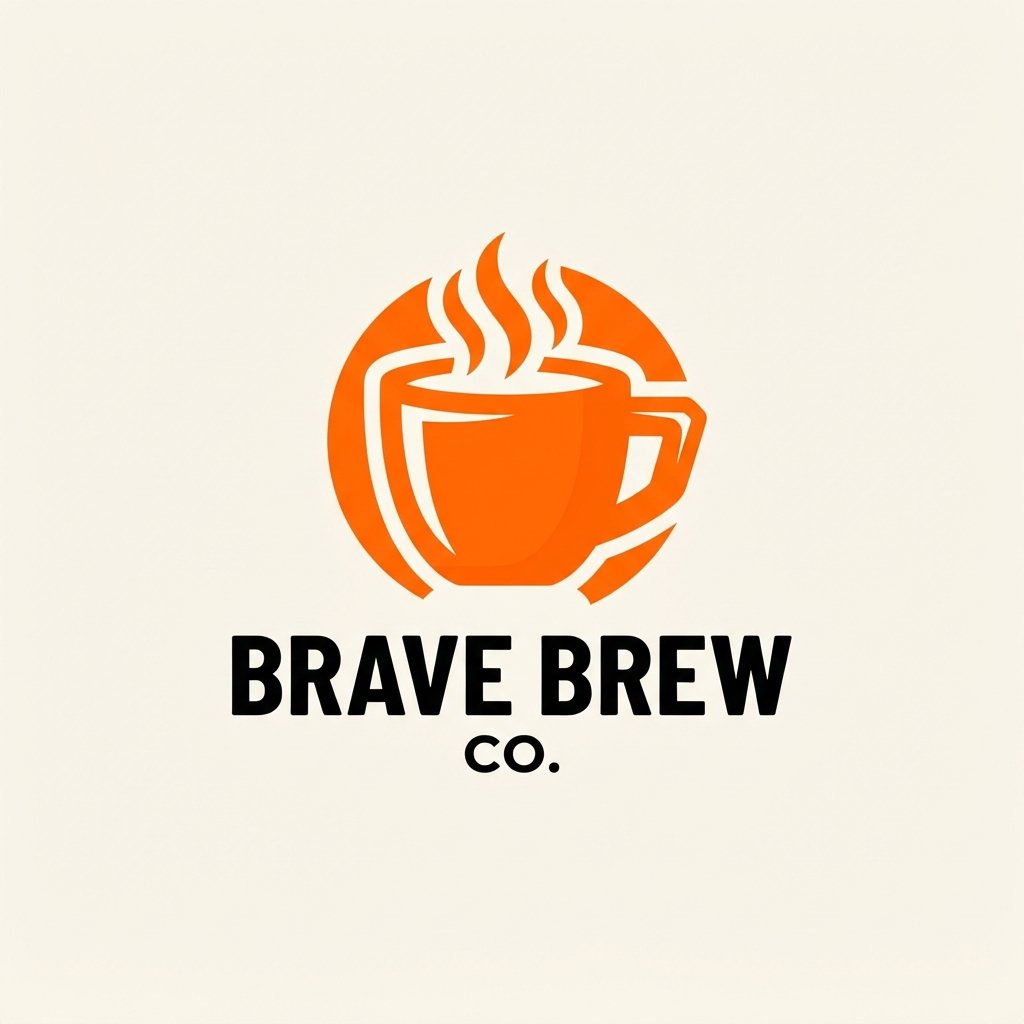
Bold color cup lean into bright, saturated palettes that grab attention instantly, even from across a crowded room. This approach suits energetic, youthful brands wanting their cups to stand out immediately on a busy street.
Pairing one dominant bold color with a simple white or black icon keeps the design from feeling overwhelming. High contrast between the background and the logo ensures the design stays sharp even printed on smaller cup sizes.
Pastel Cup Ideas
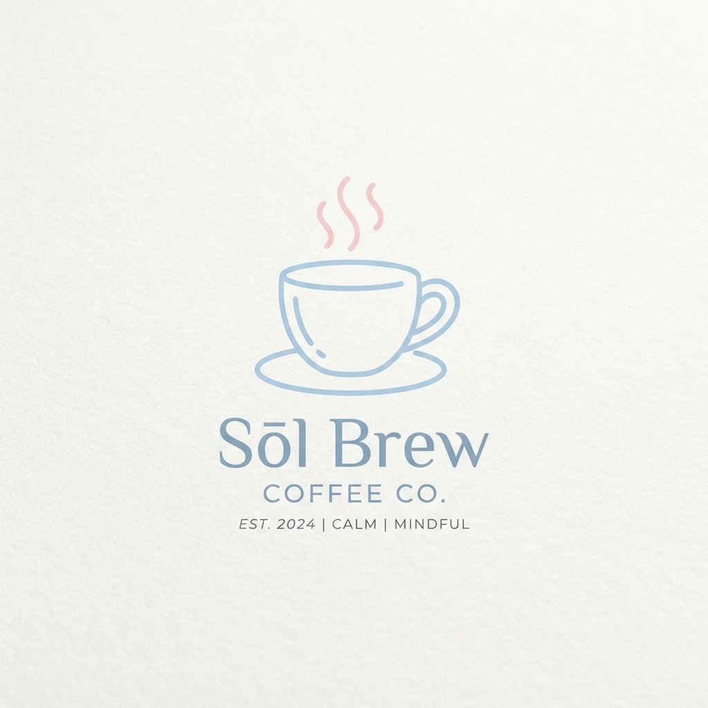
Pastel-toned cup offer a softer, gentler alternative to bold, saturated color schemes. Light pinks, soft blues, and muted greens create a calm, approachable feeling that appeals to wellness-focused and boutique beverage brands.
This palette pairs especially well with minimalist or line art icon styles, since the soft colors let the shapes take center stage. Pastel branding also photographs beautifully, which matters given how often customers share cup photos online.
Silhouette Cup Ideas
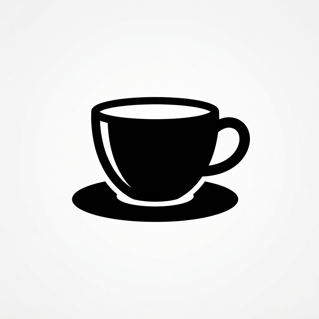
Silhouette logos use solid, single-color shapes without any internal detail, creating a clean and instantly recognizable form. A cup silhouette, an animal silhouette, or a leaf silhouette all work well within this simplified approach.
Because silhouettes rely entirely on outline shape, choosing a distinctive, easily identifiable form matters more than usual. This style prints cheaply and consistently across nearly any surface, from paper cups to embroidered merchandise.
Playful Cartoon Cup Ideas
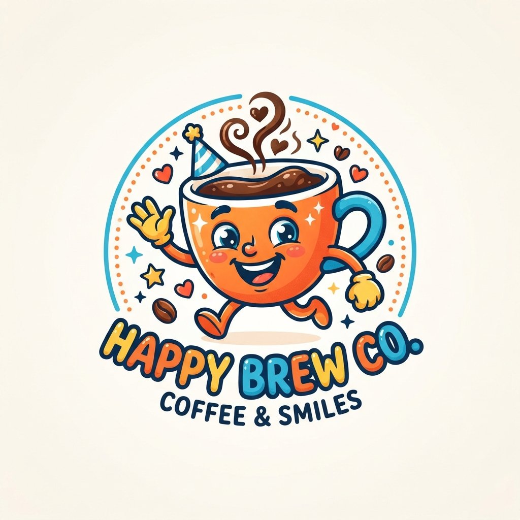
Playful cartoon-style cup bring energy and fun, often appealing to family-friendly or youth-oriented beverage brands. Exaggerated features, bright colors, and expressive characters help these logos feel approachable and lighthearted.
This style works particularly well for brands selling flavored drinks, smoothies, or dessert-style beverages aimed at a younger audience. Keeping character details simple ensures the cartoon still reads clearly once printed on an actual cup.
Modern Abstract Cup Ideas
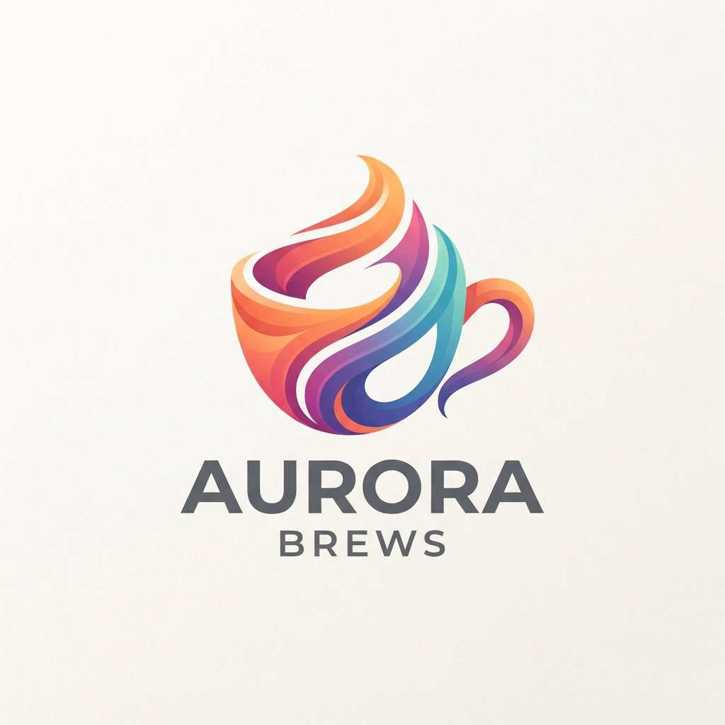
Modern abstract cup use shapes, gradients, or patterns that don’t directly represent a literal object, relying instead on feeling and impression. This approach suits brands wanting to feel forward-thinking, artistic, or distinctly different from typical beverage branding.
Abstract designs give designers more creative freedom, but they also require stronger brand storytelling to explain the concept behind the shape. Pairing an abstract mark with a clear brand name helps customers connect the visual to the business.
FAQs About Cup Ideas
What’s the easiest cup style for a new brand to start with?
Minimalist and silhouette styles tend to be the easiest starting points for new brands. They’re simple to design, cheap to print, and scale well across every size of cup.
Do cup logo ideas need to include the brand name?
Not always. Many strong cup rely entirely on an icon or symbol, especially once a brand becomes recognizable. Early on, though, including the name helps build recognition faster.
How many colors should a cup idea use?
Most successful cup stick to two or three colors at most. Fewer colors keep printing costs down and ensure the design stays legible at small sizes.
Can I combine two different cup styles together?
Yes, combining styles like line art with a bold color palette often creates a distinctive, memorable result. Just avoid mixing too many styles at once, since that tends to create visual clutter.
Which cup idea works best for a coffee shop specifically?
Coffee bean, steam icon, and minimalist styles tend to perform especially well for coffee shops. They communicate the product clearly while staying flexible enough for future rebranding.
Conclusion
Cup design gives brands an enormous amount of creative room to explore, from bold retro color schemes to quiet, minimalist line art. There’s no single right answer, only the direction that best reflects your brand’s personality and the experience you want customers to remember.
Whichever style you choose, the goal stays the same: create a cup that feels distinctly yours and travels well through the world. With so many creative directions available, the right cup idea is often closer than it seems.
One Comment